Skip to content

Case № 28

Real comfort.

Morris-Jenkins is one of the biggest heating, cooling, and plumbing companies in the country, family-run in Charlotte for almost seventy years. I rebuilt their website around one job: turn a visitor into a booked appointment.

Client Morris-Jenkins
Industry Home Services
Role Website Redesign, Site Structure & Strategy
Live at morrisjenkins.com
Morris-Jenkins hero
In short

Heating and cooling company website design.

Morris-Jenkins is one of the biggest air conditioning, heating, and plumbing companies in the country. They are based in Charlotte, family-run for almost seventy years, with a 4.9 rating across more than 35,000 reviews. I designed their new website and worked with their team to get it running on their booking and scheduling systems. This is real work for a real client, shared with their permission.

The company had been online for the better part of two decades. Like a lot of home service sites that have been around a while, theirs had been built and patched and rebuilt by a string of different people over the years. It was never really redesigned around how people find and book a contractor today. The newest version still ran on those old bones, and it spent its best space on the wrong things.

I rebuilt the site around one job. Turn a visitor into an online booking, or a call to the office. This case study walks through what the old site got wrong, what I changed, and what moved after launch.

0
Rating 35,000+ reviews, now leading the page
Open booking
Every homeowner was a members-only perk
Service + town
Real pages built for local searches
Self-service
Built in help guides + customer dashboard
01 / The Problem

What was broken.

The first problem was trust. The old homepage asked visitors to review Morris-Jenkins and follow the company on social media. But the 35,000 reviews and the 4.9 rating that actually build trust were nowhere on the page. A first-time visitor just had to take their word for it, which is backwards. A company with that much proof should never have to ask for belief.

The second problem was priorities. The best spots on the homepage went to recruiting and social media. A big banner recruiting technicians and a block asking people to follow along sat front and center. Good for hiring. Not much help for a homeowner with no heat at 9pm who needs to know two things: can I trust these people, and how fast can they get here.

The third problem was booking. The old site framed online scheduling as a perk for Priority Advantage members, who could book faster and pay online. That made the easiest way to book sound like something you had to join to get. Add a page that took over six seconds to show its first content on a phone, where most of these visits happen, and the site was working against the company it represented. The business was excellent. The website asked you to take that on faith.

02 / The Approach

How it got fixed.

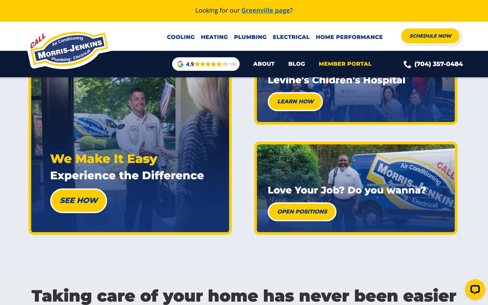
I rebuilt the site around one job. Turn a visitor into an online booking, or a call to the office. Every layout decision, every block of copy, and every technical choice got measured against that job.

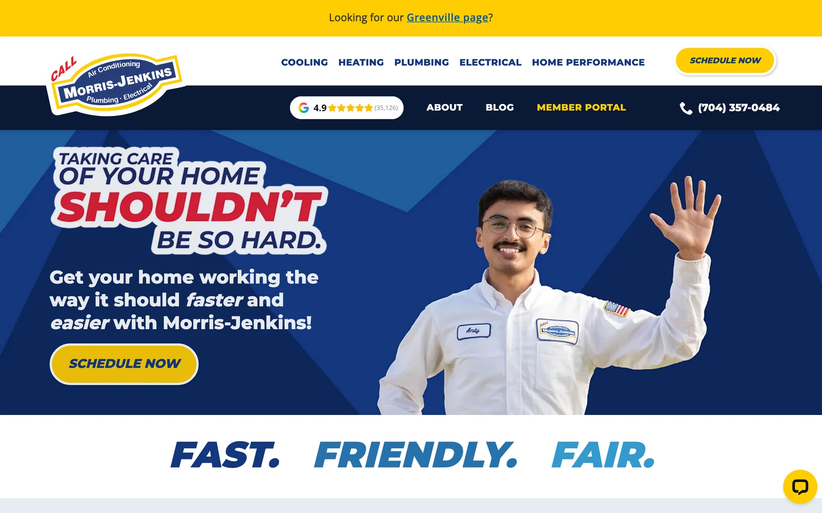
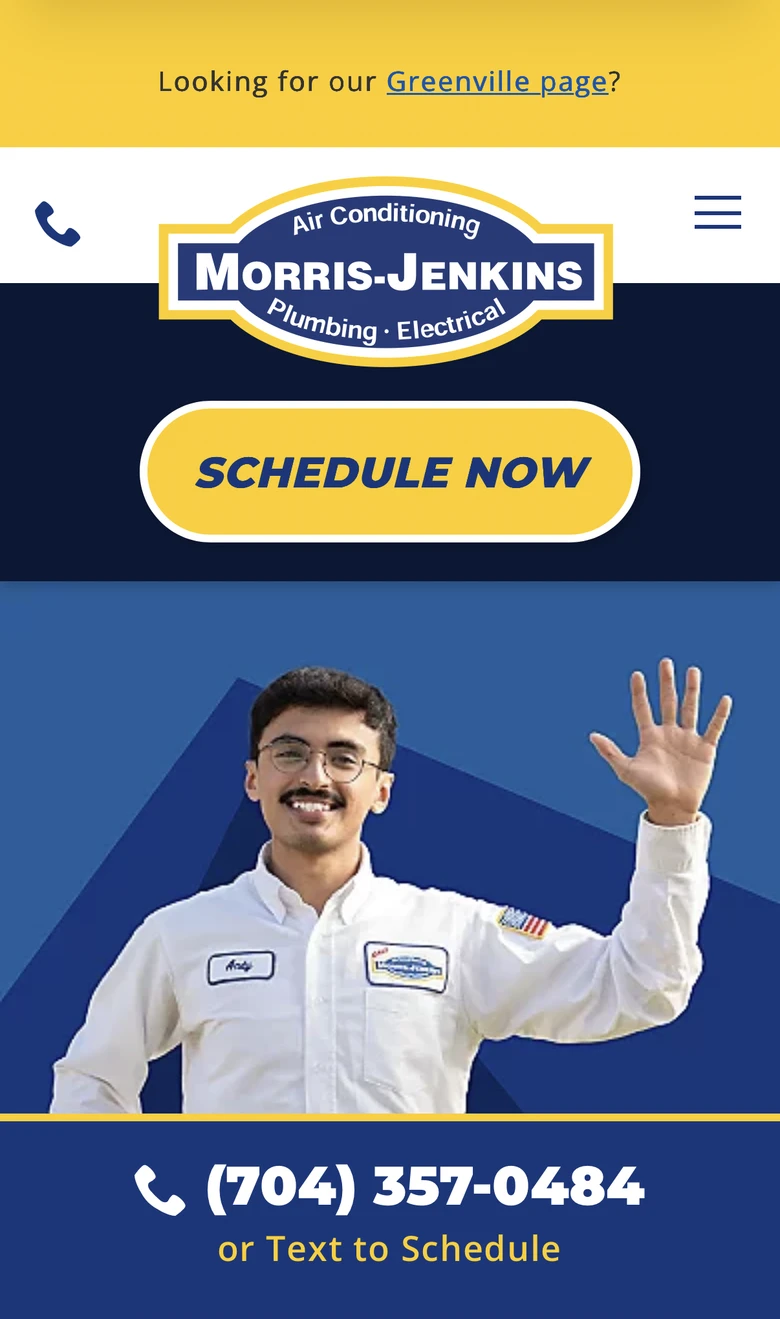
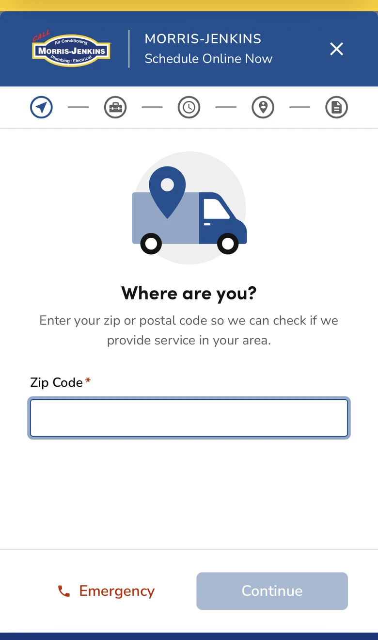
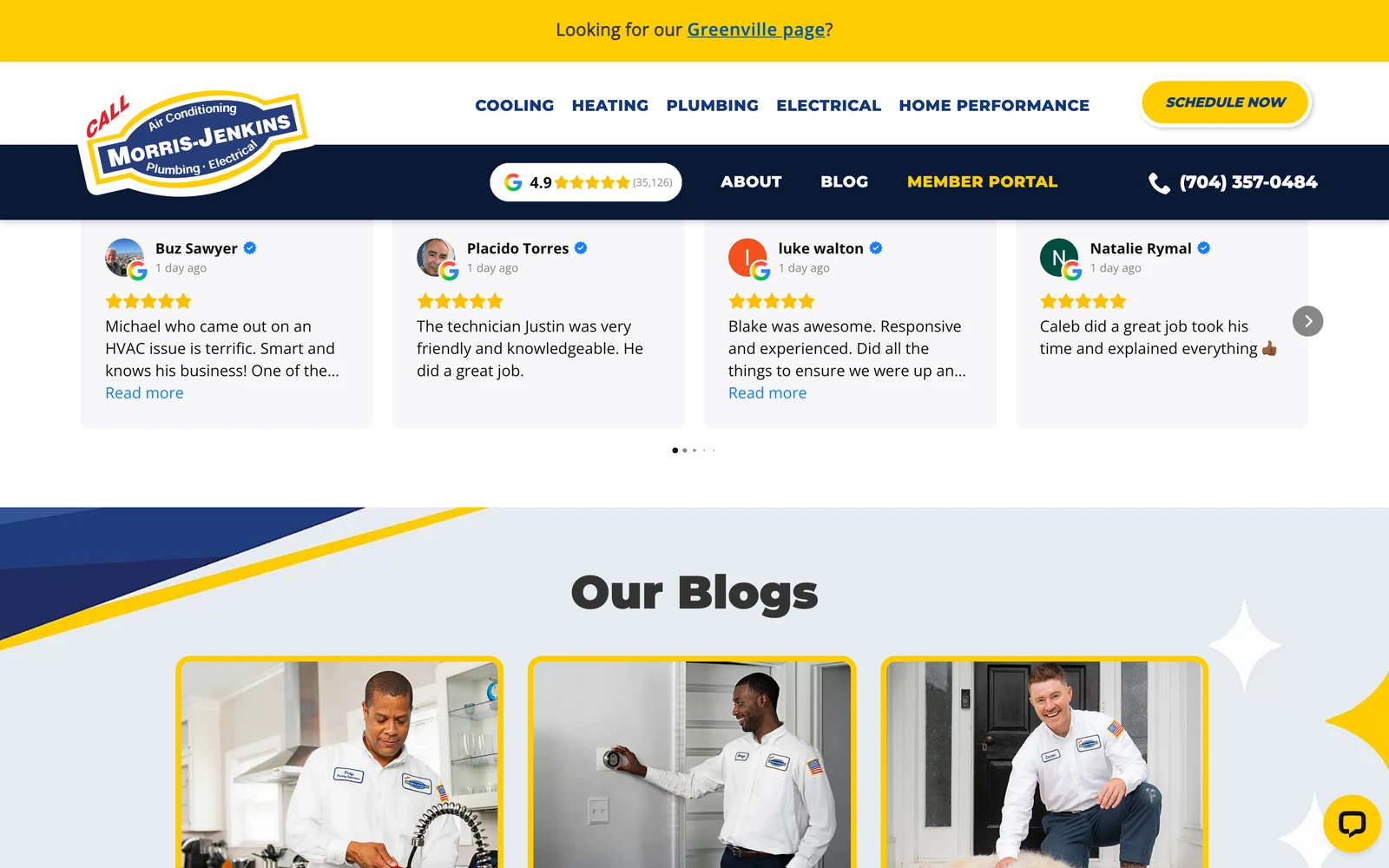
Trust went right up front. The 4.9 rating and the 35,000 reviews now sit at the top of the page, with video stories from real customers. People see the proof before they ever pick up the phone. Then I made the next step impossible to miss. Schedule Now sits in the header and repeats down every page, right next to a tap-to-call number, so the next step is always one thumb away. And I worked with their team to open online scheduling to every homeowner, not just members, running on the booking and scheduling systems their office already uses. Someone can lock in a time at 9pm without waiting for the office to open.

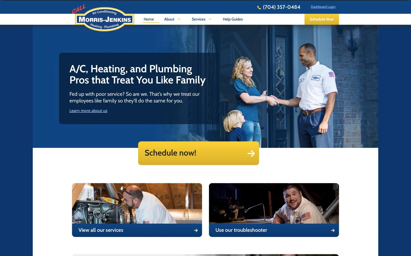
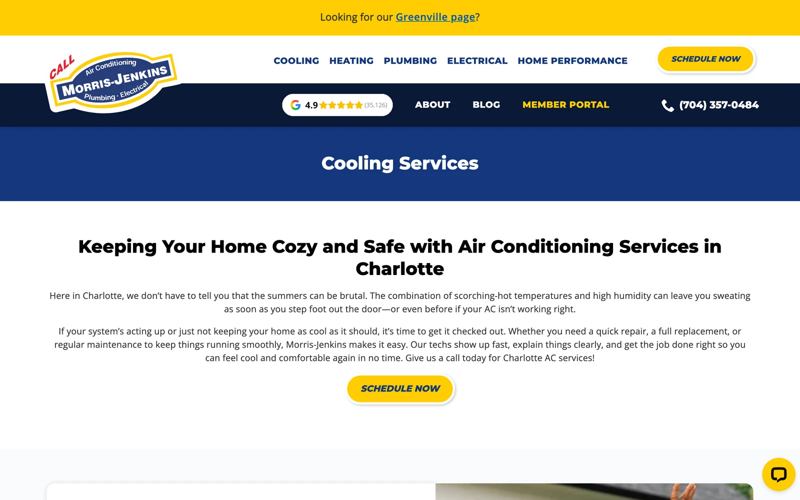
Underneath that, I built out the structure Google needs. Proper pages for each service and each town they cover, like heating, cooling, and plumbing, and towns like Mint Hill, so the site says clearly what they do and where. A clean, modern design that looks as legit as the company behind it and loads fast on a phone. And self-service built in: Help Guides, a troubleshooter, and a customer dashboard, so homeowners can answer common questions and check their own appointments without calling in.

01

Trust shown, not asked for

The old page asked visitors to leave a review and follow on social media. I flipped it. The 4.9 rating and the 35,000+ reviews now lead the page, with video stories from real customers, so people see the proof before they ever pick up the phone.

02

One clear next step, everywhere

Schedule Now sits in the header and repeats down every page, right next to a tap-to-call number. Whether someone lands on furnace repair, drain cleaning, or a town page, the next step is always one thumb away.

03

Booking opened to every homeowner

Online scheduling used to read like a members-only perk. I worked with their team to open it to everyone, running on the scheduling systems their office already uses, so a homeowner with no heat at 9pm can lock in a time without waiting for morning.

04

Real service and town pages

Proper pages for each service and each town they cover. Heating, cooling, plumbing, and towns like Mint Hill. The site now says clearly what they do and where, which gives Google real pages to show for local searches.

05

Self-service built in

Help Guides, a troubleshooter, and a customer dashboard let homeowners answer common questions and check their own appointments without calling in. The easy questions get handled on the site, so the phones stay open for booking actual work.

How it shipped

The work, step by step.

01

Heating and cooling company website design built around booking

A home service website has one job: turn a visitor into a booking or a call. I rebuilt every page around that job. Schedule Now lives in the header and repeats down every page next to a tap-to-call number. Online scheduling went from a members-only perk to something any homeowner can use at any hour, wired into the booking and scheduling systems the office already runs on. Nobody has to figure out what to do next, because the next step is always in front of them.

02

Trust signals for a home services website

Morris-Jenkins earned a 4.9 rating across more than 35,000 reviews, and the old site barely mentioned it. The new site leads with it. The rating and the review count sit at the top of the page, backed by video stories from real customers talking about real visits. A first-time visitor with a broken air conditioner gets the proof in the first scroll, before they decide whether to call. The company never has to ask for trust again. The page shows it.

03

Service and town pages that grow a local search footprint

The old site collapsed a huge service catalog into a handful of pages. I built proper pages for each service, from air conditioning repair to furnace installation to drain cleaning, and for each town they cover, like Mint Hill. Each page answers one real search a homeowner actually types. That gave Google more real pages to show, and the search footprint grew as those pages started ranking for local searches across the Charlotte area.

04

Self-service tools that take routine questions off the phones

A lot of calls to a home service company are not booking calls. They are homeowners asking when their appointment is, or whether a noisy water heater is an emergency. I built Help Guides, a troubleshooter, and a customer dashboard into the site so people can answer those questions and check their own appointments without calling in. The site handles the routine questions on its own, and the call center spends its time on the conversations that book work.

05

Mobile-first design for homeowners in a hurry

Most visits to a site like this happen on a phone, often mid-emergency. The old site took over six seconds to show its first content on a phone, which is an eternity to someone with water on the floor. The new design is clean, modern, and built to load fast where these visits actually happen. Tap-to-call, text-to-schedule, and online booking all sit within reach of a thumb, so the person standing in a cold house gets help without fighting the website first.

The Work, Specifically

What I actually shipped.

Not a services list. The real work streams, in the order I ran them.

  1. № 01

    Discovery and site audit

    I went through the old site page by page before touching a wireframe. Where the trust signals were missing, where the best space went to recruiting instead of booking, and where the load times were costing visits on phones. That audit became the brief for the rebuild.

  2. № 02

    Site structure and strategy

    A real architecture for a huge service catalog. Each service and each town got its own page, organized so a homeowner finds their exact problem in one or two clicks and Google gets real pages to show for local searches.

  3. № 03

    Responsive website design

    A clean, modern design that looks as legit as the company behind it. Built mobile-first because most of these visits happen on a phone, often mid-emergency, and tuned to load fast where the old site made people wait.

  4. № 04

    Booking and scheduling integration

    I worked with their team to run online scheduling on the booking systems their office already uses, and to open it to every homeowner instead of just members. Someone can lock in a time at 9pm without waiting for the office to open.

  5. № 05

    Trust and review surfaces

    The 4.9 rating and the 35,000+ reviews moved from nowhere to the top of the page, backed by video stories from real customers. First-time visitors get the proof in the first scroll, before they decide whether to call.

  6. № 06

    Self-service tools

    Help Guides, a troubleshooter, and a customer dashboard built into the site. Homeowners answer common questions and check their own appointments without calling in, which keeps the phones open for the calls that book work.

  7. № 07

    Search foundation

    Clean markup, fast loads, and a page structure that mirrors how homeowners actually search for a contractor. Each service and town page answers one real query, so the search footprint keeps growing as the pages rank.

03 / The Work

What shipped.

Morris-Jenkins — What shipped
The old site asked for trust. The new one shows it.
The home page leads with the 4.9 rating and the reviews, then puts Schedule Now one thumb away.
The cooling page answers the searches homeowners actually type, from repair to maintenance to installation.
The heating page gets a homeowner with no heat from landing to booked without a single detour.

The home page leads with the 4.9 rating and the reviews, then puts Schedule Now one thumb away.

  • The phone version leads with Schedule Now and a tap-to-call number, one thumb from booked.
    The phone version leads with Schedule Now and a tap-to-call number, one thumb from booked.
  • The whole company in one menu. Cooling, heating, plumbing, electrical, each a real page.
    The whole company in one menu. Cooling, heating, plumbing, electrical, each a real page.
  • Online booking open to every homeowner. Zip code in, appointment locked, day or night.
    Online booking open to every homeowner. Zip code in, appointment locked, day or night.
Morris-Jenkins Morris-Jenkins
Morris-Jenkins

Six surfaces of one home services brand.

04 / The Outcome

Where it landed.

Building the site out with real service and town pages gave Google more real pages to show, so the search footprint grew. The site went from showing up for about 6,900 searches before the redesign to over 9,000 today, as the new service and town pages started ranking for local searches. Estimated traffic value is up about 25% over the same stretch.

Straight talk on those numbers. Morris-Jenkins runs their own marketing too, so the redesign helped that growth along. It did not cause all of it on its own. A better-built site helped a great company get found for more of what its customers are searching for.

The booking side changed shape as well. Online scheduling is now open to every homeowner instead of reading like a members-only perk, so someone can lock in a time at 9pm without waiting for the office to open. And the Help Guides, troubleshooter, and customer dashboard let homeowners handle routine questions themselves, which keeps the phones pointed at booking work. A home service website is not a brochure. It is the front desk that never sleeps, and the storefront Google decides whether to show. Built right, it does both.

The Role
Website Redesign Site Structure & Strategy Responsive Website Design Booking & Scheduling Integration Search Optimization Self-Service Tools

Ready for your own case study?

Drop your URL. Nick will audit your site personally and build a live preview you can click through before you pay a dollar.

or write directly

Free, weekly

Site teardowns for home-service owners.

One real home-service site, broken down each week. What's leaking, what's working, the one fix that would matter most. Sent Mondays. Built for operators, not designers.

Built for home-service operators. Unsubscribe in one click.

See your free rebuild

No pressure. No upfront payment.