Skip to content
BurksUP Design

Case № 18

Real recovery.

A complete redesign of the website behind one of the world's most exclusive mental health and addiction recovery centers, tucked into the Rocky Mountains of Colorado.

Client All Points North
Industry Healthcare & Wellness
Role Digital Branding, User Experience Design
Live at apn.com
All Points North hero
In short

Mental health clinic website design.

All Points North runs a mental health clinic in the Rocky Mountains of Colorado that quietly serves professional athletes, executives, and public figures from around the world. When Anna Mason, their Director of Marketing, brought me in, the existing site had grown to more than a thousand pages, a deep backlink profile, and a strong organic search footprint, but the visitor experience no longer matched the calibre of care happening on the ground.

I designed a calmer, more confident interface that lets the clinic's photography breathe, rebuilt the navigation around the way prospective patients actually arrive (often in crisis, often on a phone, often from a referral link), and developed the entire site on a custom WordPress backend so the marketing team can run their content engine without designer support. Privacy-grade communications, accessibility compliance, and the existing search footprint all carried forward into the new build.

This case study walks through how I planned the work, what shifted in the structure, and why the new site holds up as the clinic continues to scale.


1,000+
Pages migrated rankings preserved
Custom
WordPress build marketing team self-serve
Privacy-grade
Communications U.S. healthcare privacy
Mobile-first
Responsive design phone-first audience
01 / The Problem

What was broken.

All Points North had quietly become one of the most respected mental health and recovery facilities in the world, with a clientele of professional athletes, celebrities, and executives who landed there through word-of-mouth and a heavy paid search investment. The marketing team had built a content library of more than a thousand pages, a strong backlink profile, and an organic search footprint that was carrying real revenue. The visitor experience, though, hadn't kept up.

Anna Mason and her team had three things they needed from the redesign. The interface had to feel as confident and considered as the in-person experience at the lodge. The navigation had to make sense to a stressed visitor on a phone, not just to a marketer who'd built the site. And the privacy-grade communications, accessibility requirements, and existing search rankings all had to carry forward without a dip on launch day.

There was also a structural issue. A site that had grown to a thousand pages over many years had developed several competing navigation patterns, duplicate content paths, and dead-end pages that visitors were dropping off from. The new architecture had to address that without breaking the search equity built up underneath it.

02 / The Approach

How it got fixed.

I started in the analytics. Heat maps, scroll depth, top-entry pages, and the full search-console picture. The goal was to understand who was actually arriving, what device they were on, what they did first, and where they bounced. From there I worked backward into a new sitemap that organized everything around three primary visitor jobs: understand the programs, see the place, and reach out for a confidential conversation.

With Anna and the marketing team, I ran a working session on the brand evolution they had planned for the year ahead. The new interface kept the clinical credibility the original had earned but moved the photography and the language to the front. Mountain photography, room photography, and team portraits became the anchor of every key page, with copy stripped back to what a real visitor needs in the first ten seconds.

The site was rebuilt on a fully custom WordPress backend with privacy-grade communications integrated for any web-based contact, accessibility compliance baked into the components, and the search architecture preserved page by page. Every legacy URL was mapped to a destination on the new site so the existing rankings carried forward intact.

01

Analytics-led discovery

I went deep into the existing analytics, heat maps, and search-console data with Anna's team to understand who was arriving, on what device, and what they did first. The output was a one-page personas-and-pain-points brief every downstream decision tied back to.

02

Site structure rebuild

I rebuilt the navigation around three primary visitor jobs (understand the programs, see the place, reach out) and consolidated overlapping content paths so a stressed visitor on a phone could find what they needed in two taps.

03

Refined user interface

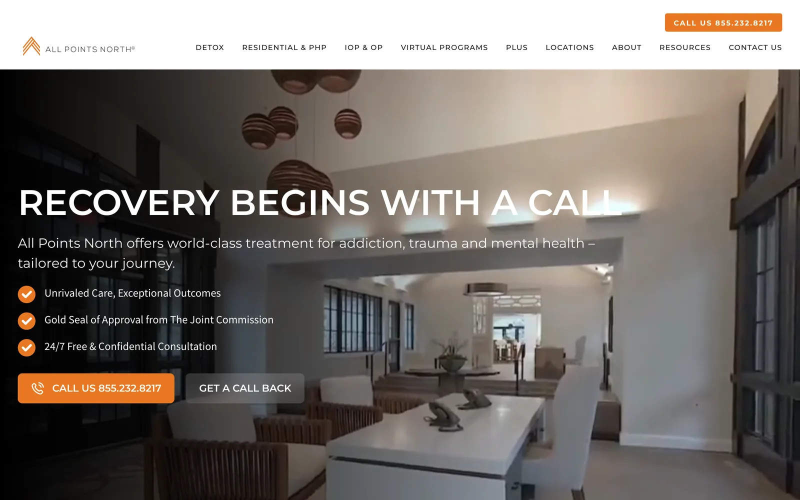
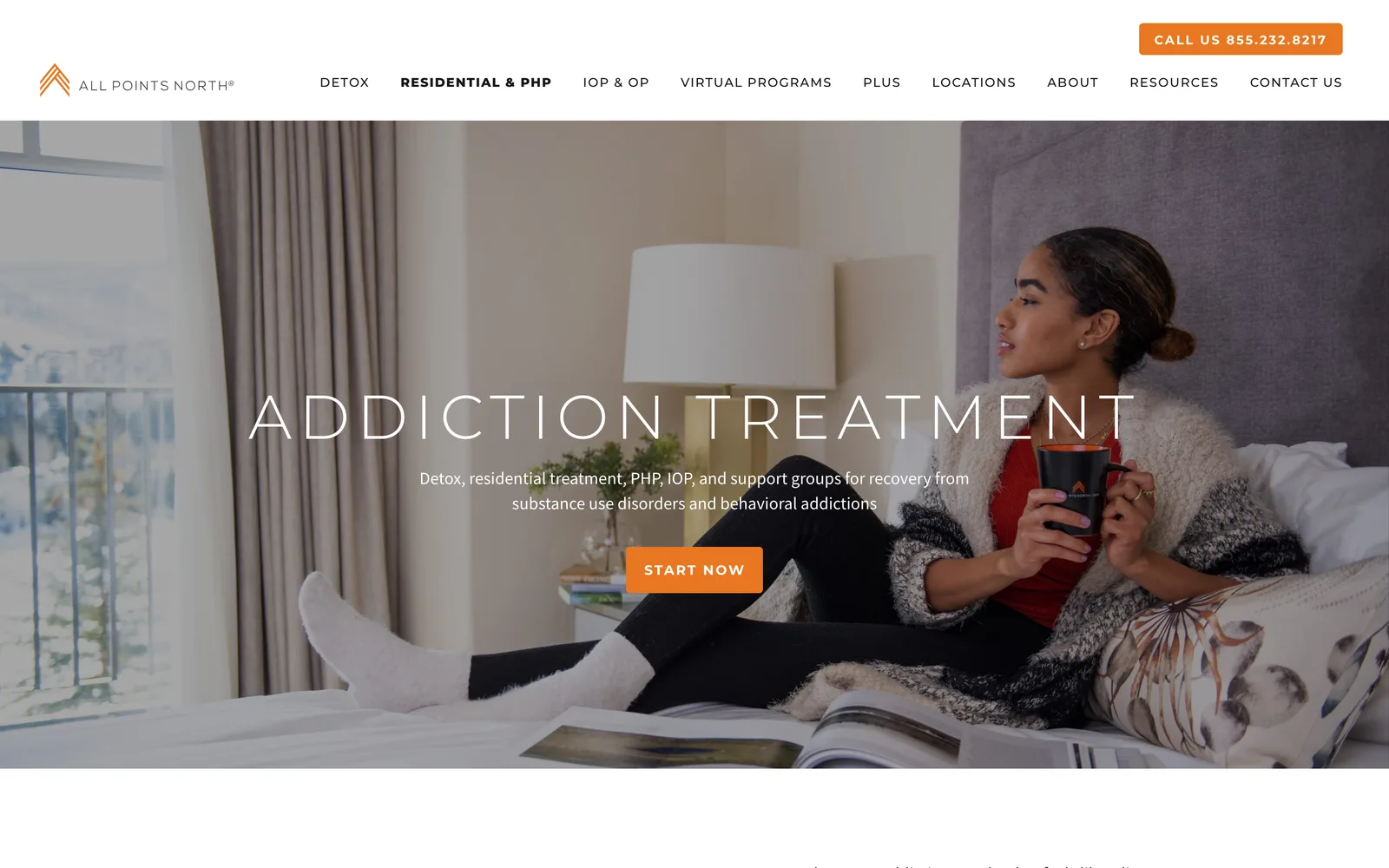
I designed a calmer, more confident interface anchored on the clinic's mountain and lodge photography. Type and color got tightened, white space got generous, and the calls to action got direct so the page felt like the place.

04

Custom WordPress build

I developed a fully custom WordPress backend so Anna's team could publish, edit, and update across a thousand-plus pages without designer support. Every component was built to keep the new design system from drifting.

05

Privacy-grade integrations and search preservation

I integrated industry-leading privacy applications for every web-based communication touchpoint, baked accessibility compliance into the components, and mapped every legacy URL to a destination on the new site so the existing rankings carried forward.

How it shipped

The work, step by step.

01

Mental health clinic website design that calms the visitor first

Most prospective patients arrive at a mental health website in a hard moment. Sometimes it's a referral, sometimes it's a 2 a.m. search, sometimes it's a family member trying to help. The new design leads with mountain and lodge photography, generous white space, and direct copy because that's what calms a visitor enough to read further. Every page got the same treatment so a visitor arriving on a deep procedure page from a search result lands somewhere that feels intentional, not buried.

02

Site structure for a thousand-page healthcare site

The original site had grown organically over years and had developed several competing navigation patterns. I rebuilt the sitemap around three jobs a visitor actually shows up to do: understand a specific program, see what the place looks like, or reach out for a confidential conversation. Everything else (about, press, careers, insurance) lived behind those three. The result was a navigation a phone-first visitor could navigate without scrolling through a mega-menu.

03

Mobile-first responsive design for a healthcare audience

Most of the inbound traffic was mobile. The mobile interface got designed first, with tap targets, line lengths, and form fields tuned for one-handed phone use. The desktop experience inherited the same flow rather than the other way around. Touchscreen prototypes were shared with Anna's team in a cloud-based prototyping tool so every stakeholder could click through the experience in context before a single line of code was written.

04

Custom WordPress build with privacy compliance

I built a fully custom WordPress backend so the marketing team could run their content engine across a thousand-plus pages without designer support. Privacy-grade communications were integrated for every web-based contact touchpoint to meet the strict requirements that come with U.S. healthcare privacy. Accessibility compliance was baked into the components, not bolted on at the end.

05

Search optimization that protects an existing footprint

All Points North had a substantial organic search footprint and a heavy paid search investment supporting it. A redesign that lost rankings would cost real revenue. I mapped every legacy URL to a destination on the new site, set the page metadata system to inherit the existing title and description patterns where they were working, and routed search-engine signals through the new architecture without a dip. The team had a recorded walkthrough of the publishing tool and the search practices to keep the site healthy after launch.

The Work, Specifically

What I actually shipped.

Not a services list. The real work streams, in the order I ran them.

  1. № 01

    Discovery and analytics review

    I went deep into the existing analytics, heat maps, and search-console data with Anna's team. The output was a one-page personas-and-pain-points brief every design decision tied back to.

  2. № 02

    Site structure and wireframes

    I rebuilt the sitemap around three primary visitor jobs and produced touchscreen prototypes in a cloud-based prototyping tool so every stakeholder could click through before a single line of code was written.

  3. № 03

    User interface design system

    I designed a calmer, more confident interface anchored on the clinic's mountain and lodge photography. Type, color, white space, and calls to action were all tightened so the page felt like the place.

  4. № 04

    Custom WordPress development

    I developed a fully custom WordPress backend so the marketing team could publish, edit, and update across a thousand-plus pages without designer support. Every component was built to keep the design system from drifting.

  5. № 05

    Privacy and accessibility integrations

    I integrated privacy-grade applications for every web-based communication touchpoint to meet U.S. healthcare privacy requirements, and baked accessibility compliance into the components.

  6. № 06

    Search preservation and training

    I mapped every legacy URL to a destination on the new site so existing rankings carried forward, and walked Anna's team through a recorded session on the publishing tool and search best practices.

03 / The Work

What shipped.

The All Points North experience, in the browser.

The All Points North experience, in the browser.

All Points North, Mountain photography that anchors every key page. (desktop)
All Points North, Mountain photography that anchors every key page. (mobile)

Mountain photography that anchors every key page.

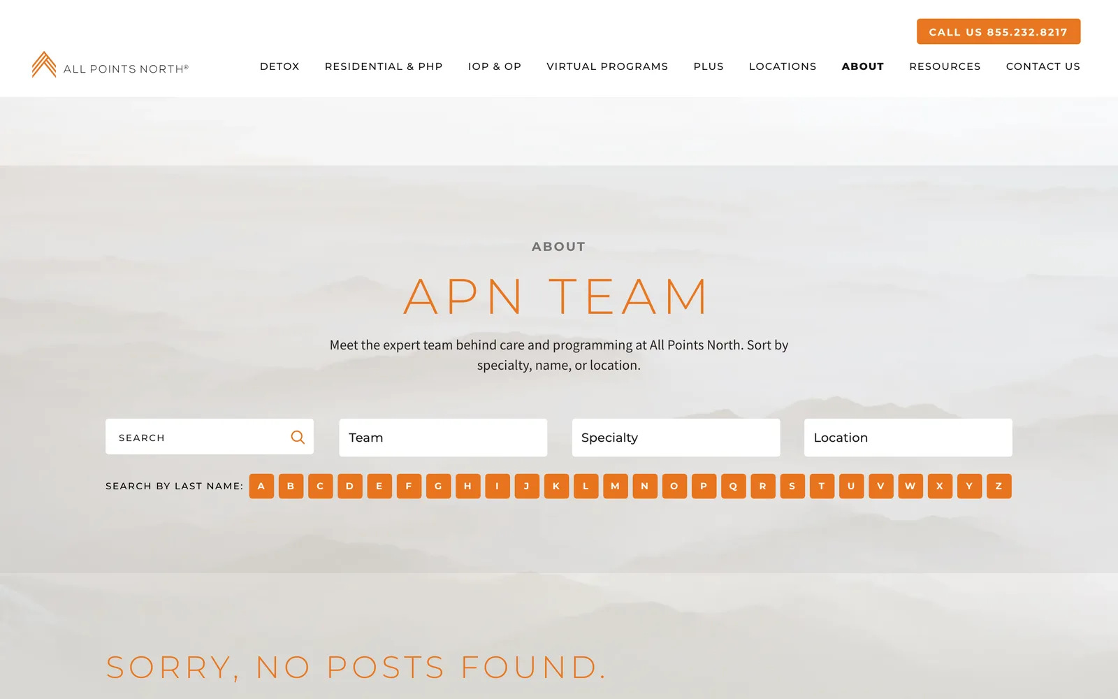
All Points North — view 1
All Points North — view 2
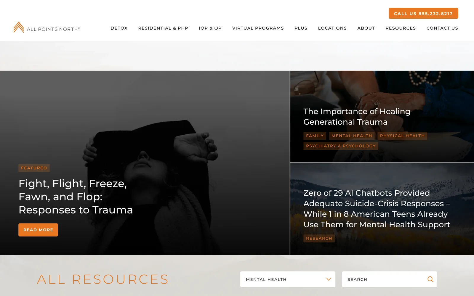
All Points North — view 3

Across recovery, the team, the trust signals.

We did EXTENSIVE research and interviewed multiple companies before ultimately choosing Nick. I am so glad we did as he is incredibly professional, extremely talented, and became an extension of our marketing team. He presented a beautiful concept and worked extensively (and very patiently) with our team as we tweaked details to bring our exact vision to life. I've been blown away by his balance of accommodation and informative approach as he worked with us to evolve our business. The new website is beautiful and purposeful and I would highly recommend Nick for web design for small, mid-size, and large businesses.
Anna Mason Director of Marketing, APN Health Center
04 / The Outcome

Where it landed.

The new site launched and All Points North has been running on it as the foundation of their marketing presence. The clinic continues to serve a global clientele, the marketing team continues to publish across a thousand-plus pages without designer support, and the search footprint that was carrying revenue before launch carried forward without a dip.

Anna describes the engagement in terms of how the team showed up: "became an extension of our marketing team… beautiful and purposeful… I would highly recommend Nick." That's the outcome that matters most for a healthcare project at this scale. The site is treated as load-bearing infrastructure for the business, not as a one-off marketing artifact.

The interface feels like the place. The navigation makes sense to a phone-first visitor in a hard moment. The publishing tools let the team move fast without breaking the design system. And the team Anna and I built that working relationship with continues to evolve the brand on top of the foundation we shipped together.

The Role
Digital Branding User Experience Design Site Structure & Navigation Responsive Website Design Art Direction & Consulting

Ready for your own case study?

Drop your URL. Nick will audit your site personally and build a live preview you can click through before you pay a dollar.

or write directly

Free, weekly

Site teardowns for home-service owners.

One real home-service site, broken down each week. What's leaking, what's working, the one fix that would matter most. Sent Mondays. Built for operators, not designers.

Built for home-service operators. Unsubscribe in one click.

See your free rebuild

No pressure. No upfront payment.