Skip to content
BurksUP Design

Case № 04

Real surgery.

A complete user experience and visual overhaul for Toronto's most respected plastic surgery clinic, including a custom WordPress build, a payment gateway, and the mobile experience the clinic had never had before.

Client The Plastic Surgery Clinic
Industry Healthcare & Wellness
Role User Experience Design, Responsive Website Design
Live at www.theplasticsurgeryclinic.ca
The Plastic Surgery Clinic hero
In short

Plastic surgery clinic website agency.

The Plastic Surgery Clinic is Toronto's most notable plastic surgery group. Their search optimization partner recommended me for the rebuild after years of working with their previous agency hadn't kept the site current. Marketing Director Elizabeth Lista brought me in to design and develop a complete digital rebrand and technical overhaul of an aging website that was carrying real revenue but no longer matched the calibre of the clinic.

I led the user experience overhaul, the new visual direction, the responsive site (the clinic's first real mobile experience), the custom WordPress build, the e-commerce payment gateway for prepayment of procedures, and a search optimization plan executed alongside the clinic's existing search partner. Anchor sub-navigation handles long procedure pages, custom backend tools manage the dynamic content the clinic publishes weekly, and a custom canonical URL function in WordPress mitigates duplicate content automatically.

This case study walks through how the rebuild was planned, what shifted in the user experience, and why the new site has held up as the clinic continues to grow.

20+
Custom layouts managed in WordPress
Secure
Payment gateway online prepayment for procedures
Anchor
Sub-navigation long procedure pages
First
Mobile experience designed before desktop
01 / The Problem

What was broken.

The Plastic Surgery Clinic had earned years of search authority through a deep library of in-depth procedure articles, photo galleries, and video. The site was carrying real revenue, but it was tired, mobile was an afterthought, and the navigation no longer matched how patients were actually arriving and converting.

Elizabeth and her team had three things they needed from the rebuild. The visitor experience had to feel as confident and considered as the in-clinic experience, not like a brochure printed in another era. The mobile experience had to exist (the original site barely had one) because the audience had moved to phones and the conversion data showed it. And the search investment underneath the site had to be protected through the entire migration, not gambled with.

There was also an e-commerce ambition. The clinic wanted to move toward letting patients prepay for procedures online, which meant a secure payment gateway integrated into the checkout, not a bolted-on shopping cart. And there was a structural duplicate-content issue the search partner had flagged, where the same procedure topic was appearing across procedure pages, blog articles, events, and gallery posts. Both issues needed to be solved in the rebuild.


02 / The Approach

How it got fixed.

I started in the analytics with full access to the clinic's site data and the search partner's reporting. The goal was to understand who was arriving, what device they were on, what convinced them, and where they bounced. From there I worked backward into a new sitemap that organized everything around the way patients actually move toward booking a free consultation.

With Elizabeth's team and the clinic's search partner, I ran working sessions on the visual direction. The new interface kept the clinical credibility the original had earned but introduced a bold color palette and stronger photography so the brand commands attention even at a glance. Every long procedure page got an embedded anchor sub-navigation so visitors can navigate dense content without scrolling fatigue, with supporting video, photo galleries, and graphics broken in throughout to handle the depth of content the search partner needed without inundating the reader.

The site was rebuilt on a fully custom WordPress backend with a secure e-commerce payment gateway integrated into the checkout, a custom canonical URL function that mitigates duplicate content automatically, and a CRM and live-chat integration so the clinic's marketing operations run inline with the website. The mobile experience, the clinic's first real one, got designed first so the desktop inherited from it.

01

Analytics-led discovery with the search partner

I went deep into the existing analytics with Elizabeth's team and the clinic's search optimization partner to understand who was arriving, on what device, and what convinced them. The output was a one-page personas-and-conversions brief every downstream decision tied back to.

02

Site structure rebuild around conversion

I rebuilt the sitemap to address user drop-offs and surface content that had been buried under the previous navigation. Every page was placed to move a visitor toward the primary conversion (request information or book a free consultation) without making them work for it.

03

Bold user interface with anchor sub-navigation

I designed a confident interface anchored on a bold color palette and strong photography. Every long procedure page got an embedded anchor sub-navigation so visitors can navigate dense content without scrolling fatigue, with video and gallery breaks integrated through.

04

Mobile-first responsive design

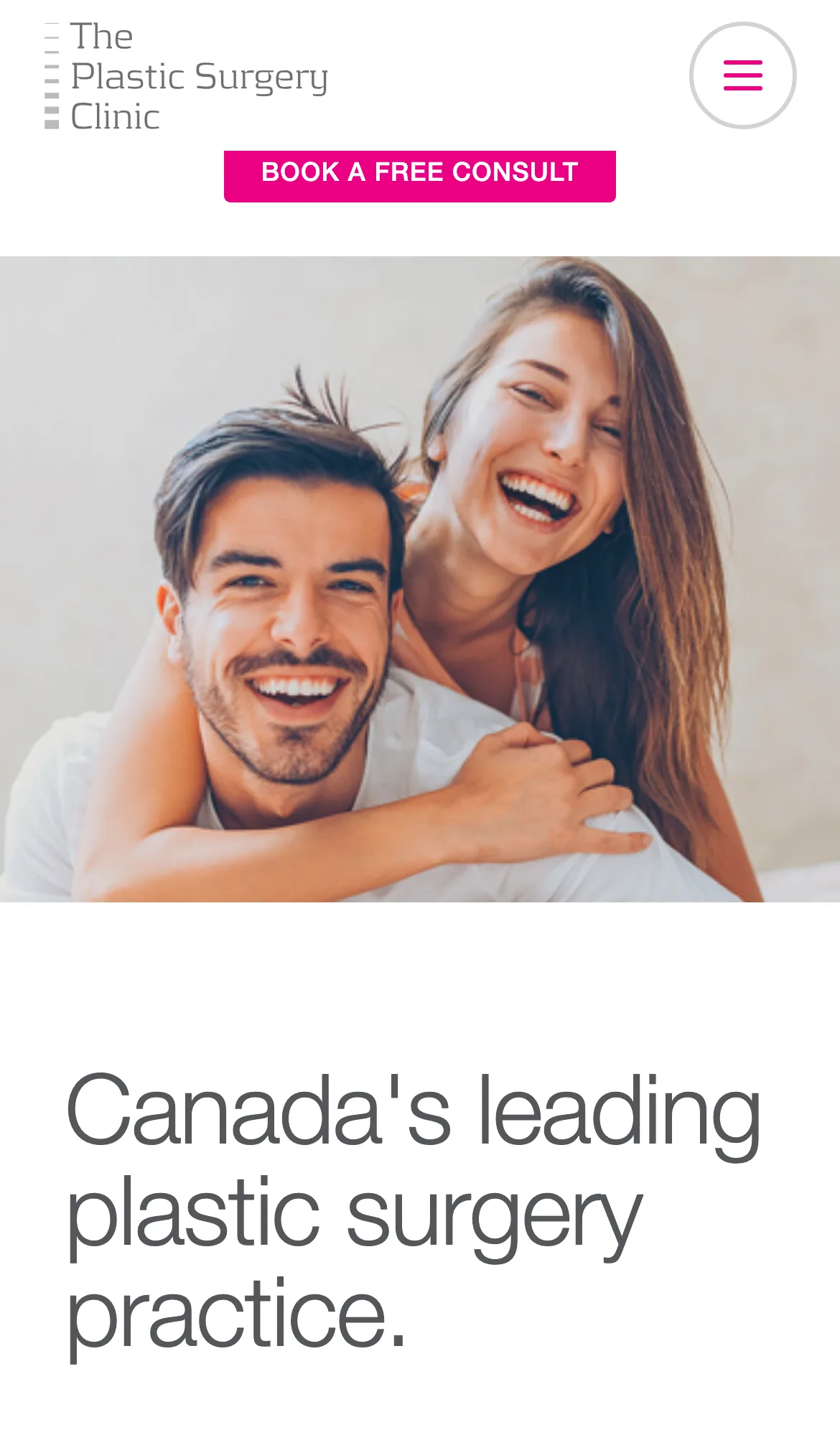
I designed the mobile experience first because the clinic had never had one and the audience had moved to phones. The desktop experience inherited the same flow rather than the other way around.

05

Custom WordPress build with payment gateway

I developed a fully custom WordPress backend with a secure e-commerce payment gateway for procedure prepayment, a custom canonical URL function that mitigates duplicate content automatically, and a CRM and live-chat integration so marketing operations run inline.

How it shipped

The work, step by step.

01

Plastic surgery clinic website agency that protects existing search equity

The clinic's search investment had been built up over years and was carrying real revenue. A redesign that lost rankings would cost the clinic. I worked alongside the search partner from the strategy phase forward, mapped every legacy URL to a destination on the new site, and shipped the new build with the existing search architecture preserved page by page. Rankings carried forward through launch.

02

User experience design for long procedure pages

Plastic surgery procedure pages are inherently long because patients researching a surgery want depth. The challenge was presenting that depth without inundating the reader. I designed an embedded anchor sub-navigation so the table of contents stays with the visitor as they scroll, broke the page into reasonable sections with supporting video and photo galleries integrated through, and laid out the content so a visitor can scan the procedure and a visitor can read deep on it from the same page.

03

Mobile-first responsive design for a clinic audience

Until the rebuild, the clinic had effectively no mobile experience. The audience had moved to phones, and the conversion data was clear that visitors were starting on one device and finishing on another. I designed the mobile interface first with tap targets, line lengths, and form fields tuned for one-handed phone use, and shared touchscreen prototypes with Elizabeth's team in a cloud-based prototyping tool so every stakeholder could feel the new experience in context.

04

Custom WordPress build with payment gateway and duplicate-content fix

The clinic wanted patients to be able to prepay for procedures online, which meant a secure e-commerce payment gateway integrated into the checkout. The clinic's search partner had also flagged a duplicate-content issue across procedures, blog, events, and galleries. I built a custom canonical URL function in WordPress that automatically writes the appropriate canonical link based on the content type, so duplicate-content concerns get mitigated without any effort from the website administrator.

05

Search optimization in partnership with the clinic's search expert

I worked side-by-side with the clinic's search optimization partner from strategy through launch. We agreed early that bespoke design and in-depth content can coexist, that visitor experience and search performance are not competing priorities, and that the rebuild had to deliver both. The result was a new site that reads cleanly to visitors and to search engines, with the existing search footprint preserved and a CRM and live-chat integration that lets the marketing team operate inline with the new site.

The Work, Specifically

What I actually shipped.

Not a services list. The real work streams, in the order I ran them.

  1. № 01

    Discovery with the search partner

    I went deep into the analytics and search-console data with Elizabeth's team and the clinic's search optimization partner. The output was a one-page personas-and-conversions brief every design decision tied back to.

  2. № 02

    Site structure and wireframes

    I rebuilt the sitemap to surface buried content and address user drop-offs, then produced touchscreen prototypes in a cloud-based prototyping tool so every stakeholder could click through before any creative design started.

  3. № 03

    User interface design with anchor sub-navigation

    I designed a confident interface anchored on a bold color palette and strong photography. Every long procedure page got an embedded anchor sub-navigation, with video and gallery breaks integrated through.

  4. № 04

    Mobile-first responsive design

    I designed the mobile experience first because the audience had moved to phones, and shared touchscreen prototypes with Elizabeth's team in full context before development.

  5. № 05

    Custom WordPress build with payment gateway

    I developed a fully custom WordPress backend with a secure e-commerce payment gateway for procedure prepayment, a custom canonical URL function that mitigates duplicate content automatically, and a CRM and live-chat integration.

  6. № 06

    Search preservation, hosting, and training

    I mapped every legacy URL to a destination on the new site, staged on managed WordPress hosting for soft-launch, and walked Elizabeth's team through a recorded session on the publishing tool and search best practices.

03 / The Work

What shipped.

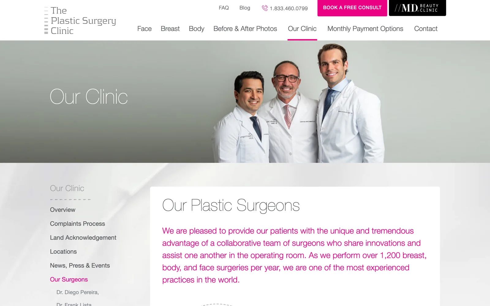
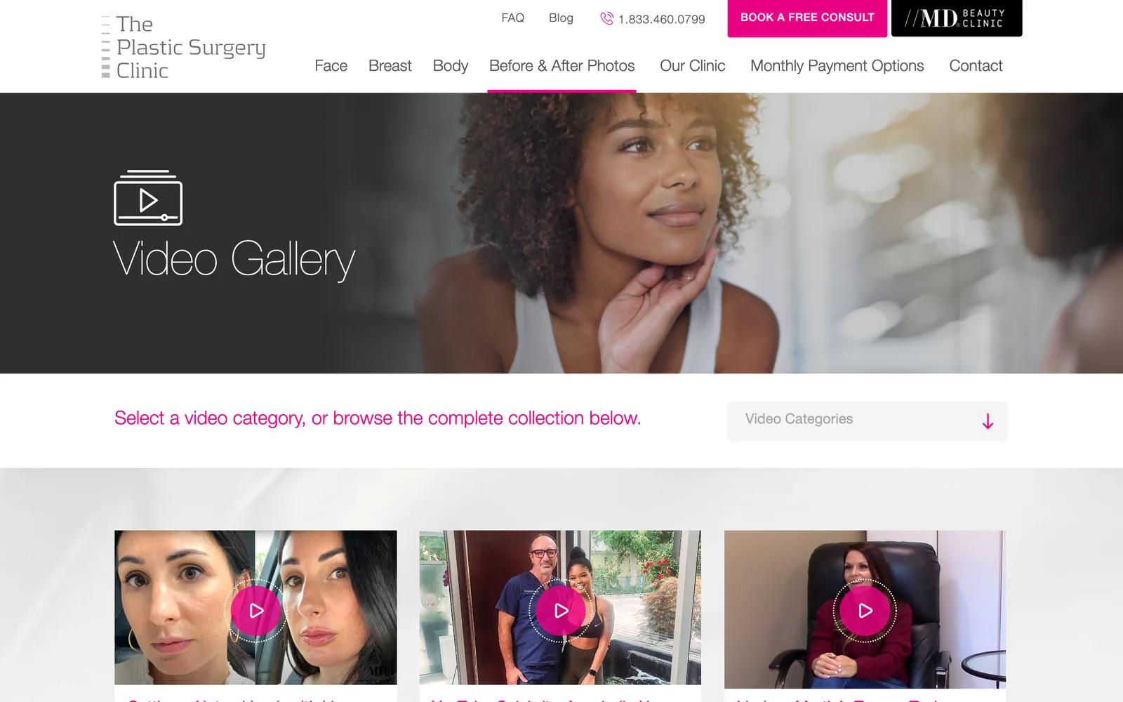
The Plastic Surgery Clinic experience, in the browser.

The Plastic Surgery Clinic experience, in the browser.

The Plastic Surgery Clinic, Anchor sub-navigation handles dense procedure content. (desktop)
The Plastic Surgery Clinic, Anchor sub-navigation handles dense procedure content. (mobile)

Anchor sub-navigation handles dense procedure content.

The Plastic Surgery Clinic The Plastic Surgery Clinic

Across the procedures, the surgeons, the outcomes.

Nick is hands down the best web designer I have ever worked with. Nick is enormously thorough and attentive. He is a big picture thinker but also incredible at managing the complex, itty bitty details of a project. He clearly has an amazing team of people working with him, everyone is just ON IT. I would highly recommend Nick for anyone looking to take on a web development project.
Elizabeth Lista Director of Marketing, The Plastic Surgery Clinic
04 / The Outcome

Where it landed.

The new site launched on managed WordPress hosting and The Plastic Surgery Clinic has been running on it as the foundation of their digital presence. The clinic continues to grow, the search footprint that was carrying revenue before launch carried forward through the migration, and the mobile experience that didn't exist before launch now handles the bulk of the inbound traffic.

Elizabeth describes the engagement in clear terms: "Nick is hands down the best web designer I have ever worked with… a big picture thinker but also incredible at managing the complex, itty bitty details… I would highly recommend Nick for anyone looking to take on a web development project." That's the outcome that matters most for a project at this calibre. The site is treated as load-bearing infrastructure for the clinic, not as a one-off marketing artifact.

The interface commands attention. The anchor sub-navigation handles the depth of content the search partner needs without making visitors work for it. The payment gateway lets patients prepay for procedures online. And the canonical URL function quietly solves the duplicate-content issue every time a new procedure page or blog article gets published.

The Role
User Experience Design Responsive Website Design Art Direction & Consulting Search Engine Optimization

Ready for your own case study?

Drop your URL. Nick will audit your site personally and build a live preview you can click through before you pay a dollar.

or write directly

Free, weekly

Site teardowns for home-service owners.

One real home-service site, broken down each week. What's leaking, what's working, the one fix that would matter most. Sent Mondays. Built for operators, not designers.

Built for home-service operators. Unsubscribe in one click.

See your free rebuild

No pressure. No upfront payment.