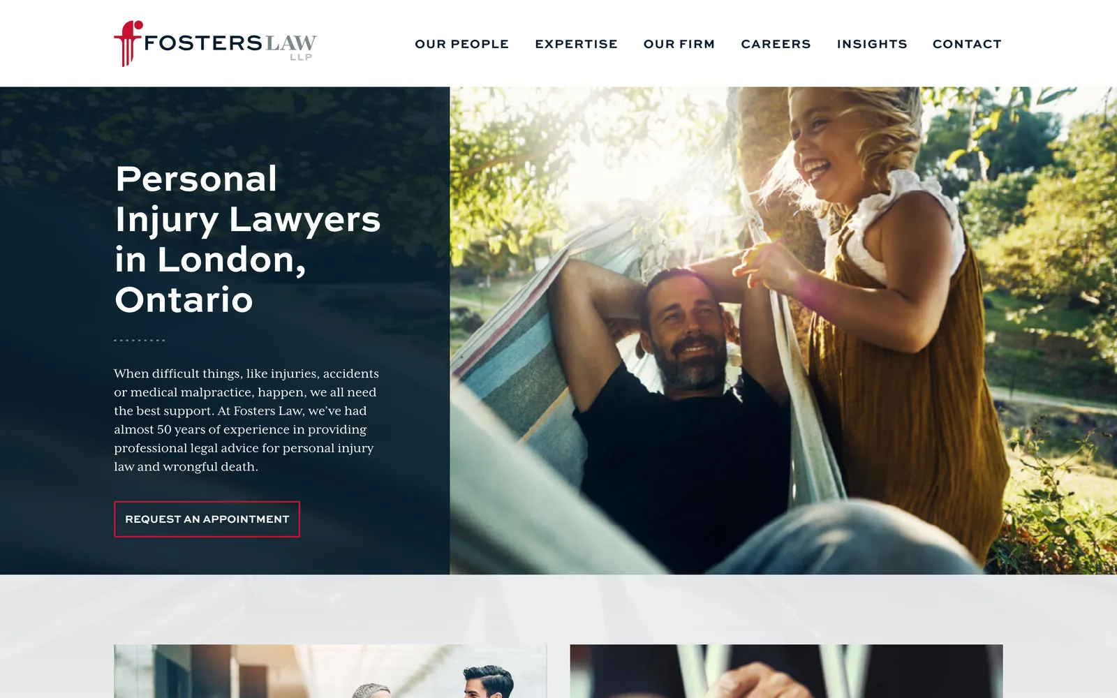
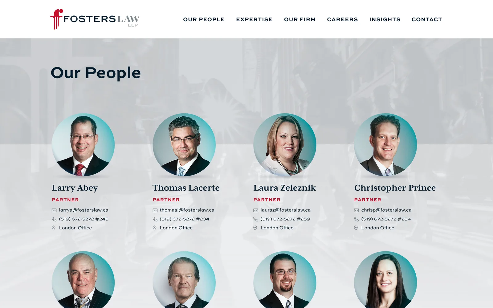
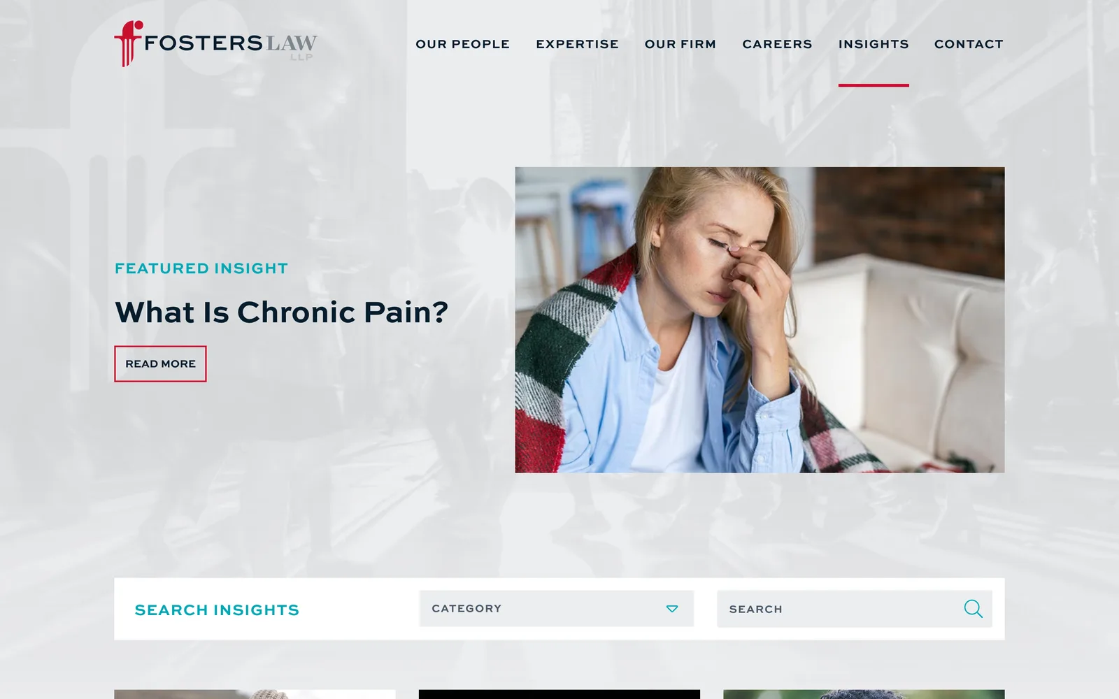
I started where the previous engagements ended. Six years of marketing materials, a decade of search data, conversion patterns from the old forms, and direct knowledge of how the firm communicates with clients. The strategy work that usually takes weeks was already done, which let me get into design quickly without skipping diligence. The kickoff was a working session with the partners and the firm administrator covering brand evolution direction, the new firm name positioning, and the architectural decisions that the new website would need to support.
The identity work came first because every other deliverable inherits from it. I simplified the existing logo into a contemporary wordmark that kept the silhouette people recognized in London and Toronto. The color palette got pulled back into a more professional foundation, slightly desaturated, so the new website design had room to breathe and the brand could carry into print, signage, and advertising without re-inventing itself for each channel. I locked the typographic system at the same time, with a primary serif for legal authority paired with a clean sans for navigation and supporting copy.
With the new logo locked, I rebuilt the navigation and the page architecture from scratch. The new sitemap centers on the legal team and the practice areas, with calls-to-action and contact paths surfaced on every page. I built modules that give visitors who are not yet ready to call a way to keep reading and self-qualify, and modules that give visitors who are ready a single tap to a lawyer. I also designed an internal job board so the firm can post openings and intake applications without involving me each time. The whole site was prototyped in an interactive tool so the partners could click through the experience in a real browser context before any visual design was finalized, which kept the creative phase efficient and the partner review schedule realistic.