I had nearly a decade of working knowledge of Stern Cohen heading into the rebuild. The audience, the personality, the search positions, the analytics history, and the firm's actual differentiators were all known quantities. That history let the strategy work move fast and made the design decisions defensible without re-litigating fundamentals. The kickoff was a focused strategy meeting with Julie James and the partners covering the brief, the brand evolution direction, and the measurable goals the rebuild needed to support.
The identity refresh came first. I made careful adjustments to the logo and pulled the corporate color palette in a direction that allowed for more personality and emotion in the brand without losing the existing recognition. Within a week, we had a stronger contemporary mark that gave the new website room to breathe. The typographic system got refreshed alongside the mark so the new website, the firm's print collateral, and the digital advertising could all carry the same visual posture without any single channel pulling against the others.
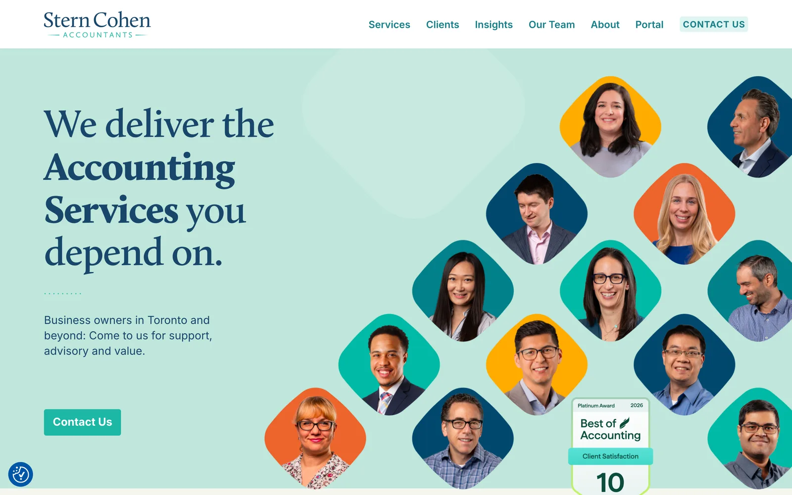
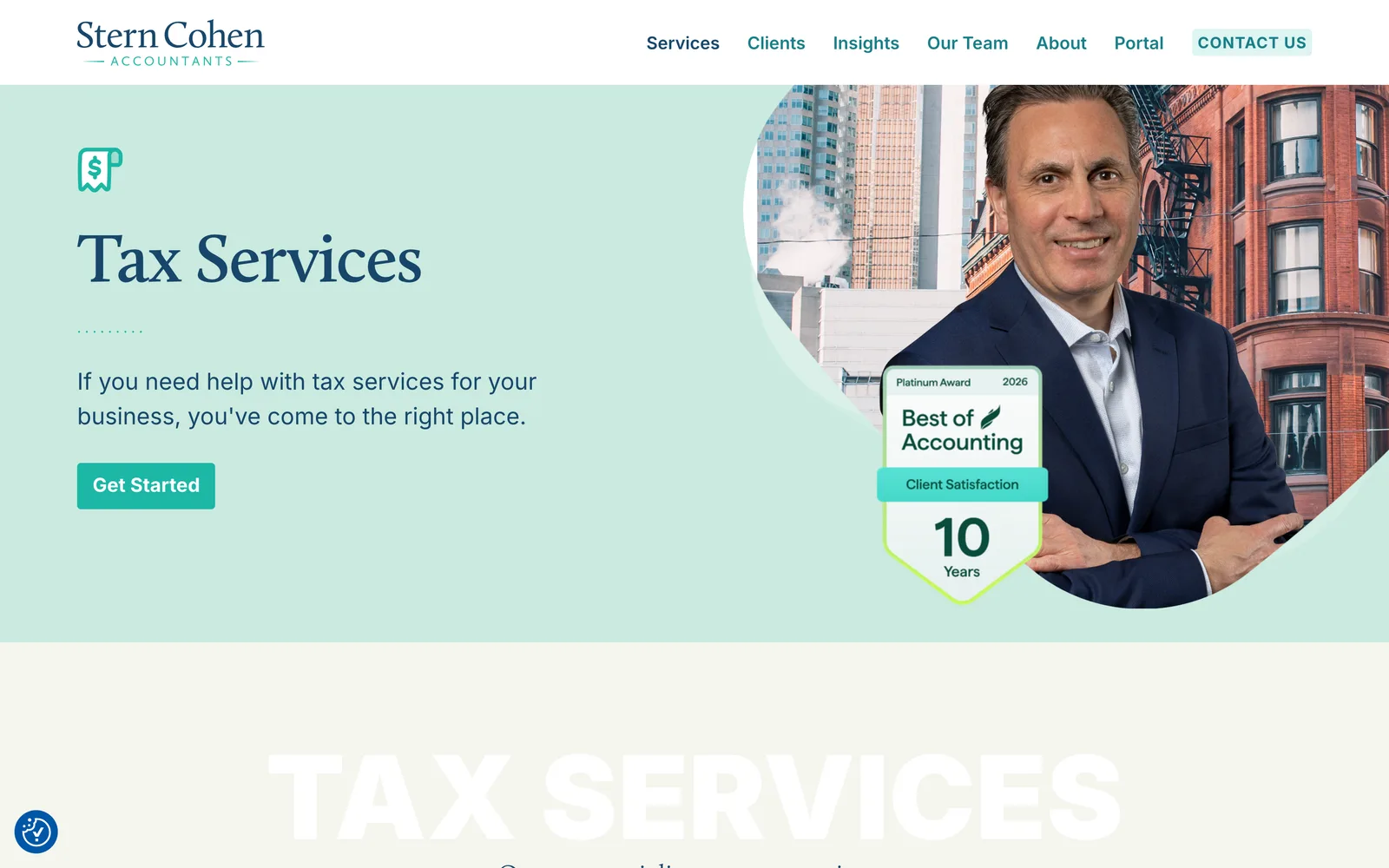
From there I rebuilt the user interface around the firm's culture. Stern Cohen is genuinely playful in person and that did not come through in the previous site. The new interface centers the team, their stories, and their contact details (including downloadable v-cards), keeps a calming visual tone that suits a financial relationship, and surfaces the careers section as a first-class page so the firm can post openings the moment they need to. The publishing tool was rebuilt as a custom WordPress install with marketing-team automations and a secure client portal that lives behind authentication for tax document delivery. The search optimization strategy was wired into the templates and the metadata system so every new page the team publishes inherits the firm's strategic positioning automatically.