Skip to content
BurksUP Design

Case № 07

Real loyalty.

Bond Brand Loyalty is a global loyalty and customer engagement consulting agency working with many of the world's most established brands. I migrated them off Squarespace onto a custom WordPress platform, rebuilt the digital brand language, and engineered the publishing tool to support the scale and pace of an enterprise consulting practice.

Client Bond Brand Loyalty
Industry Professional Services
Role Branding Strategy, User Experience Design
Live at bondbl.com
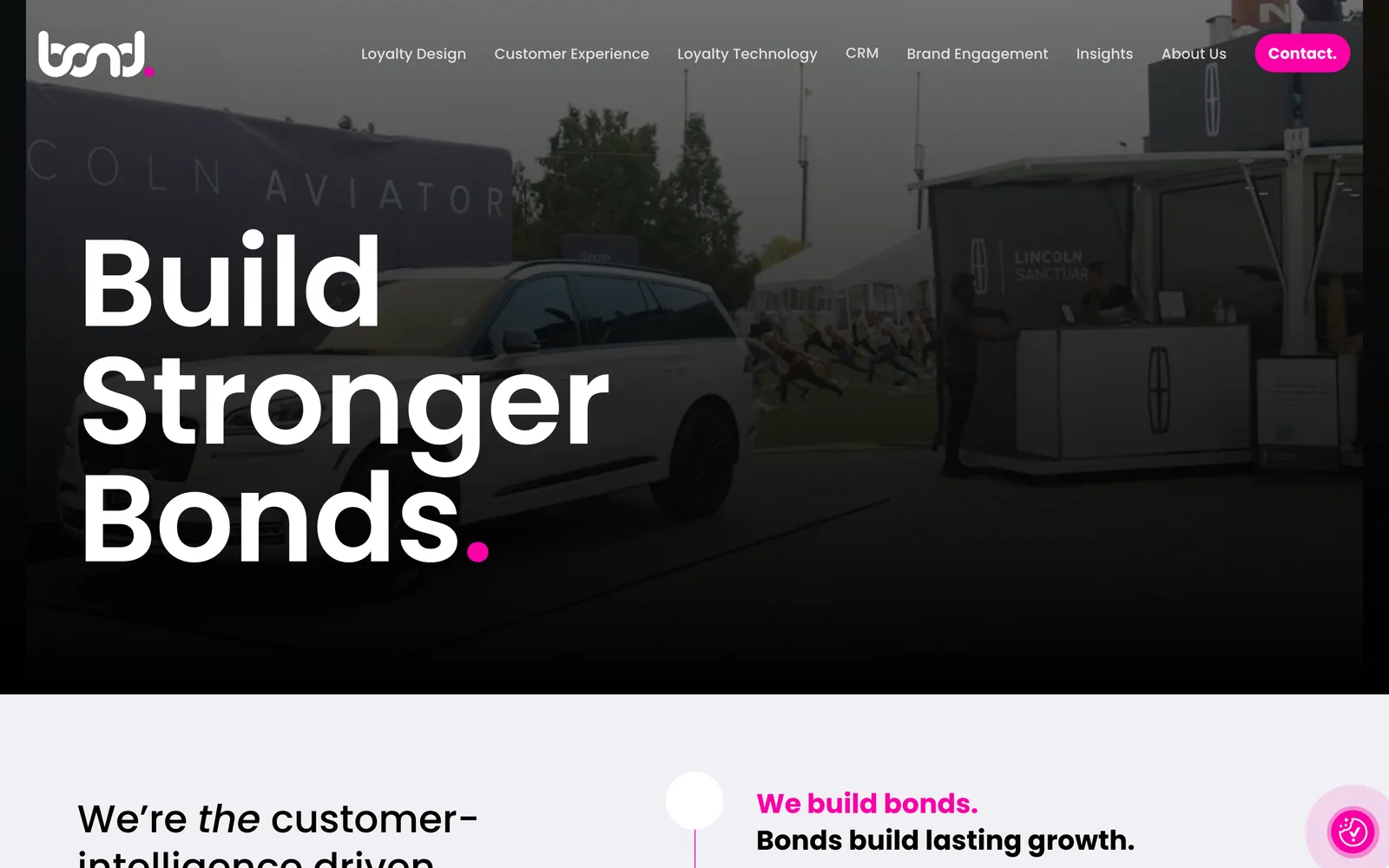
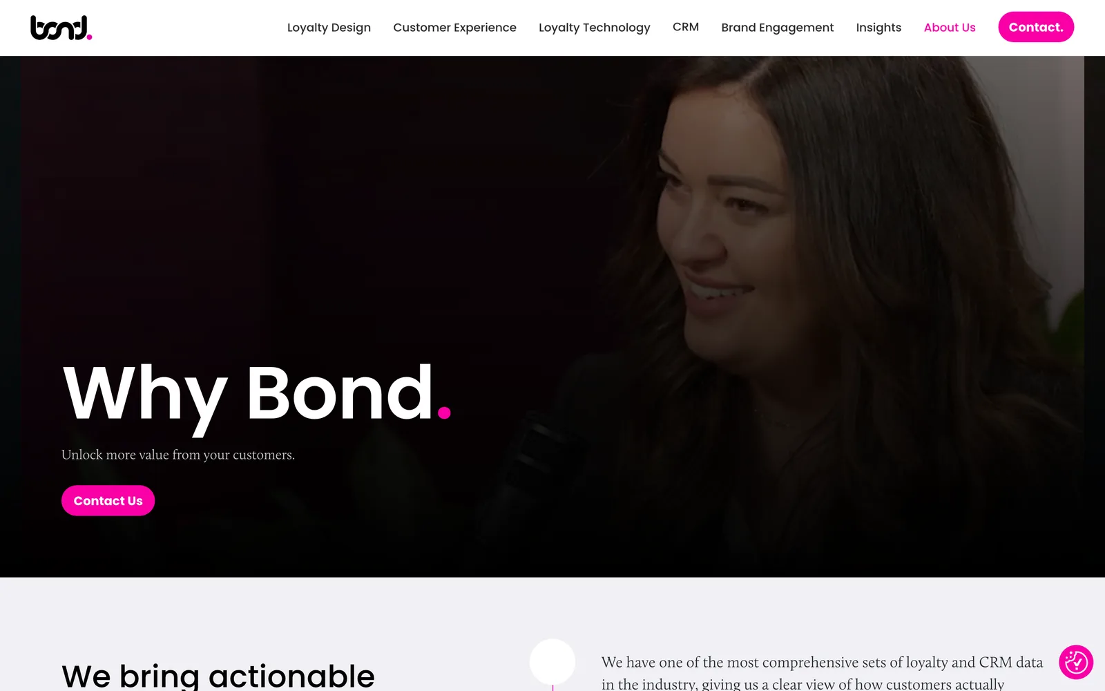
Bond Brand Loyalty hero
In short

Consulting agency website design.

Bond Brand Loyalty is a global loyalty and customer engagement consulting firm that works with many of the world's most established brands. The business had outgrown its previous website. The offering had expanded, the strategic depth had increased, and the global reach had grown, but the digital experience still read like an earlier version of the company.

I led the rebuild from the ground up. A custom WordPress platform replacing Squarespace, an information architecture overhaul across services, insights, and case studies, a refined visual language that projects the seniority of an enterprise consulting practice, and a publishing tool engineered specifically for the way a modern marketing and editorial team actually works.

This is one of the most demanding categories of website to design well. Enterprise consulting buyers expect authority, precision, and proof. The site has to project leadership instantly without crossing into corporate sterility, and it has to scale across services, thought leadership, case studies, and reporting without the structure collapsing.

Custom
WordPress platform migrated from Squarespace
Three
Content areas services, insights, case studies
Modular
Component system from data tables to dashboards
Accessibility
Standards built in from the first commit
01 / The Problem

What was broken.

Bond had outgrown the previous site in three different ways at once. The brand presence undersold the actual scale and influence of the practice. Services were not clearly articulated and the structure flattened complex strategic depth into surface-level content. And the publishing tool (Squarespace) had become a constraint instead of a foundation. Layout flexibility was limited, content models were lacking, and the marketing team struggled to adapt pages as priorities shifted.

The brand language was the most expensive problem. For a firm defining a category in customer experience and loyalty, the website had to project confidence and authority on first look. The previous design lacked the precision and visual gravitas that a global consulting client expects. That gap was costing credibility in the moments that matter most: the first time a prospect lands on the site, the first time a procurement team reviews the firm during a vendor selection, and the first time a journalist looks for a credible source on loyalty strategy.

The scale problem was just as serious. Bond produces a continuous stream of thought leadership, case studies, and the annual Bond Loyalty Report. The platform had to support that publishing cadence with content models that fit each format and structural support for the editorial workflow. The previous tool could not.

02 / The Approach

How it got fixed.

I started with a deep discovery phase aligned with Bond's business objectives, audience segments, and internal content workflow. The discovery covered every meaningful surface of the existing experience: a content audit across the website and supporting marketing materials, user journey mapping for each audience segment, and a structural review of the publishing workflow inside the marketing team. The output identified significant gaps in content structure, in the clarity of the brand's core messaging, and in the operational support the editorial team actually had from their previous platform.

The insights from discovery drove a fundamental refinement of the information architecture. I rebuilt the structure around three primary content areas (services, insights or thought leadership, and case studies as proof points) with the hierarchy designed to serve two distinct user behaviors. Fast scanning for visitors who need a quick read, and deep engagement for visitors who want to dig into the strategic substance. The architecture made every page reachable in two or three clicks regardless of entry point. Three core objectives guided every architectural decision: clarify Bond's story and offerings, extend the brand with confidence and consistency across channels, and build a system that empowers the marketing team to operate with autonomy.

The creative phase translated the brand into a more disciplined, modern, high-performing visual language. Typography became the primary tool for visual authority, with a typeface selected for stability and gravitas and a strict typographic hierarchy that gave dense data and statistical content room to breathe. Color was deployed with strict intention to reinforce hierarchy and direct attention to calls-to-action, never as decoration. A modular component system handled everything from data tables to reporting dashboards without the design fragmenting. Interaction design and motion were kept subtle and functional so transitions and micro-interactions reinforced polish without becoming gratuitous.

The development phase replaced Squarespace with a custom WordPress platform built specifically around Bond's editorial team. Granular block-level control over page composition, branded layouts that editors can build without touching code, and integrations with the firm's customer relationship system. Performance, accessibility standards, and search optimization were engineered into the architecture from the first commit, not added later. The editorial team gained the ability to run experiments, iterate on messaging, and ship new campaign content without filing tickets or waiting on developer support.

01

Discovery anchored in business objectives and editorial workflow

I aligned with Bond's strategic objectives, mapped the audience segments, and audited the existing content and editorial workflow. The output drove every architectural and creative decision downstream.

02

Information architecture rebuilt around three content areas

Services, insights, and case studies got reorganized into a structure that supports both fast scanning and deep engagement. The architecture makes every page reachable in two or three clicks regardless of entry point.

03

Disciplined visual language with typography as the lead

Typography carries the visual authority. Color is deployed with strict intention. Spacing and grid systems give dense data room to breathe. The result feels assured, modern, and unmistakably Bond.

04

Migration off Squarespace onto custom WordPress

I migrated Bond off the constraints of Squarespace onto a custom WordPress platform built specifically around the editorial team's workflow. Granular content control, branded layouts editors can build without code, and customer relationship integrations.

05

Performance, accessibility, and search built into the architecture

Page speed, accessibility standards, and search optimization were engineered into the platform from the first commit, not bolted on after launch. The site is built to perform and stay performant.

How it shipped

The work, step by step.

01

Consulting agency website design that projects authority on first look

Enterprise consulting buyers decide credibility in seconds. The site had to project the seniority of a global loyalty and engagement firm without crossing into corporate sterility. I made typography the primary tool for visual authority, used a tightly disciplined color system, and gave dense statistical content the spacing and hierarchy it needs to read as substantive rather than overwhelming. The first scroll establishes the practice's gravitas and the rest of the site sustains it.

02

Information architecture for services, insights, and case studies at scale

A consulting practice publishes a lot of substantive content. Services pages, industry pages, insights, white papers, the annual Bond Loyalty Report, and case studies. The architecture had to keep all of that scannable and findable. I rebuilt the structure around three primary content areas with cross-links between them so a services page surfaces relevant case studies, a case study surfaces the services it relied on, and an insight surfaces both. Every page is reachable in two or three clicks.

03

Migration from Squarespace to a custom WordPress platform

Squarespace had been adequate early on but became a constraint as Bond grew. Layout flexibility was limited, content models were lacking, and the editorial team could not adapt fast enough. I migrated the site to a custom WordPress platform with content models designed around the actual editorial workflow. Editors now build branded page layouts directly, control the order of content blocks, and apply visual emphasis without writing code or filing tickets.

04

Modular component system for data, dashboards, and reporting

Bond publishes data-heavy content including the annual Bond Loyalty Report. I engineered a modular component system that handles everything from dense data tables to dynamic reporting layouts without the visual system fragmenting. Pages feel tailored to their function but stay cohesive under the overarching brand. That balance is the design problem of an enterprise consulting site, and it is what the modular system solves.

05

Performance, accessibility standards, and search optimization built in

Page speed, accessibility standards, and search optimization went in at the architectural level. I tuned the platform for fast loads, structured the page metadata system around the firm's highest-value queries, built compliance into every component (keyboard navigation, contrast, alt text discipline, form labelling) and ran the site through a quality assurance pass against the same standards before launch. The result is a platform that performs on the day it ships and stays compliant as the editorial team adds content.

The Work, Specifically

What I actually shipped.

Not a services list. The real work streams, in the order I ran them.

  1. № 01

    Discovery and brand strategy

    Alignment with Bond's strategic objectives, audience segment mapping, content audit, user journey mapping, and a review of the editorial workflow. Output was the strategic plan that drove every downstream decision.

  2. № 02

    Information architecture and sitemap

    A new structure built around three primary content areas (services, insights, case studies) with cross-links between them and a hierarchy designed to support both fast scanning and deep engagement.

  3. № 03

    User experience and wireframe design

    Interactive wireframes covering each unique page template, presented in a prototyping tool so stakeholders could review structure in real browser context before any visual design started.

  4. № 04

    Visual system and creative interface design

    A disciplined design system with typography leading the visual authority, color deployed with strict intention, and a modular component system that handles dense data and reporting layouts without the design fragmenting.

  5. № 05

    Custom WordPress migration and platform build

    Migration off Squarespace onto a custom WordPress platform engineered around the editorial team's workflow. Granular content control, branded layouts editors can build without code, and customer relationship integrations.

  6. № 06

    Publishing tool training and post-launch support

    Recorded live training session covering the publishing tool and the search optimization framework, plus a 60-day complimentary aftercare period with monitoring, security updates, and performance and search health checks.

03 / The Work

What shipped.

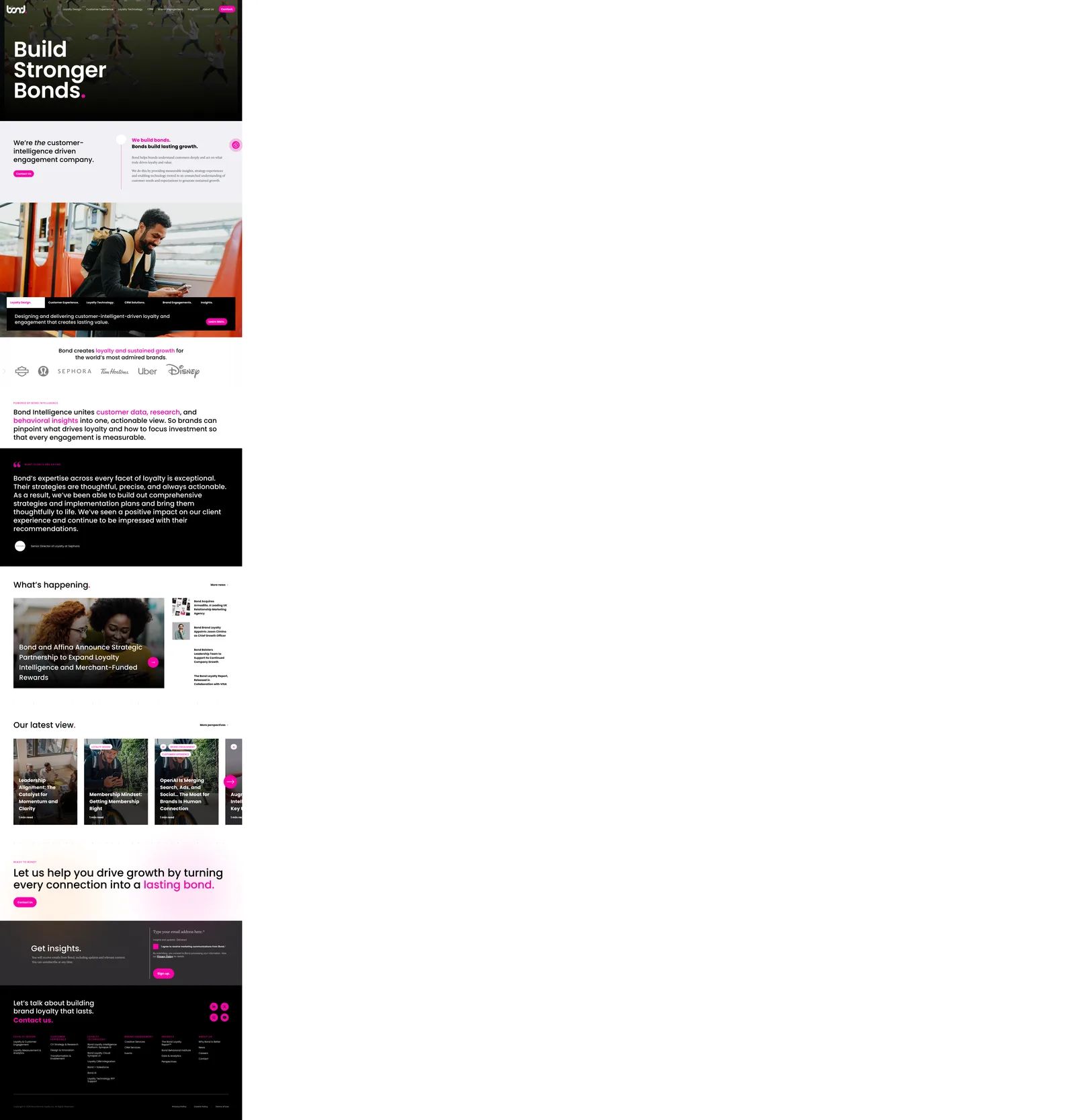
The Bond Brand Loyalty homepage, in the browser.

The Bond Brand Loyalty homepage, in the browser.

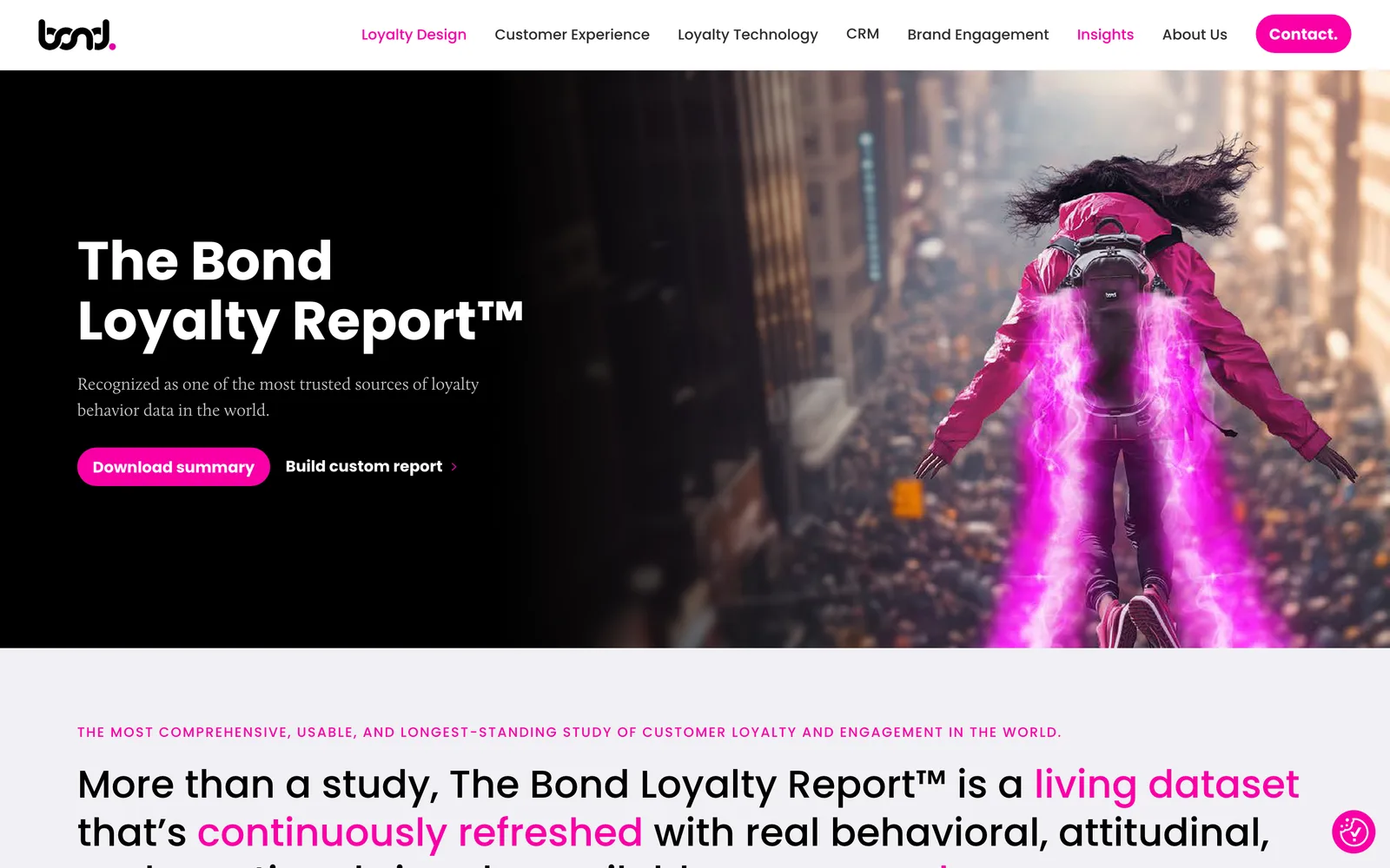
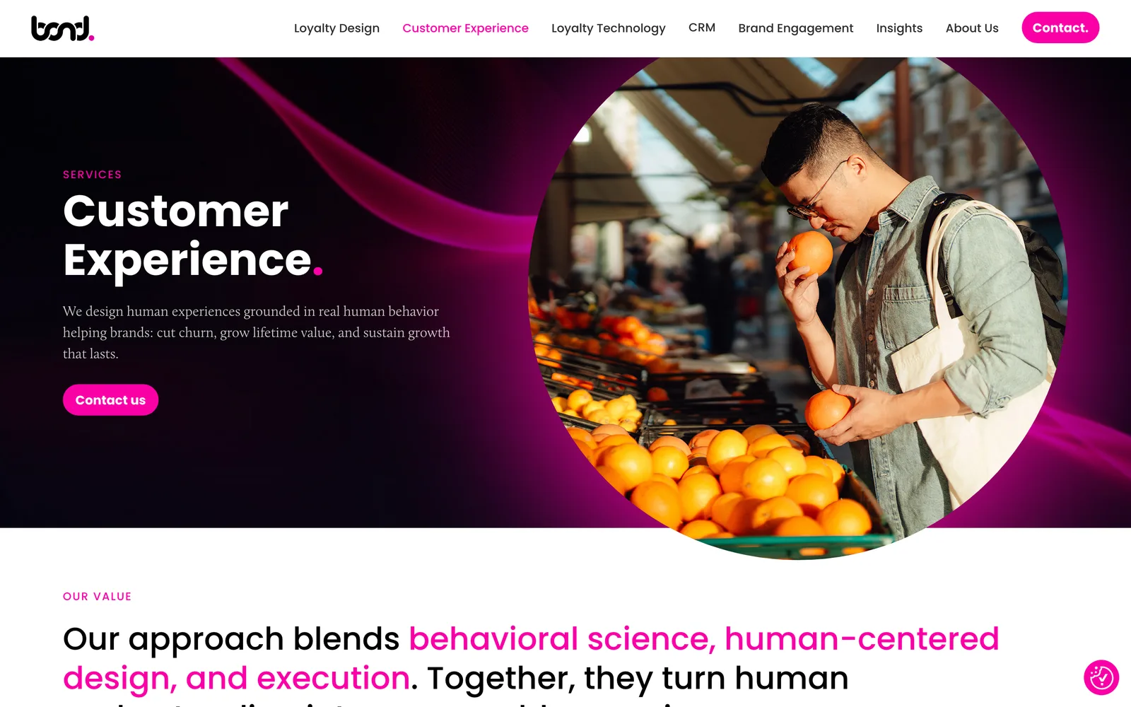
Bond Brand Loyalty, Typography as the lead, color used with strict intention. (desktop)
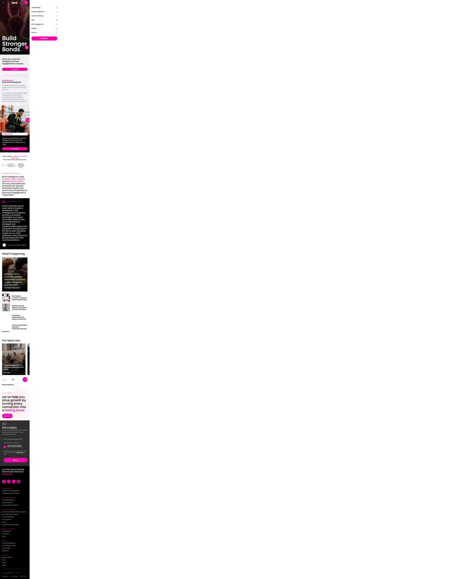
Bond Brand Loyalty, Typography as the lead, color used with strict intention. (mobile)

Typography as the lead, color used with strict intention.

Bond Brand Loyalty Bond Brand Loyalty

Card, account, story, all stitched together.

04 / The Outcome

Where it landed.

The new platform shipped and Bond now has a digital presence that matches the strength of their long-standing reputation. The brand language projects authority and precision on first look, the information architecture supports both fast scanning and deep engagement, and the publishing tool gives the marketing team meaningful autonomy. The visual system feels assured, modern, structurally sound, and unmistakably connected to the essence of the Bond brand, which is exactly the posture an enterprise consulting practice needs in front of high-value clientele.

The operational lift is just as material. Editors can build branded page layouts directly, adapt content as priorities shift, and run rapid experiments without filing tickets. The marketing and communications teams can respond to market changes at the pace the business actually moves. Customer relationship integrations connect the public site to the rest of the firm's go-to-market motion, so leads, content engagement, and downstream nurture flows all run on a single connected layer instead of disconnected systems.

The platform is engineered for the future. The architecture supports continued growth in services, insights, case studies, and the annual Bond Loyalty Report without structural rework. As Bond expands, the platform expands with it. The migration off Squarespace removed a long-standing constraint and replaced it with a foundation built to absorb the firm's next decade of growth and brand evolution without forcing another full rebuild.

The Role
Branding Strategy User Experience Design Information Architecture Responsive Website Design Custom WordPress Development Vector and User Interface Animation Customer Relationship Integration Search Optimization Accessibility Compliance

Ready for your own case study?

Drop your URL. Nick will audit your site personally and build a live preview you can click through before you pay a dollar.

or write directly

Free, weekly

Site teardowns for home-service owners.

One real home-service site, broken down each week. What's leaking, what's working, the one fix that would matter most. Sent Mondays. Built for operators, not designers.

Built for home-service operators. Unsubscribe in one click.

See your free rebuild

No pressure. No upfront payment.