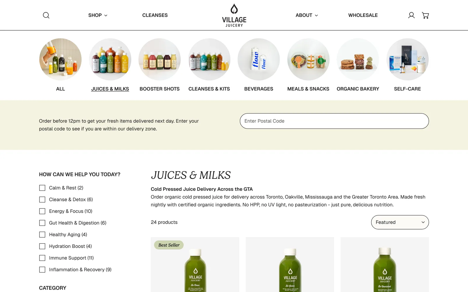
I started where I always start with food and beverage clients: at the buyer journey. How does someone find Village Juicery, what convinces them on the product page, what gets them to a second order. From there I worked backward into the brand system, the ecommerce architecture, and the packaging.
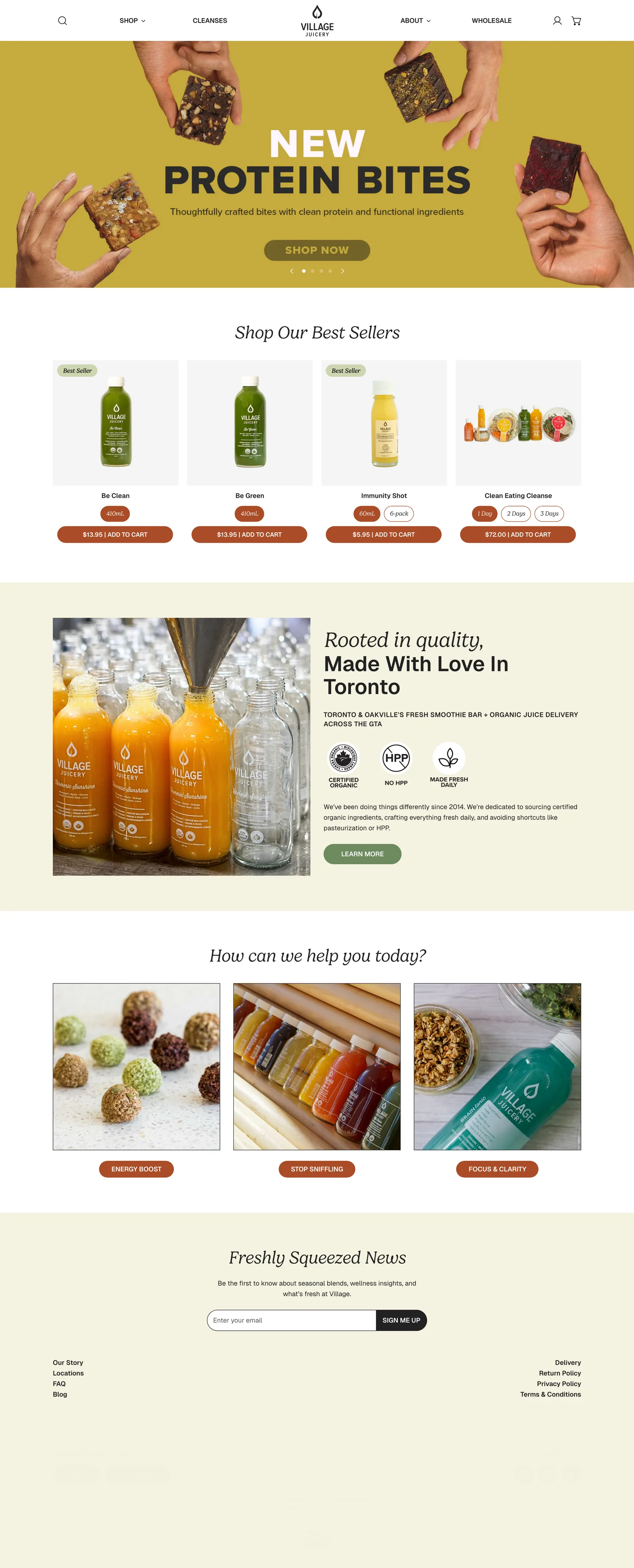
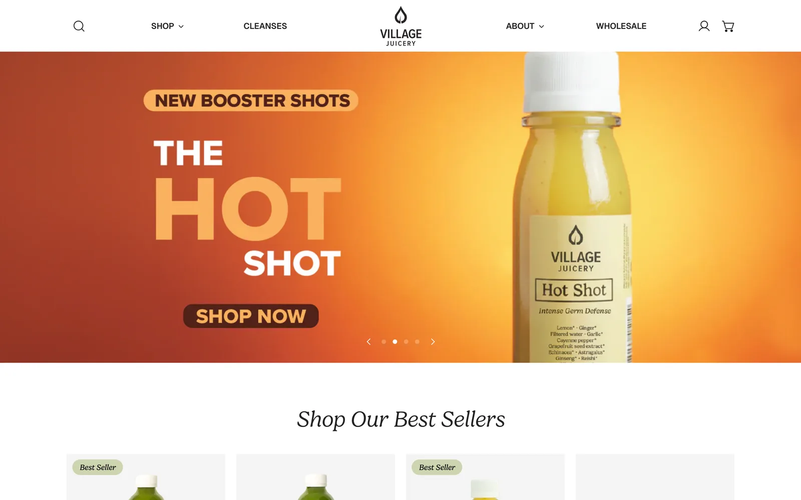
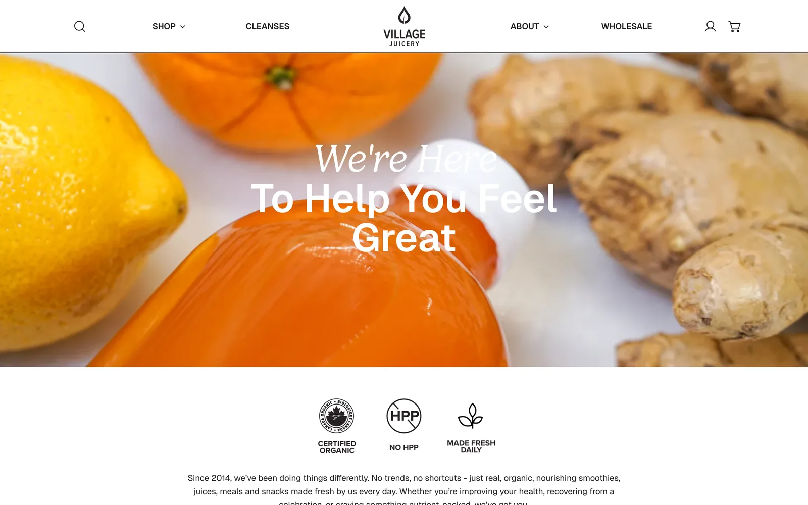
The brand identity refresh kept the original wordmark recognizable but tightened the type system, expanded the color palette to handle the broader product line (juices, milks, food, jars), and built out a photography direction that used the actual juice color as the primary visual anchor. No stock food photography. Every shot was custom, in-house, in the same lighting setup so the product line read as a single family.
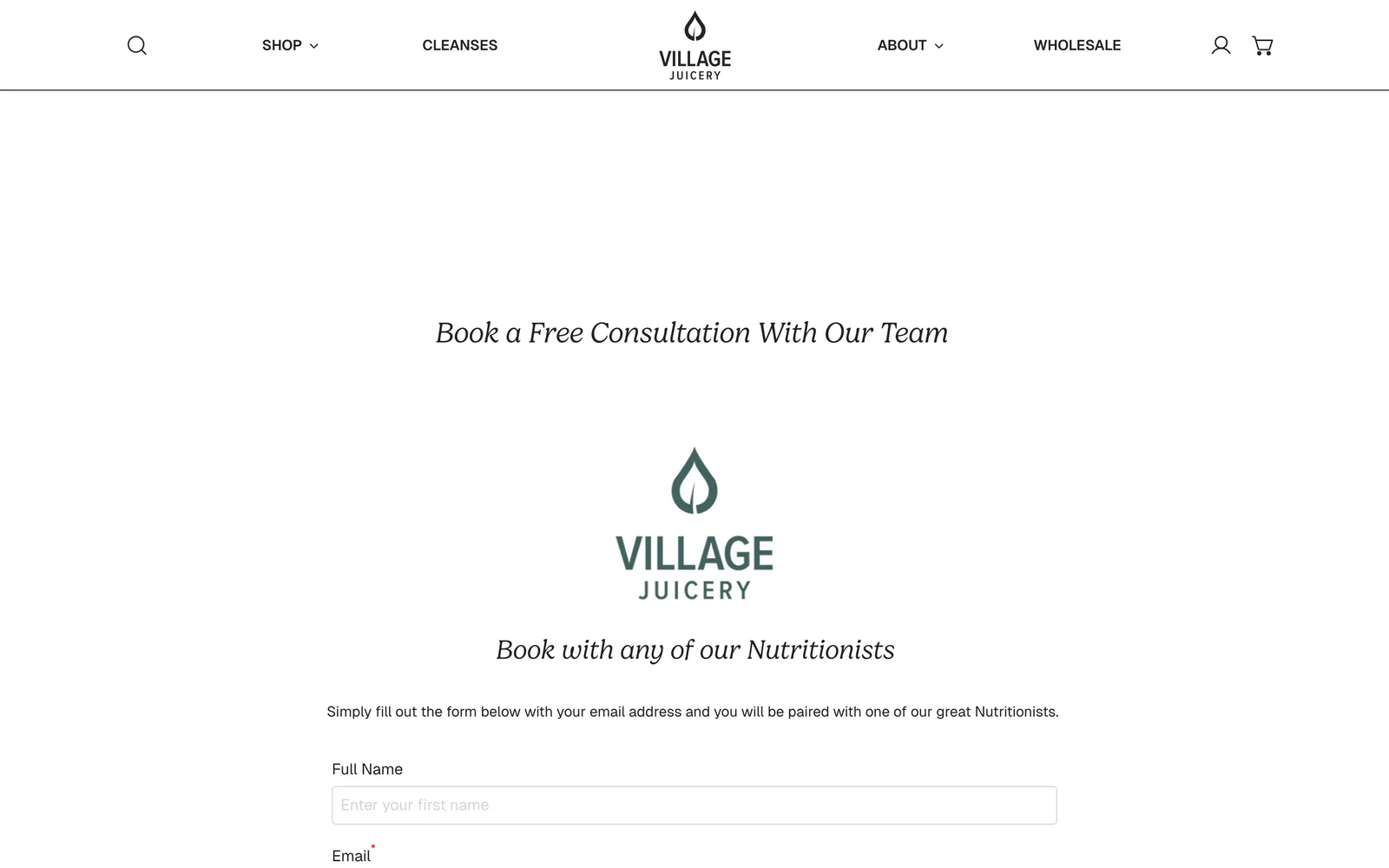
The site was rebuilt in WordPress with a custom template system, a dynamic store locator integrated with Google Maps so customers could find the nearest of the four stores, and a third-party scheduling integration that lets visitors book a nutrition consultation directly from the page. The blog was rebuilt as Education, repositioning Village Juicery as the source customers turn to when they want to understand cold-pressed juice and nutrition, not just when they want to buy a bottle.