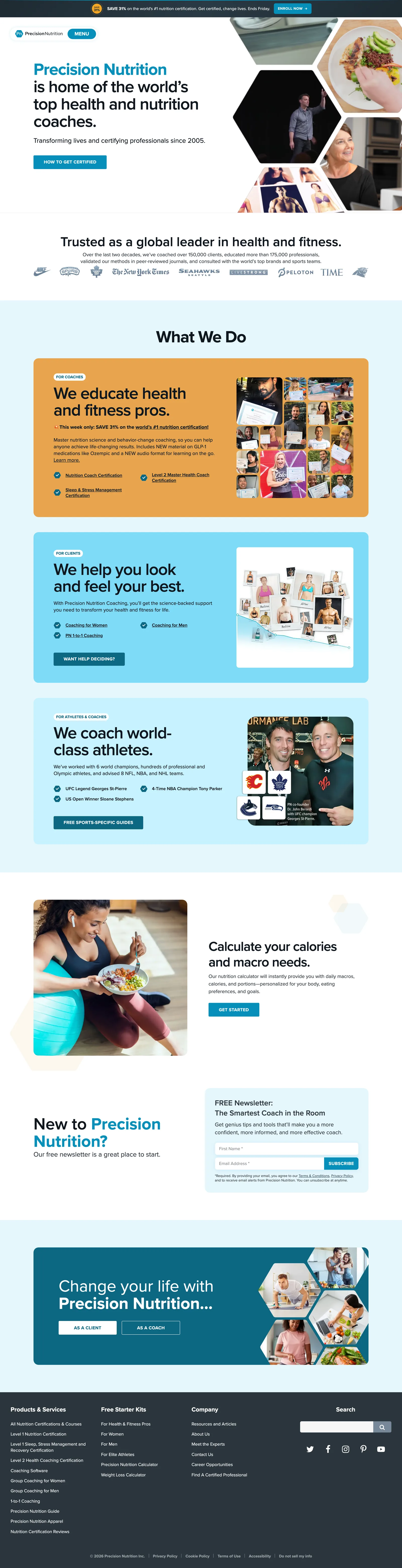
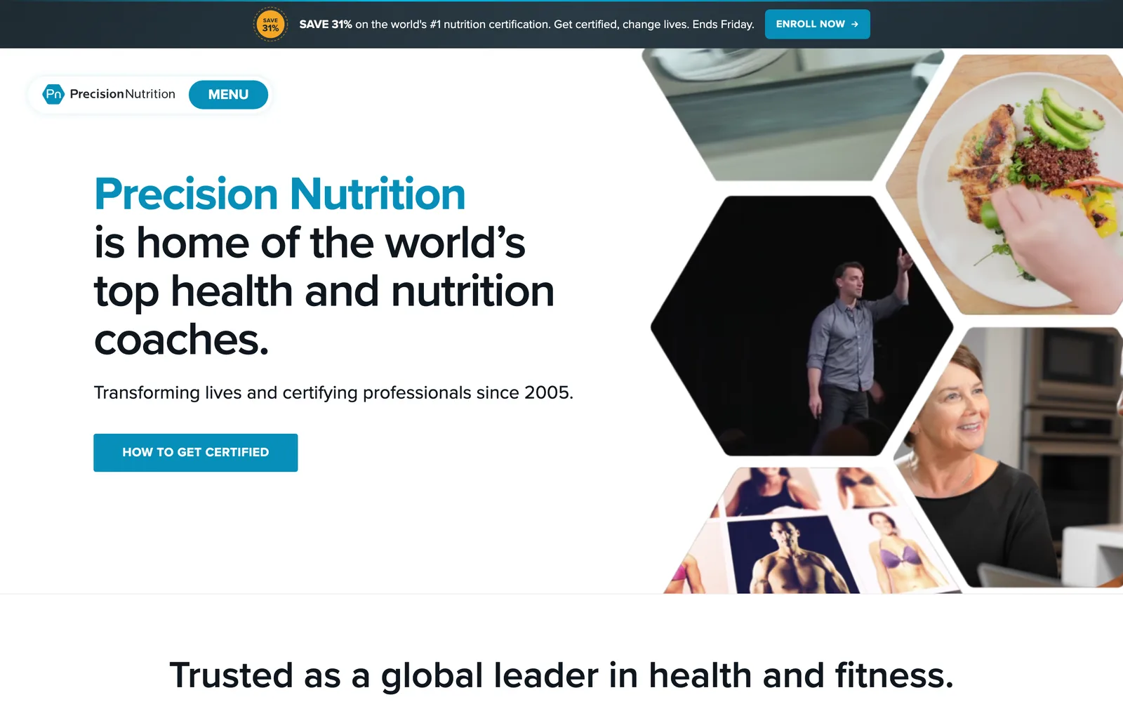
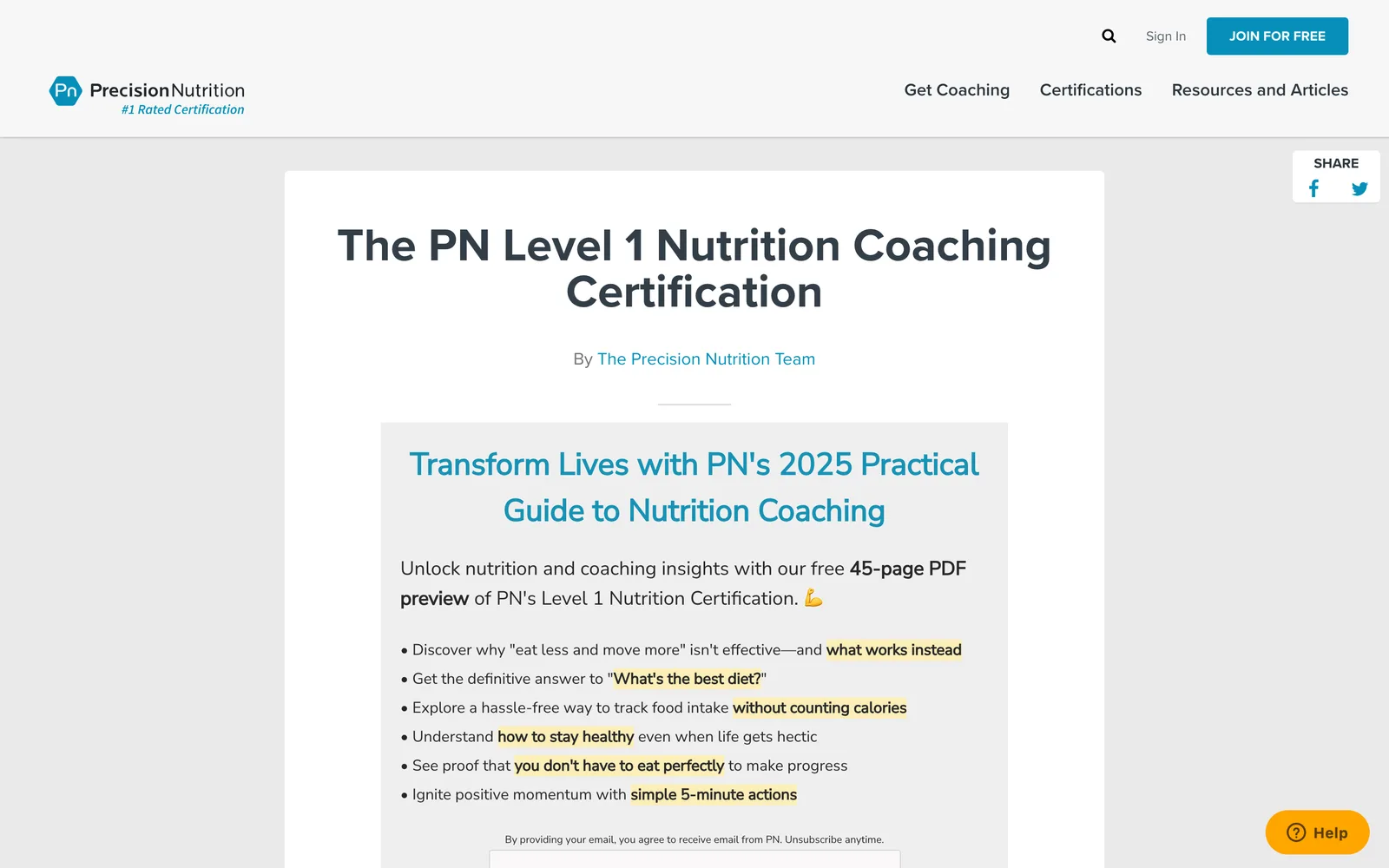
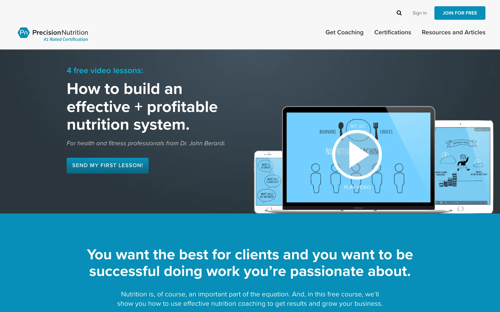
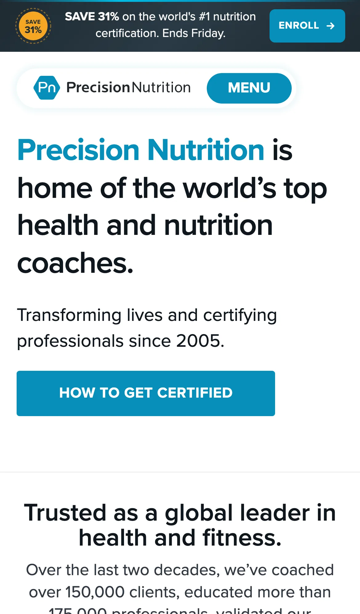
Precision Nutrition is the most respected name in nutrition coaching. Their content goes deeper than any competitor in the field, and their marketing volume is correspondingly high. The internal team had been running their corporate site themselves for years, and they had done a credible job of it, but they were not satisfied with the user interface or the way the depth of their content was being presented. They wanted a redesign that finally matched their expertise without throwing away the editorial voice they had built.
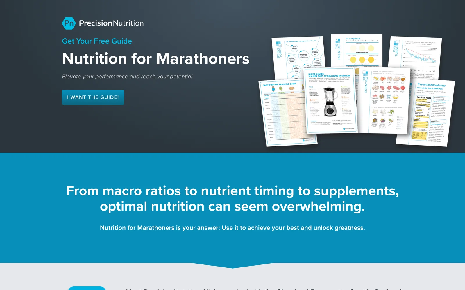
The other half of the brief was operational. Every new campaign required landing pages, ads, remarketing graphics, and downloadable assets, and the existing process meant rebuilding pieces from scratch each time. The team needed a design system and a custom WordPress architecture that let them deploy new campaigns without a designer or developer becoming the bottleneck. The volume of campaigns made the cost of that bottleneck add up fast, and the redesign had to solve the production pipeline, not just a single site.
The creative challenge sat on top of all of that. Precision Nutrition's pages have an enormous amount of information per scroll. The redesign had to take a content-first, information-first approach (the opposite of the heavy-hero default that most modern sites lean on) and still feel clean, elegant, and trustworthy. The page had to invite a reader into a long article, not push them toward a 30-second hero animation.