Skip to content
BurksUP Design

Case № 02

Real pet food.

A Toronto pet meals startup that turned fresh, human-grade ingredients into a recognizable brand, a beloved in-store cafe, and a subscription-friendly online ordering experience that shows up at the door.

Client Tom&Sawyer
Industry Food & Beverage
Role Branding Strategy, Logo Design
Live at www.tomandsawyer.com
Tom&Sawyer hero
In short

Pet food brand website design.

Pet food brand website design was the heart of the Tom&Sawyer engagement, and it touched almost every surface the brand would meet a customer on. Kristin Matthews and Peter Zakarow invited me out for a coffee to walk through a new venture they were planning, a fresh, human-grade pet meals company built around their dog Sawyer. I had worked with Peter on an earlier project, and we already shared a working rhythm, so I came on to design the entire brand from logo to packaging to the responsive ecommerce site to the interior and exterior signage of the Leslieville cafe.

Tom&Sawyer is built on a simple premise. The pet food category is loosely regulated and most pets are fed something far below what their humans would eat. Kristin and Peter wanted to fix that under the guidance of a veterinarian and a pet nutritionist, with a menu of meals made from ingredients you would find in any kitchen refrigerator.

This case study walks through how the brand came together, how the website was designed for both casual visitors and recurring subscribers, and how the in-store and online experiences were tied to a single visual system.

Full system
Brand to storefront to web logo, packaging, signage, site
On-site
Cafe signage build Leslieville renovation
Subscription
Ecommerce flow fresh meals delivered
Custom
Food photography human-grade ingredients shown
01 / The Problem

What was broken.

Tom&Sawyer was launching into a category that was already crowded with bagged kibble, raw food brands, and a flood of new direct-to-consumer pet products. The founders had a clear point of view, fresh meals made from human-grade ingredients, but no brand and no storefront yet. Everything had to be designed from a blank page, including the audience definition, which we narrowed to local pet parents in their mid twenties through mid sixties with above-average disposable income who already buy premium grocery for themselves.

The scope was unusually wide. Kristin and Peter needed a logo and identity system that could carry across packaging, interior and exterior signage at a brick and mortar cafe in Leslieville, and a responsive website that handled both single orders and recurring subscriptions. The brand needed to feel premium without feeling cold, and warm without feeling cute. It also had to read consistently across three very different surfaces (a glass storefront sign, a printed package label, and a retina-density product page) without any one piece feeling like a translation of the other.

The other constraint was operational. The in-store team was preparing fresh meals daily, so the packaging had to be functional for kitchen staff, the website had to be runnable by a small team without a designer on call, and the subscription flow had to work for a customer ordering once and a customer ordering every week. The fortunate flip side of all of this was that there was no hard timeline and no constrained budget, which let me run the brand through a deeper exploration than most launches allow.

02 / The Approach

How it got fixed.

I started where I usually do with a new food brand, by sitting down with the founders and running a brand discovery exercise. The questionnaire is intentionally a little playful, because the off-the-cuff answers are where the real personality of a founder usually lives. From those sessions Kristin and Peter, alongside their target audience of local pet parents in their mid twenties through mid sixties with above-average disposable income, gave me everything I needed to build the system.

The logo came first because every downstream piece (packaging, signage, web, social) inherits from it. Kristin sketched alongside me through this stage, taking my early concepts home and coming back with her own variations on paper. That back-and-forth shaped a wordmark that felt collaborative rather than imposed, which mattered for a founder who would be living with this mark for the next decade.

From there I rolled the system out across packaging that the in-store team could fill and label without slowing down their kitchen, signage that I measured and specced on site with the sign maker during the cafe build-out, and a responsive website that handled custom photography of the meals, ingredient breakdowns, and a subscription path right through to checkout.

01

Brand discovery with the founders

I ran working sessions with Kristin and Peter, including the playful questionnaire that surfaces the personality behind the brand. Pairing that with competitor analysis in the pet food category gave me a clear visual and verbal direction before any design started.

02

Collaborative logo development

I designed the wordmark over multiple rounds with Kristin sketching alongside me. She took early concepts home and brought back her own variations, which shaped the final mark into something both of us were proud to ship.

03

Functional packaging design

I designed packaging that the in-store team could fill, label, and run without slowing down kitchen prep. The system was clean and contemporary, but the priority was operational fit on a daily fresh-food workflow.

04

Interior and exterior signage

I designed both the interior and exterior signage for the Leslieville cafe during the renovation. That meant on-site visits to take measurements, conversations with the sign maker, and applying the brand to the physical space ahead of opening day.

05

Responsive website with subscription flow

I led the user experience and responsive design for the site, working with the web developer to wireframe and design product pages built around custom food photography, ingredient thumbnails, and a subscription path that gets fresh meals delivered without a store visit.

How it shipped

The work, step by step.

01

Brand discovery for a fresh pet meals startup

Tom&Sawyer kicked off without a hard timeline or a constrained budget, which is rare and worth using well. I ran the brand discovery questionnaire with Kristin and Peter, then layered in competitor analysis across the pet food category, both the bagged-kibble incumbents and the newer fresh and raw brands. The output was a one-page direction we could point every downstream decision at, including the target audience of local pet parents with above-average disposable income who were already buying premium grocery for themselves.

02

Logo design that the founders helped shape

The Tom&Sawyer logo design was unusually collaborative. After my first sketches and concepts went back to Kristin, she returned with her own pencil drawings on top of mine, suggesting forms and proportions I had not considered. I incorporated those iterations and ran a few more rounds until we landed on a mark that read as warm and crafted but still confident on a storefront sign. It is the kind of process that only works when a founder is actually engaged, and Kristin was.

03

Packaging design for a fresh-prep kitchen

Packaging is where pet food brands either differentiate or disappear. Tom&Sawyer was preparing meals daily in the Leslieville kitchen, so the package had to be filled, labeled, and shipped without slowing the team down. I designed a clear, contemporary system, working through forms and sizes with the team, that kept the brand recognizable on a retail shelf while staying friendly to a real fresh-food workflow.

04

Interior and exterior signage for the Leslieville cafe

I took the brand off the screen and onto the cafe build during the renovation. That meant a couple of trips to the job site to take measurements, walk the space, and meet the sign maker. The interior and exterior signage was designed to read consistently with the packaging and the website, so customers walking in for the first time after seeing the brand online recognized it immediately.

05

Responsive website design with subscription ordering

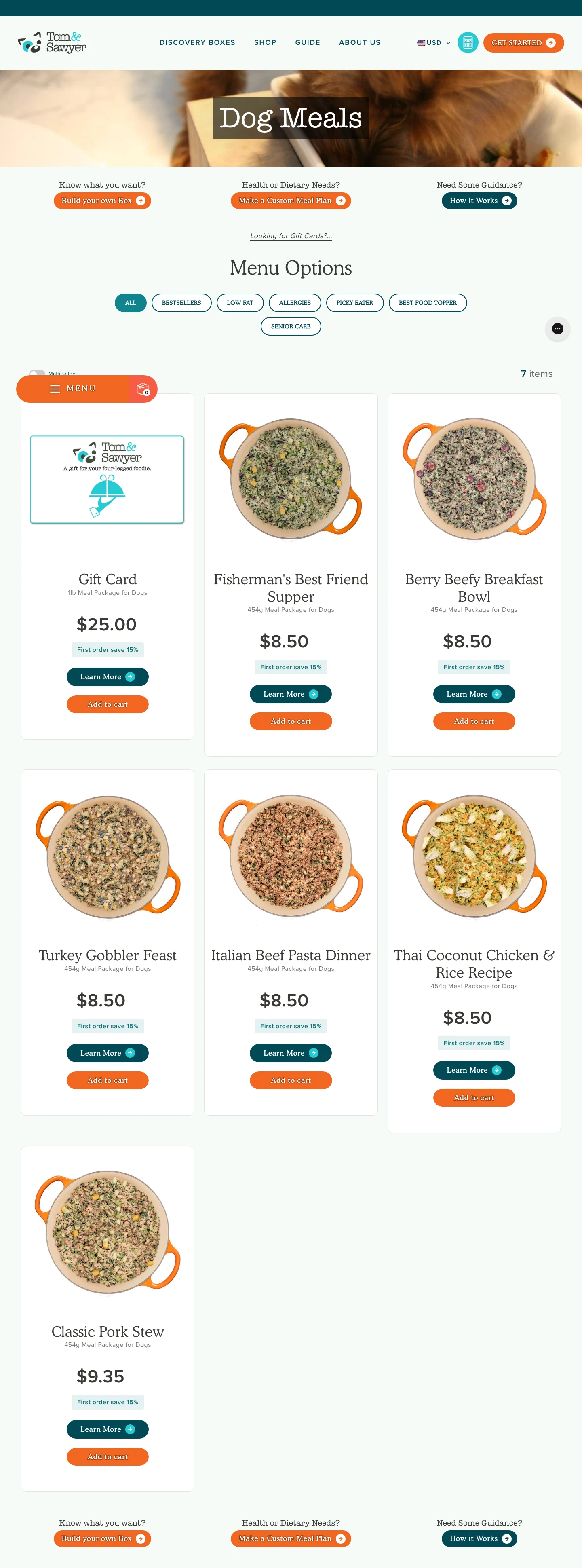
After aligning with the web developer and reviewing initial wireframes, I led the user experience and responsive design for the site. Custom food photography sat front and center, with ingredient thumbnails that opened to deeper benefit information for each protein and vegetable in a meal. The site supports both a single order and a recurring subscription, so a pet parent can place a one-off order or set up a weekly delivery without going to the cafe.

The Work, Specifically

What I actually shipped.

Not a services list. The real work streams, in the order I ran them.

  1. № 01

    Brand discovery and strategy

    I ran the discovery questionnaire and competitor analysis with Kristin and Peter to lock the audience, the positioning, and the personality before any design started. The output was a single-page direction that every downstream decision tied back to.

  2. № 02

    Logo and identity system

    I designed the wordmark over multiple rounds with Kristin sketching alongside me. The final mark works at the scale of a packaging label, a website nav, and a storefront sign without losing its character.

  3. № 03

    Packaging design

    I designed clean, contemporary packaging that the in-store team could fill and label inside a fresh-food workflow. It carries the brand on a retail shelf while staying friendly to daily kitchen operations.

  4. № 04

    Interior and exterior signage

    I designed both the interior and exterior signage for the Leslieville cafe, working with the sign maker and taking measurements on site during the renovation. The signage reads as a clear extension of the packaging and the website.

  5. № 05

    Responsive website design

    I led the user experience and responsive design for the site, with custom food photography, ingredient thumbnails that open to deeper benefit info, and a subscription path that lets customers set up a recurring delivery.

  6. № 06

    Art direction and ongoing consulting

    I directed the photography style and continued to advise the team on brand application across new product launches and marketing assets after the initial launch shipped.

03 / The Work

What shipped.

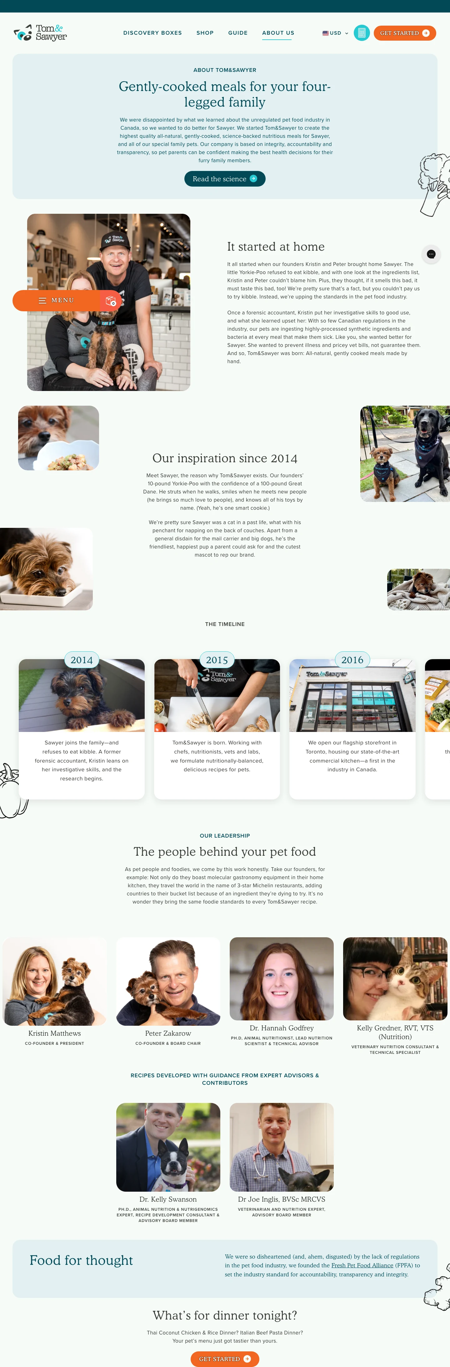
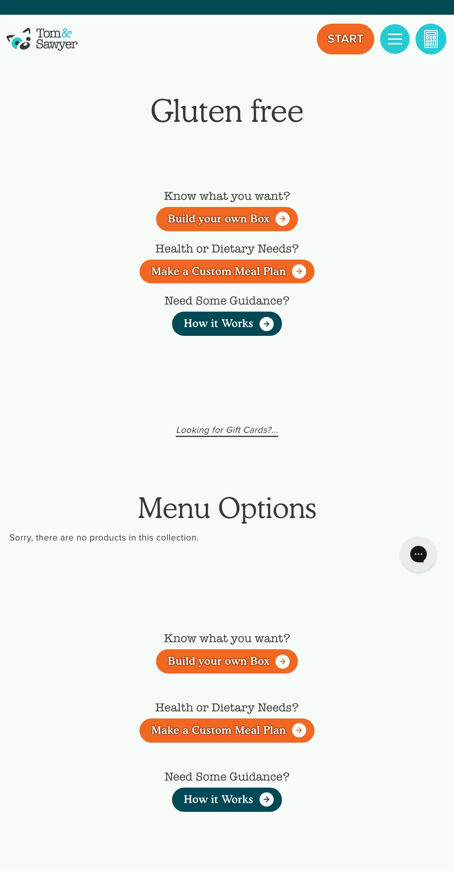
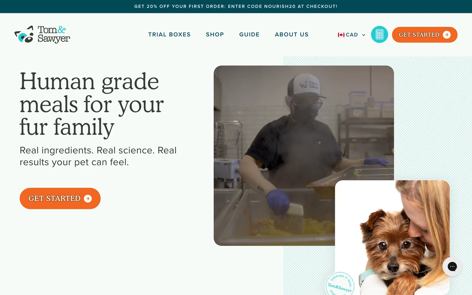
A home page that makes the new brand feel easy to trust, with a path from first visit to first order.
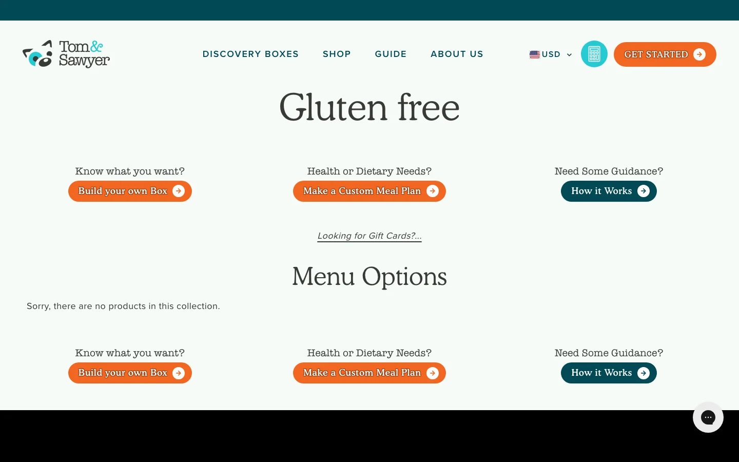
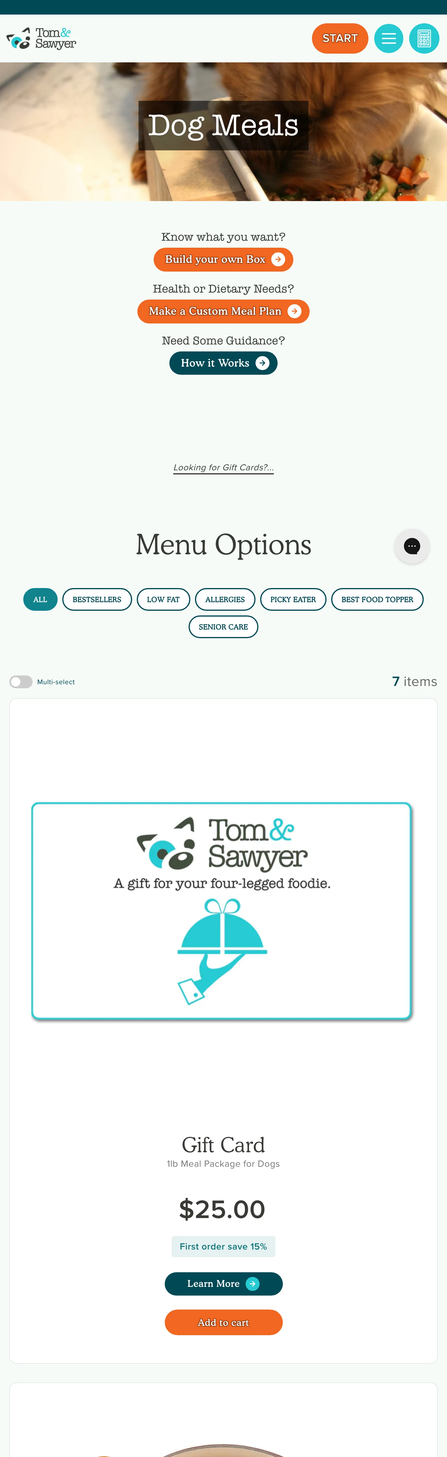
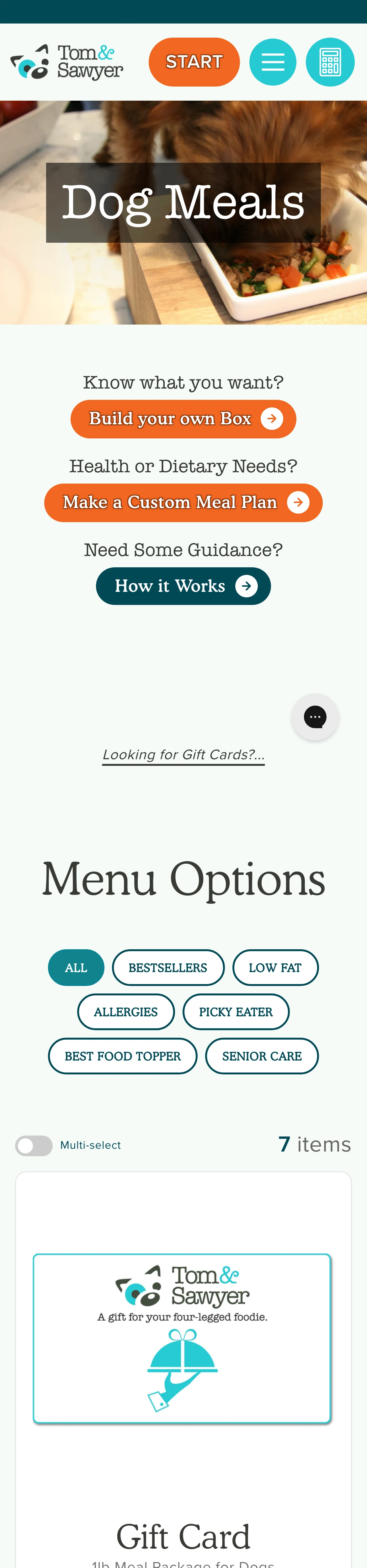
Built to help shoppers compare meals fast, with plain details that support easier choices for pets and people.
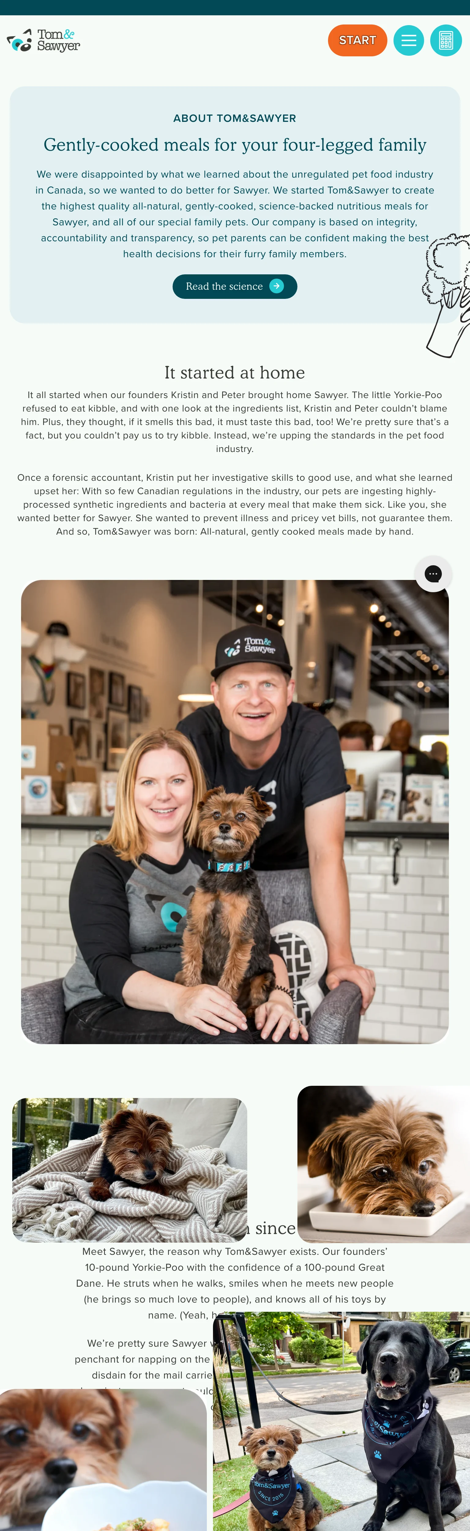
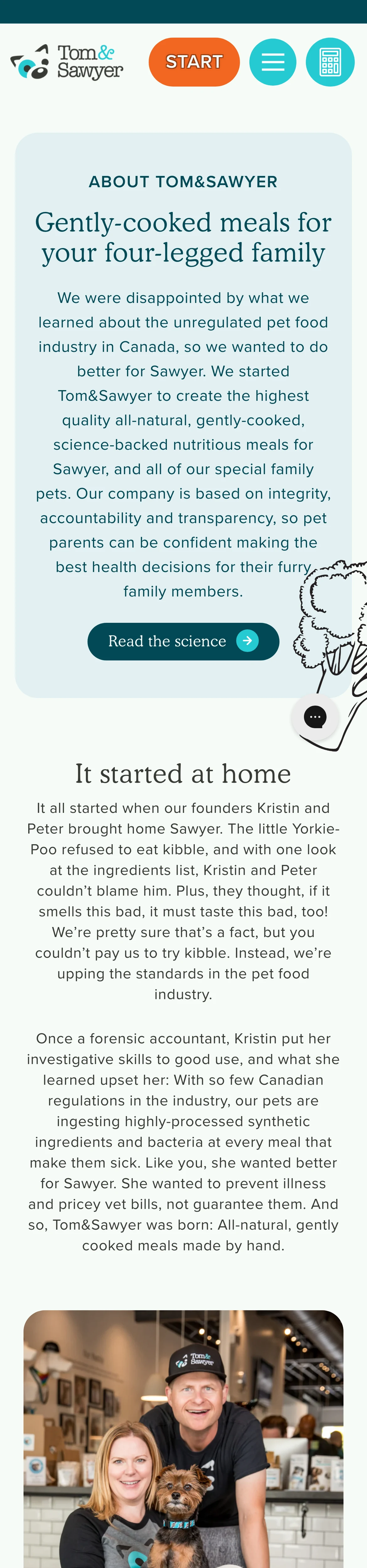
Tells the brand origin in a way that builds trust and gives shoppers a reason to care.

A home page that makes the new brand feel easy to trust, with a path from first visit to first order.

  • A home page that makes the new brand feel easy to trust, with a path from first visit to first order.
    A home page that makes the new brand feel easy to trust, with a path from first visit to first order.
  • Built to help shoppers compare meals fast, with plain details that support easier choices for pets and people.
    Built to help shoppers compare meals fast, with plain details that support easier choices for pets and people.
  • Tells the brand origin in a way that builds trust and gives shoppers a reason to care.
    Tells the brand origin in a way that builds trust and gives shoppers a reason to care.
  • A home page that makes the new brand feel easy to trust, with a path from first visit to first order.
    A home page that makes the new brand feel easy to trust, with a path from first visit to first order.
  • Built to help shoppers compare meals fast, with plain details that support easier choices for pets and people.
    Built to help shoppers compare meals fast, with plain details that support easier choices for pets and people.
  • Tells the brand origin in a way that builds trust and gives shoppers a reason to care.
    Tells the brand origin in a way that builds trust and gives shoppers a reason to care.
Tom&Sawyer, Order while you walk the dog, mobile-first. (desktop)
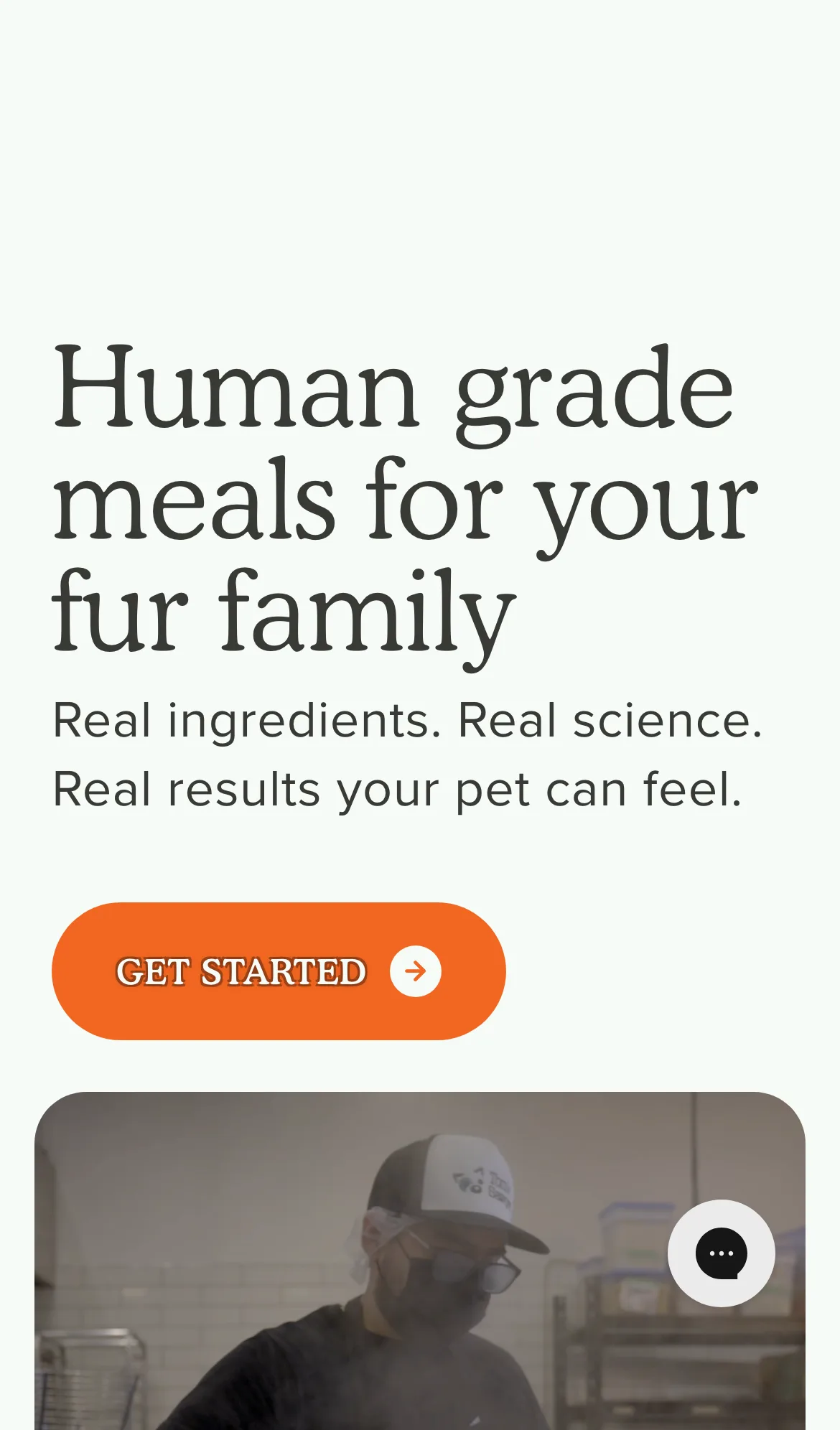
Tom&Sawyer, Order while you walk the dog, mobile-first. (mobile)

Order while you walk the dog, mobile-first.

Tom&Sawyer Tom&Sawyer

From the kibble to the cart to the doorstep.

Nick listened to our story and helped us to develop our logo and brand, which we love, as do so many people. Nick was able to translate our ideas and messaging into a visually appealing brand design that has provided our fresh prepared pet meals with a strong introduction to the pet food market.
Kristin Matthews Founder, Tom&Sawyer
04 / The Outcome

Where it landed.

Tom&Sawyer launched with a complete brand system. Logo, packaging, interior and exterior signage at the Leslieville cafe, and a responsive ecommerce site with a subscription path. The brand opened with a strong introduction to the pet food market, with both the storefront and the website carrying the same visual system from the first day. Customers walking past the cafe recognize the same identity that pulled them to the website, and customers who started online recognize the cafe immediately when they walk in for the first time.

Kristin's words on the partnership get at why the engagement worked. "Nick listened to our story and helped us to develop our logo and brand, which we love, as do so many people." That mix of being heard and being shipped is what a founding team needs from a design partner on a launch project. The collaborative process around the logo specifically (where Kristin sketched her own variations on top of mine) is the kind of working relationship that produces a mark a founder is genuinely proud of, not one that was simply approved.

The site continues to do the daily work of selling and renewing subscriptions, and the brand system has held up across packaging, signage, photography, and ongoing marketing. Tom&Sawyer continues to expand the menu and the operation under the same identity, which is the real test of whether a launch design system was built to last.

The Role
Branding Strategy Logo Design Package Design Interior and Exterior Signage Design User Experience Design Responsive Website Design Art Direction and Consulting

Ready for your own case study?

Drop your URL. Nick will audit your site personally and build a live preview you can click through before you pay a dollar.

or write directly

Free, weekly

Site teardowns for home-service owners.

One real home-service site, broken down each week. What's leaking, what's working, the one fix that would matter most. Sent Mondays. Built for operators, not designers.

Built for home-service operators. Unsubscribe in one click.

See your free rebuild

No pressure. No upfront payment.