Skip to content
BurksUP Design

Case № 25

Real AI craft.

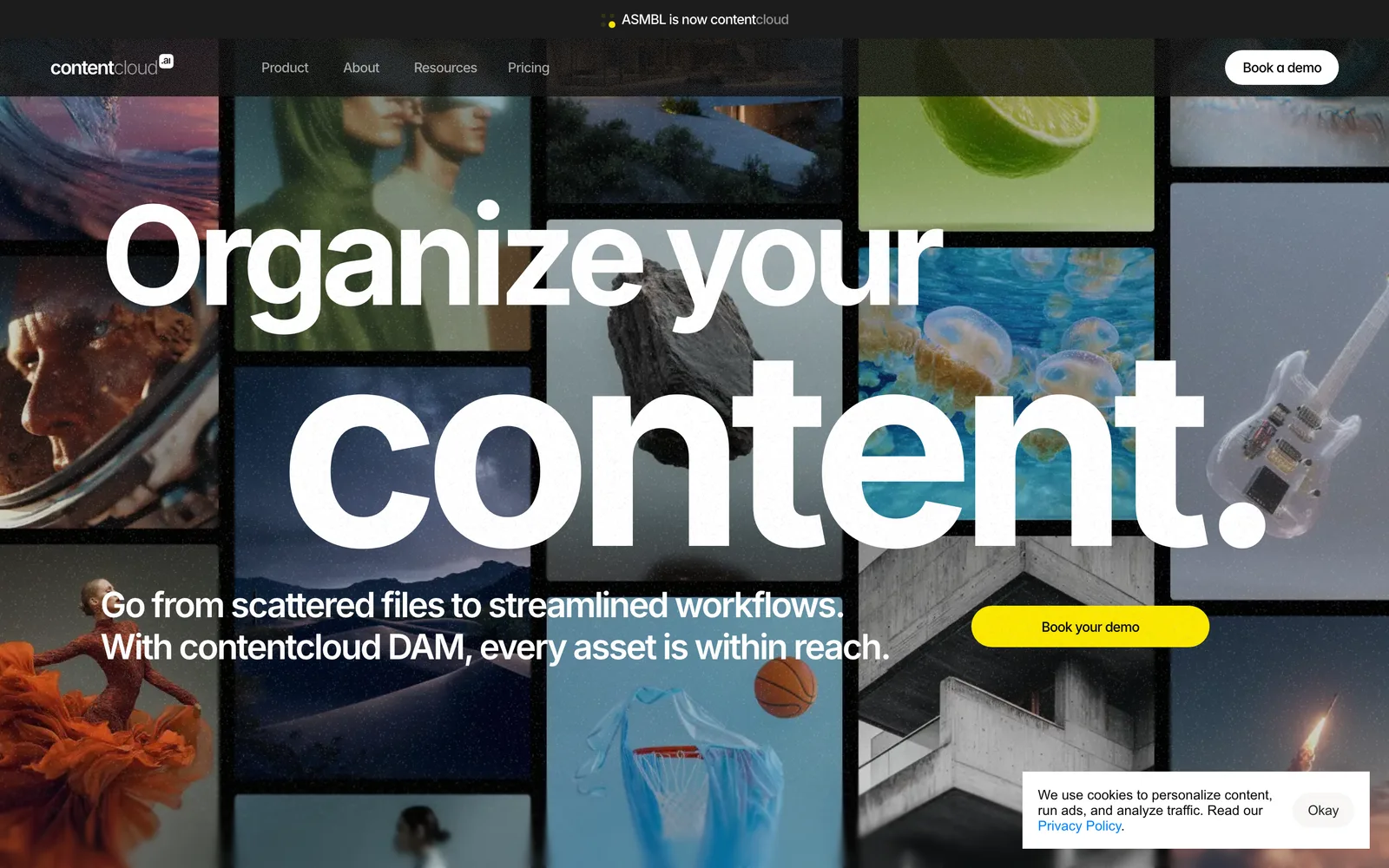
ASMBL is an AI-powered digital asset management platform that needed a marketing site sophisticated enough for enterprise buyers and clear enough for the practitioners who would actually use it.

Client ASMBL AI
Industry Software & Technology
Role Digital Branding, User Experience Design
Live at www.contentcloud.ai
ASMBL AI hero
In short

AI productivity website design.

ASMBL came to me to position their software as a premium player in a crowded AI category. The category itself reads like a wall of acronyms and feature lists, so the problem was not how to look more technical, it was how to look more confident. Pierce Kellam, the senior director on the project, wanted a site that signaled enterprise credibility on the first scroll and held up under the technical scrutiny of the engineers and operations leaders who would champion the purchase internally.

I built ASMBL a custom WordPress site, a fresh digital identity, and a system of more than two hundred bespoke graphics and animations that carry the product story without leaning on stock illustration. Every interaction is custom, every visual is original, and the publishing tool is set up so the marketing team can launch new pages, case studies, and product modules without a developer in the loop.

This case study walks through how I positioned ASMBL, how I built the user experience for two readers (the practitioner and the buyer), and what the site does for them today.

200+
Custom graphics drawn for ASMBL
Custom
WordPress build modular blocks
Two readers
Site architecture practitioner + buyer
On time
Every milestone per the client
01 / The Problem

What was broken.

Digital asset management is a category dominated by enterprise incumbents and a long tail of feature-equivalent challengers. ASMBL's pitch is that AI can take a lot of the manual tagging, search, and rights work off the team, but a pitch like that has been made before in the category. The site had to make the difference visible without forcing visitors through a forty-minute demo first.

There were two readers to design for. The practitioner is the marketing operations or creative ops lead who will actually live in the product day to day. They want to know how it integrates, how the search works, and whether it will scale to the asset library they already have. The buyer is the senior leader writing the check. They want security, governance, and a brand that makes them feel comfortable signing a multi-year contract.

The team also needed a publishing tool they could actually run. The previous setup made even small content changes feel like a release. New product modules, new use cases, new integrations, all of it was bottlenecked. The rebuild had to give the marketing team direct control over the site without making the brand drift every time someone added a page.

02 / The Approach

How it got fixed.

I started with the positioning. Pierce and I worked through ASMBL's actual differentiators (AI-driven automation, the depth of the integrations, and the security posture they built for enterprise buyers) and stripped out the parts of the pitch that any competitor could copy. The output was a one-page brief that the visual system, the site structure, and the copy all tied back to.

From there I designed a site that reads as cinematic on the surface and technical underneath. The hero and product sections lean on motion and custom illustration so the brand feels confident and original. The deeper pages (security, integrations, the product modules) get a quieter, more documentation-style treatment so the practitioner can scan and verify. The two layers share a single design system, but they earn attention in different ways for different readers.

I built the whole thing on WordPress with a custom template system anchored on Advanced Custom Fields. The marketing team gets modular blocks they can reorder and refill, which means new use cases and new product surfaces ship without my involvement. Every block was designed so the brand cannot accidentally drift when a new page goes up.

01

Positioning workshop with Pierce

I ran a working session with Pierce Kellam to land the audience, the differentiators, and the visual mood before any design started. The output was a one-page brief that every downstream decision (visual identity, page structure, motion, copy) tied back to.

02

Two-reader site architecture

I designed the site for the practitioner and the buyer at the same time. The top of every product page sells the story, the deeper sections hand the technical reader the integrations, security model, and governance details they need to champion the purchase internally.

03

More than 200 custom graphics and animations

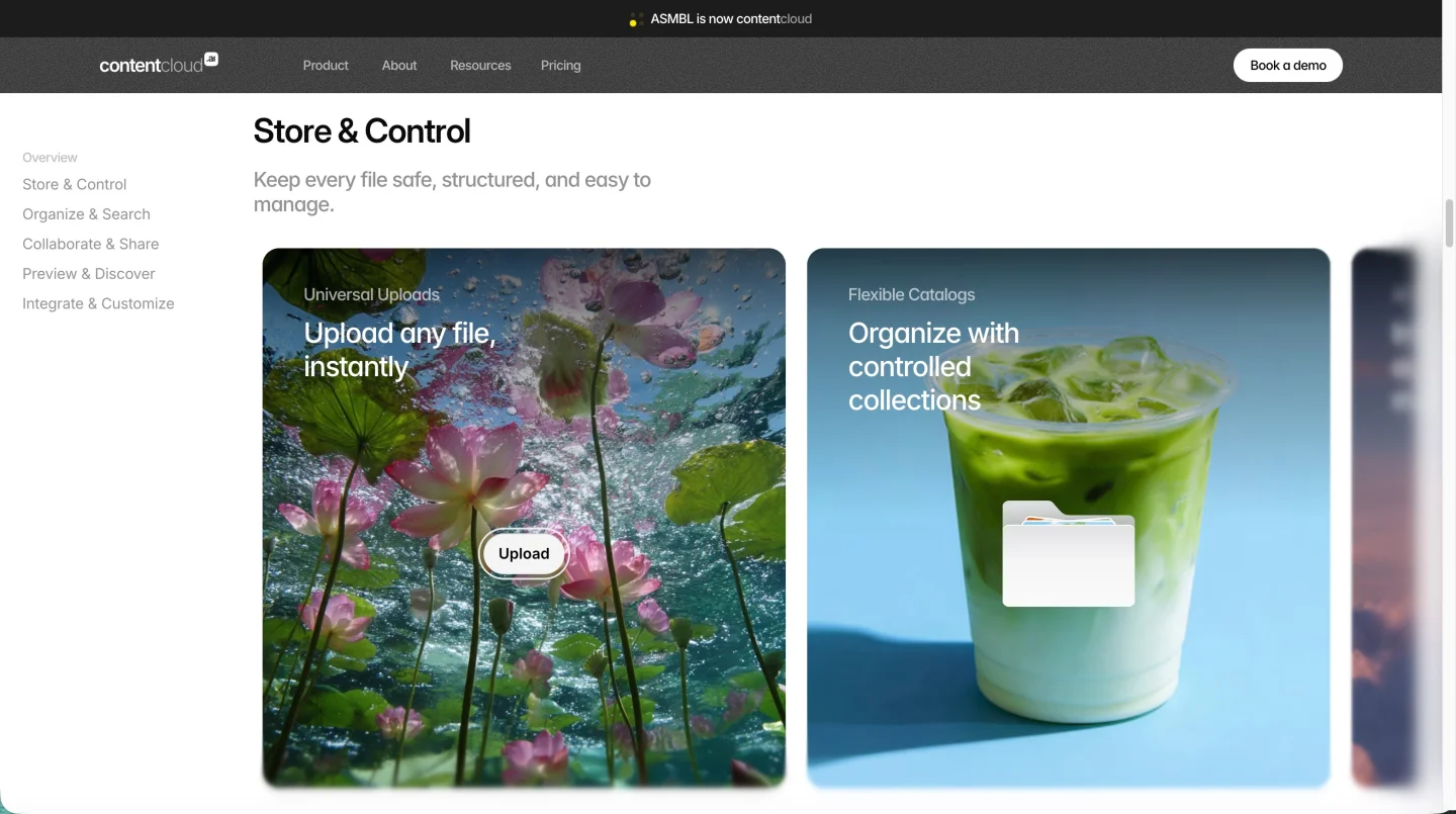
Every illustration and motion sequence was drawn for ASMBL. No stock spot-illustration, no generic isometric scenes. The graphics carry the product story across the homepage, the platform pages, and the use cases, which is the first thing that signals premium in this category.

04

Custom WordPress publishing tool

I built a WordPress site on a custom template system with modular Advanced Custom Fields blocks. The marketing team can launch new product modules, integrations, and use cases without touching code, and the templates were designed so the brand stays coherent no matter who builds the next page.

05

Performance and search foundations

Speed is a buying signal in this category. I optimized the build for fast first paint, clean semantic markup, and a per-page metadata system so every page tells search engines what it is about. The platform pages are structured around the queries enterprise buyers actually run.

How it shipped

The work, step by step.

01

Brand strategy for an enterprise software buyer

ASMBL had a strong product story but a visual identity that was reading more startup than enterprise. I rebuilt the visual system around a refined type pairing, a confident color palette, and a custom icon library tuned for the AI category without leaning on the hex-grid clichu00e9s that every competitor uses. The system was designed to scale across the marketing site, sales decks, and the product user interface without the brand fragmenting at the seams.

02

User experience design for a two-reader site

Most software marketing sites collapse the practitioner and the buyer into one experience and end up serving neither well. I designed the architecture so both readers find their answer within two scrolls. The hero and product overview sell the story for the senior reader, the deeper sections (integrations, security, governance, technical depth) hand the practitioner the proof they need, and the calls to action are placed where each reader is actually ready to convert.

03

Custom illustration and motion as the differentiator

The category is crowded with feature lists. The fastest way to look different is to look more crafted. I directed and produced more than two hundred custom graphics and animations, each one tied to a specific product capability. Motion is restrained on the deeper pages so the practitioner can scan, and used more aggressively on the homepage and product overviews so the senior reader feels the brand confidence in the first scroll.

04

Custom WordPress development for an enterprise software team

I built ASMBL on WordPress with a custom template system anchored on Advanced Custom Fields. The marketing team gets modular blocks they can reorder, refill, and translate without involving a developer. New product modules, new use cases, new integration partners, all of it ships through the publishing tool. The build avoids heavy third-party plugins so the site stays fast and the security surface stays small.

05

Search and performance for AI productivity software queries

ASMBL needs to be discoverable to enterprise teams searching problem-aware queries (digital asset management, AI tagging, marketing operations automation, integrations with their existing stack). I structured the site so each query has a page that answers it directly, with clean semantic markup, fast first paint, and per-page metadata the marketing team can edit themselves. Speed and clarity are both ranking signals and buying signals in this category.

06

Modular content blocks for an evolving product

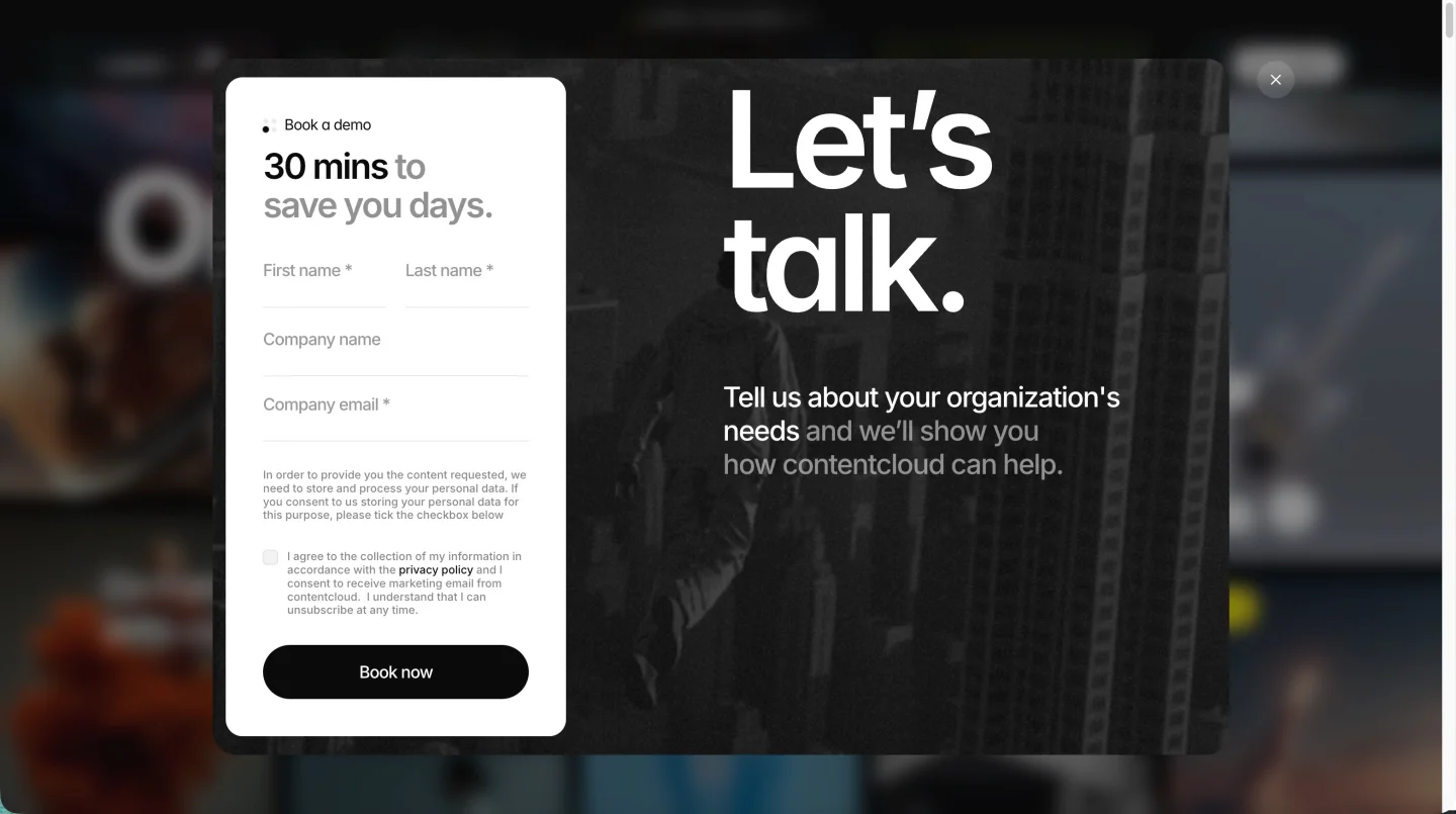
Software companies ship new capabilities constantly, and the marketing site has to keep up without becoming a patchwork. I designed a set of modular content blocks (hero, feature explainer, integration grid, customer story, security callout, comparison table, demo request) that the marketing team mixes and matches to build new pages. The blocks share a single design system so the brand stays coherent no matter who builds the next page, and the templates were drawn so a new use case page can ship in a morning rather than a sprint.

The Work, Specifically

What I actually shipped.

Not a services list. The real work streams, in the order I ran them.

  1. № 01

    Discovery and positioning

    A working session with Pierce to land the audience, the differentiators, and the visual mood. The output was a one-page brief every downstream decision tied back to.

  2. № 02

    Visual identity and design system

    A refined type pairing, a confident color palette, a custom icon library, and a motion language tuned for an enterprise AI buyer. Designed to scale across the marketing site, sales decks, and the product user interface.

  3. № 03

    Two-reader site structure

    Architecture designed for the practitioner and the buyer at the same time. The top of every page sells the story, the deeper sections hand technical readers the integrations, security, and governance proof they need.

  4. № 04

    Custom illustration and motion

    More than two hundred bespoke graphics and animations, each tied to a specific product capability. Restrained on the deeper pages, more expressive on the homepage and product overviews.

  5. № 05

    Custom WordPress build

    A custom template system anchored on Advanced Custom Fields. Modular blocks the marketing team can reorder and refill so new product modules and use cases ship without a developer.

  6. № 06

    Performance, search, and metadata

    Fast first paint, clean semantic markup, per-page metadata the marketing team can edit, and a content structure that mirrors how enterprise buyers actually search for digital asset management software.

03 / The Work

What shipped.

The ASMBL homepage, drawn from scratch.

The ASMBL homepage, drawn from scratch.

ASMBL AI, Custom motion across the product story. (desktop)
ASMBL AI, Custom motion across the product story. (mobile)

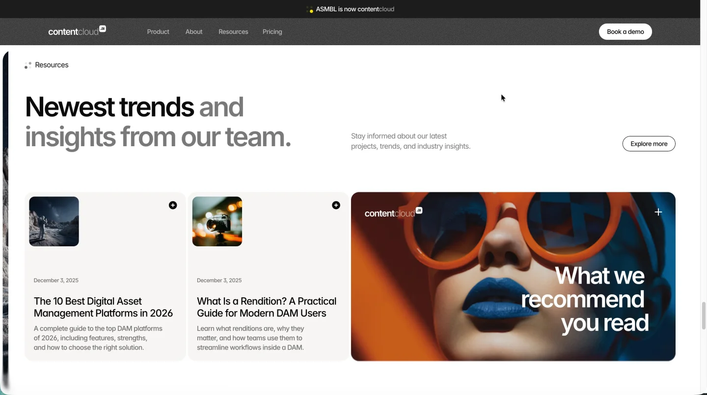
Custom motion across the product story.

ASMBL AI — view 1
ASMBL AI — view 2
ASMBL AI — view 3

Three surfaces of an AI design system.

Working with Nick was a highly rewarding experience. Beyond delivering a visually impressive and high-performing website, he went above and beyond with valuable strategic insights that shaped our project's direction. His thought leadership in design, industry trends, and user experience allowed us to craft a website that truly connects with our target audience, drives engagement, and looks great. His WordPress expertise ensured we have a secure, easy-to-use publishing tool that integrates smoothly with our tools. Nick consistently delivered on timelines, ensuring the project remained on track. If you're looking for a web designer who combines creativity with strategic vision, Nick is a top-notch choice.
Pierce Kellam Senior Director, ASMBL AI
04 / The Outcome

Where it landed.

The site launched and ASMBL has a marketing surface that holds up next to the enterprise incumbents in their category. The visual system signals premium on the first scroll. The deeper product pages hand technical readers the integrations and security detail they need. The publishing tool gives the marketing team direct control over new product modules and use cases without a developer in the loop.

Pierce called the engagement a top-notch choice for teams that want creative work paired with strategic vision. He highlighted the WordPress build as secure, easy to use, and integrated with the rest of the stack the team already runs. He also flagged that I consistently delivered on timelines, which matters more than it sounds when an enterprise software team is trying to coordinate a launch with product, sales, and partnerships at the same time.

The brand perception shift is the part of the work that compounds. ASMBL was a feature-equivalent challenger in a category dominated by incumbents, and the site now reads as a confident, premium player rather than another startup trying to break in. That shift influences every conversation downstream of the site, from the way sales decks land to the way analyst briefings get framed, and it is the kind of outcome that takes years to build and is hard to fake with copy alone.

The site has become the foundation the marketing team builds on. New use cases, integrations, and product modules ship through the modular blocks I designed. The brand stays coherent because the system was built so it cannot easily drift, and the search foundation keeps producing because the architecture maps to the queries enterprise buyers actually run. The engagement has continued past launch as new product surfaces come online, and the partnership has held the same shape it had at the beginning.


The Role
Digital Branding User Experience Design Site Structure & Strategy Responsive Website Design Art Direction & Consulting Custom WordPress Development

Ready for your own case study?

Drop your URL. Nick will audit your site personally and build a live preview you can click through before you pay a dollar.

or write directly

Free, weekly

Site teardowns for home-service owners.

One real home-service site, broken down each week. What's leaking, what's working, the one fix that would matter most. Sent Mondays. Built for operators, not designers.

Built for home-service operators. Unsubscribe in one click.

See your free rebuild

No pressure. No upfront payment.