Skip to content
BurksUP Design

Case № 16

Real AR commerce.

KiSP builds visualization tools and augmented reality sales software for industries that sell complex physical products. The rebrand had to break them out of the office furniture category they were perceived to live in.

Client KiSP Inc.
Industry Software & Technology
Role Brand Strategy & Refresh, User Experience Design
Live at kisp.com
KiSP Inc. hero
In short

Augmented reality sales platform website.

KiSP came to me with a perception problem. The company had built a deep set of visualization, configuration, and augmented reality (AR) tools for selling complex physical products, but most of the world saw them as an office furniture vendor. That was where they had earned their reputation, and that was where the marketing site kept anchoring them. The leadership team wanted to break out, sell into architecture, product design, automotive, and exhibition design, and reposition the brand as a visualization partner that happens to know furniture, not the other way around.

Christine Bellefontaine, the director of marketing, was the partner on the engagement. We ran a full rebrand, rebuilt the site from scratch on a custom WordPress platform, designed an account-gated knowledge centre for existing customers, and structured the architecture so the products (the Configurator, the KiTS Collaborator, the product data services) stand on their own and can each carry a different industry forward.

This case study walks through how I repositioned KiSP, what the new site does for the practitioner and the buyer, and how it lets the marketing team move into new industries without rebuilding the foundation again.

Full
Rebrand out of one category
Custom
WordPress build modular blocks
Gated
Knowledge centre self-managed
Multi-industry
Architecture products + sectors
01 / The Problem

What was broken.

The first challenge was the category trap. KiSP had so much equity in office furniture that anyone outside the category assumed the tools were not built for them. Architects, automotive teams, and exhibition designers would land on the site, see furniture imagery and furniture case studies, and click away. The visualization quality, the configurator depth, and the AR capability never got a chance to land.

The second was the product surface. KiSP has multiple products and services with overlapping features (the Configurator, the KiTS Collaborator, product data creation, visualization services, augmented reality previews). The previous site flattened them into a single feature list, which made the value impossible to tell apart. A buyer trying to figure out which product solved their problem had to read the whole site to find out.

The third was the publishing tool. The team needed to ship case studies for new industries, update product imagery as visuals improved, and run campaigns into verticals they had not sold into before. The previous setup made all of that slow. New industry messaging meant a release. New visuals meant a workaround. The rebuild had to make day-to-day content work fast and let the brand carry through cleanly into industries the team had never published into before.

02 / The Approach

How it got fixed.

I ran stakeholder workshops with Christine and the leadership team to redefine the brand strategy. We named the superpowers (visualization quality, configurator depth, AR fidelity, the speed of getting a real product into a real environment) and stripped out the parts of the old positioning that anchored the company to one category. The output was a positioning brief that the rest of the work tied back to.

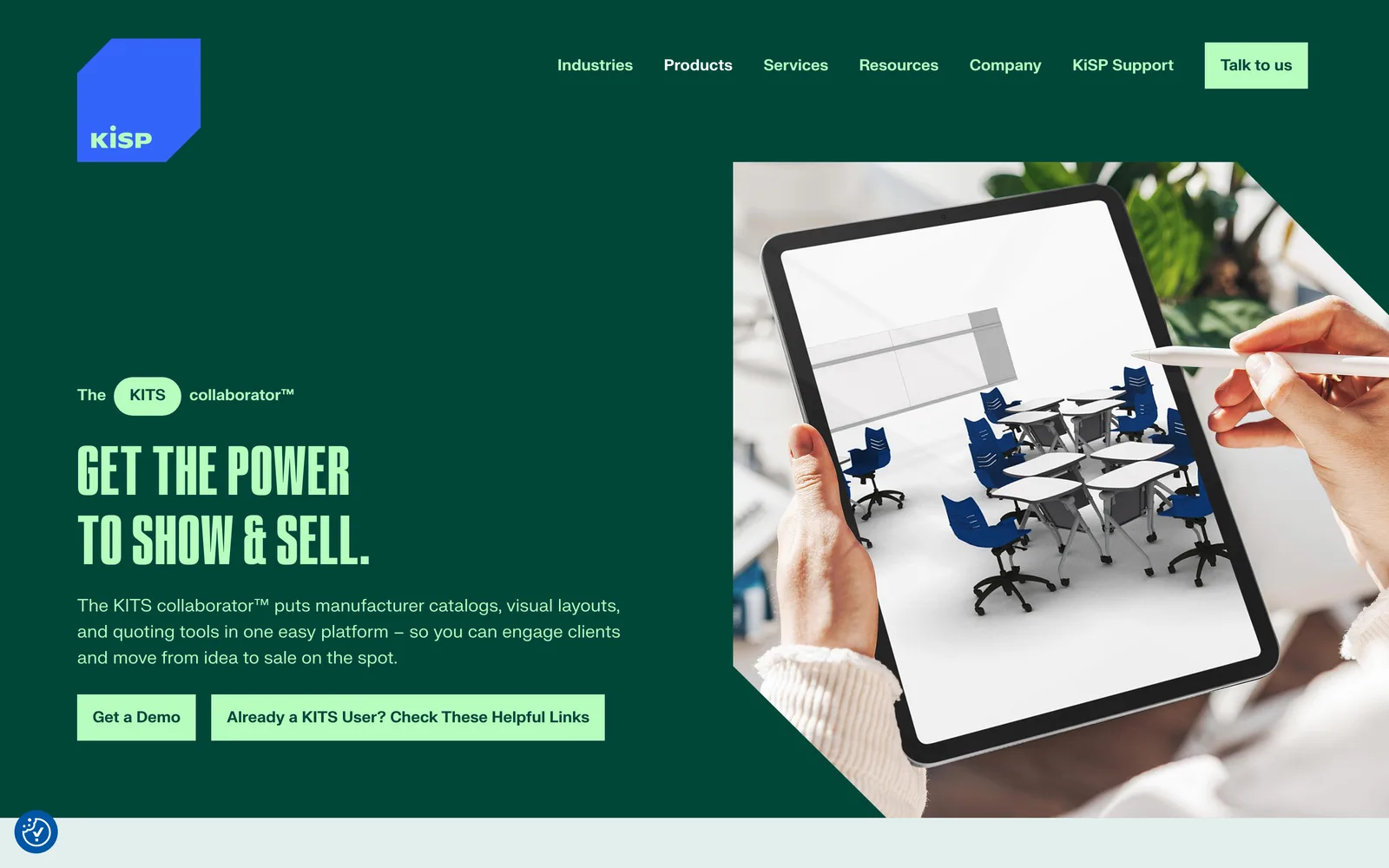
From there I designed a new visual system. A cinematic typographic pairing, a color palette that reads premium across categories, an abstract brand-mark system that does not lean on furniture cliches, and a photography and rendering direction that uses cinematic environments instead of office showroom shots. The system was built so a furniture case study and an architecture case study could sit beside each other and read as the same brand.

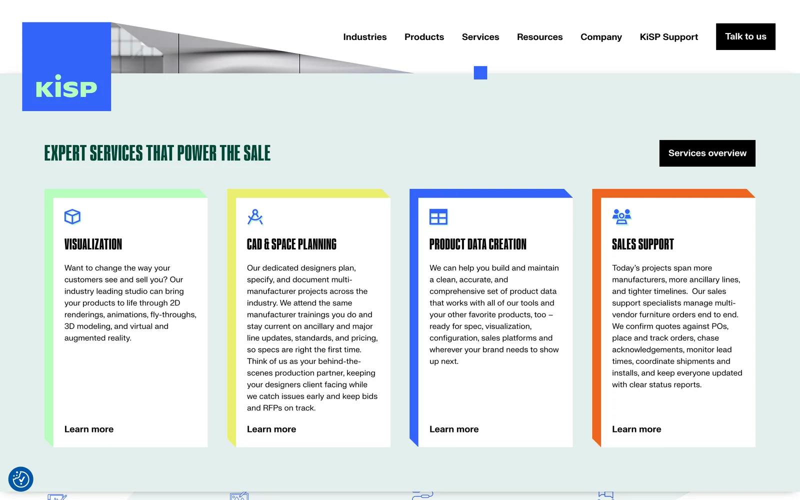
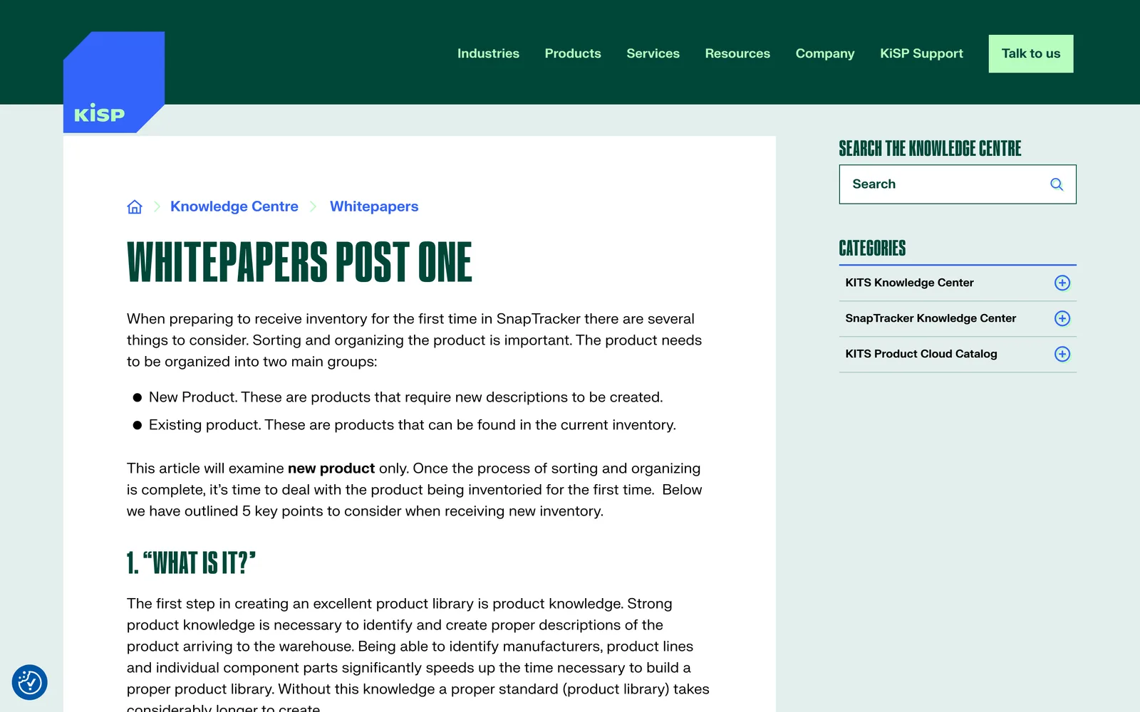
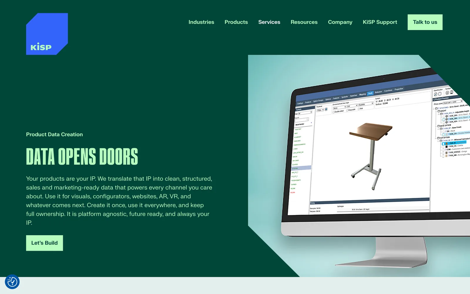
I rebuilt the site on a custom WordPress install with Advanced Custom Fields running the templates. The product surfaces (Configurator, KiTS Collaborator, product data services) each have their own architecture so a buyer in any industry can find the product that solves their problem. The knowledge centre is account-gated so existing customers can pull whitepapers, instructional guides, and resources without making them public, and the publishing tool gives the marketing team direct control over new industry pages and case studies.

01

Stakeholder workshops with Christine

I ran working sessions with Christine and the KiSP leadership team to redefine the brand strategy and surface the cross-industry positioning. The output was a one-page brief that the visual system, the architecture, and the copy all tied back to.

02

Cinematic visual rebrand

I built a new visual system anchored on cinematic typography, an abstract brand-mark direction, and a rendering and photography style that reads premium across categories. The brand was designed so a furniture case study and an architecture case study read as the same company.

03

Multi-industry site architecture

I structured the site so industries served and products live as parallel surfaces. Architects, automotive teams, and exhibition designers each find their own way in, and the products (Configurator, Collaborator, product data services) each have a clear story of their own.

04

Account-gated knowledge centre

I designed and built a self-managed knowledge centre on the custom WordPress build so existing customers can access whitepapers, instructional guides, and resources behind a login. The KiSP team manages accounts and content without a developer in the loop.

05

Custom WordPress publishing tool

A custom WordPress site on Advanced Custom Fields with modular blocks the marketing team can run themselves. New industry pages, new case studies, and new product modules ship without a developer, and the templates were drawn so the brand stays coherent across categories.

How it shipped

The work, step by step.

01

Brand strategy for a multi-industry visualization company

The hardest part of this engagement was the unwind. KiSP had earned its reputation in furniture, and the rebrand had to honor that without trapping the company there. I designed the visual system around superpowers that translate across categories (visualization quality, configurator depth, AR fidelity, the speed of getting a real product into a real environment) so the brand reads as a visualization partner first and a furniture vendor second. The system was built to scale across the marketing site, sales decks, trade-show material, and the gated knowledge centre.

02

User experience design across industries served

I designed the architecture so industries served and products live as parallel surfaces. An architect lands on the architecture industry page, sees an architecture case study and an architecture-relevant product story, and converts on a path that makes sense for their buying process. An automotive team gets the same treatment. The products (Configurator, KiTS Collaborator, product data creation) each get a story of their own so a buyer can pick the product that solves their problem without having to read the whole catalog.

03

Custom WordPress development with a gated knowledge centre

I built KiSP on a custom WordPress install with Advanced Custom Fields running the templates. The marketing team gets modular blocks they can reorder and refill, which means new industry pages and case studies ship without a developer. The knowledge centre is an account-gated experience where existing customers can pull whitepapers, instructional guides, and product resources behind a login. The KiSP team manages accounts and content directly through the publishing tool.

04

Performance, accessibility, and search foundations

Heavy renderings and product imagery were optimized through responsive design, lazy-loading, and asset compression so the site stays fast on every device. Accessibility practices were baked into the component library so new content rolls out accessible on day one rather than getting retrofitted later. The site was structured so each product and each industry has a page that answers the queries that audience actually runs.

05

Augmented reality sales tooling on the marketing surface

Augmented reality is one of KiSP's strongest signals, and the marketing site had to demonstrate it rather than describe it. I integrated interactive configurators and demo experiences so visitors can engage with KiSP's tools directly on the site. The integrations were designed so the team can swap in new product configurations as the catalog grows without rebuilding the page each time.

06

Cinematic photography and rendering direction

The fastest way to break a category perception is to look like you do not belong to it. I directed a photography and rendering style that leans cinematic rather than catalog. Real environments rather than showroom shots. Rendered products placed in architecture, automotive, and exhibition contexts so a buyer in any of those industries sees their world represented. The visual library was built so it can grow as the team enters new categories, and the system was designed so a new industry case study reads as the same brand the moment it ships.

The Work, Specifically

What I actually shipped.

Not a services list. The real work streams, in the order I ran them.

  1. № 01

    Discovery and brand strategy

    Stakeholder workshops with Christine and the leadership team to redefine the brand and surface the cross-industry positioning. The output was a one-page brief every downstream decision tied back to.

  2. № 02

    Visual rebrand

    Cinematic typographic pairing, an abstract brand-mark direction, a premium color system, and a rendering and photography style that reads across categories. Designed so a furniture case study and an architecture case study read as the same brand.

  3. № 03

    Multi-industry site structure

    Architecture with industries served and products living as parallel surfaces. Architects, automotive teams, and exhibition designers each find their own way in, and each product has a story of its own.

  4. № 04

    Custom WordPress build

    A custom template system on Advanced Custom Fields with modular blocks the marketing team can run themselves. New industries, new case studies, and new product modules ship without a developer.

  5. № 05

    Account-gated knowledge centre

    A self-managed knowledge centre behind a login so existing customers can pull whitepapers, instructional guides, and product resources. The KiSP team manages accounts and content directly through the publishing tool.

  6. № 06

    Search and accessibility foundations

    Per-page metadata, clean semantic markup, accessible components by default, and a content structure aligned with how each industry actually searches for visualization, configuration, and augmented reality tools.

03 / The Work

What shipped.

The KiSP homepage, post-rebrand.

The KiSP homepage, post-rebrand.

KiSP Inc., Cinematic visualization across industries. (desktop)
KiSP Inc., Cinematic visualization across industries. (mobile)

Cinematic visualization across industries.

KiSP Inc. — view 1
KiSP Inc. — view 2
KiSP Inc. — view 3

From the brand, the product, the story.

We chose to partner with Nick because he truly listened to our needs, while other firms pushed us toward rigid templates. As someone unsure of the process, he reassured me at every step with clear communication and thoughtful systems for capturing feedback and keeping us on track. He always hit deliverables, even when we pivoted through a brand re-design. The end result is a website that makes it much clearer to our customers what we do and how we can help them. Customers and colleagues alike have been impressed with how well the new website expresses our brand and clearly communicates our solutions and services.
Christine Bellefontaine Director of Marketing, KiSP Inc.
04 / The Outcome

Where it landed.

KiSP launched with a brand and a site that no longer reads as office furniture. Christine described it as a website that makes it much clearer to customers what KiSP does and how the company can help them, and she flagged that customers and colleagues alike have been impressed with how well the new site expresses the brand and communicates the products and services.

The rebrand has unlocked categories the company could not credibly compete in before. Architecture, product design, automotive, and exhibition teams now land on a site that speaks their language, with case studies and product stories that read as built for them. The publishing tool gives the marketing team direct control so new industries and new case studies ship without a developer, and the gated knowledge centre has become a real customer retention surface where existing users can pull whitepapers, instructional guides, and product resources without a support ticket.

The inbound mix has shifted post-launch. Inquiries from outside the legacy furniture category have grown materially, which validates the positioning thesis we worked through in the discovery workshops. The product surfaces (the Configurator, the KiTS Collaborator, product data services) each get to tell their own story, which means a buyer evaluating any one of them can find what they need without having to read the whole catalog first.

Christine also flagged something about the working relationship that matters here. She noted that I listened where other firms had pushed templates, that I reassured her through a process she had not run before, and that I hit deliverables even when the team pivoted through a brand redesign mid-project. That is what makes the partnership keep working post-launch. The site is now the foundation KiSP builds on as the company expands into industries it has not sold into before, and the system was designed so the brand carries cleanly into each one without being rebuilt every time.


The Role
Brand Strategy & Refresh User Experience Design Site Structure & Strategy Responsive Website Design Custom WordPress Development Gated Knowledge Centre

Ready for your own case study?

Drop your URL. Nick will audit your site personally and build a live preview you can click through before you pay a dollar.

or write directly

Free, weekly

Site teardowns for home-service owners.

One real home-service site, broken down each week. What's leaking, what's working, the one fix that would matter most. Sent Mondays. Built for operators, not designers.

Built for home-service operators. Unsubscribe in one click.

See your free rebuild

No pressure. No upfront payment.