I started with a discovery phase that lived inside the analytics. Who was actually using the previous site, what paths they abandoned, where the regional and language audiences diverged, and what the rebrand needed to prove on the first scroll. The discovery analysis was the brief the rest of the work was built on.
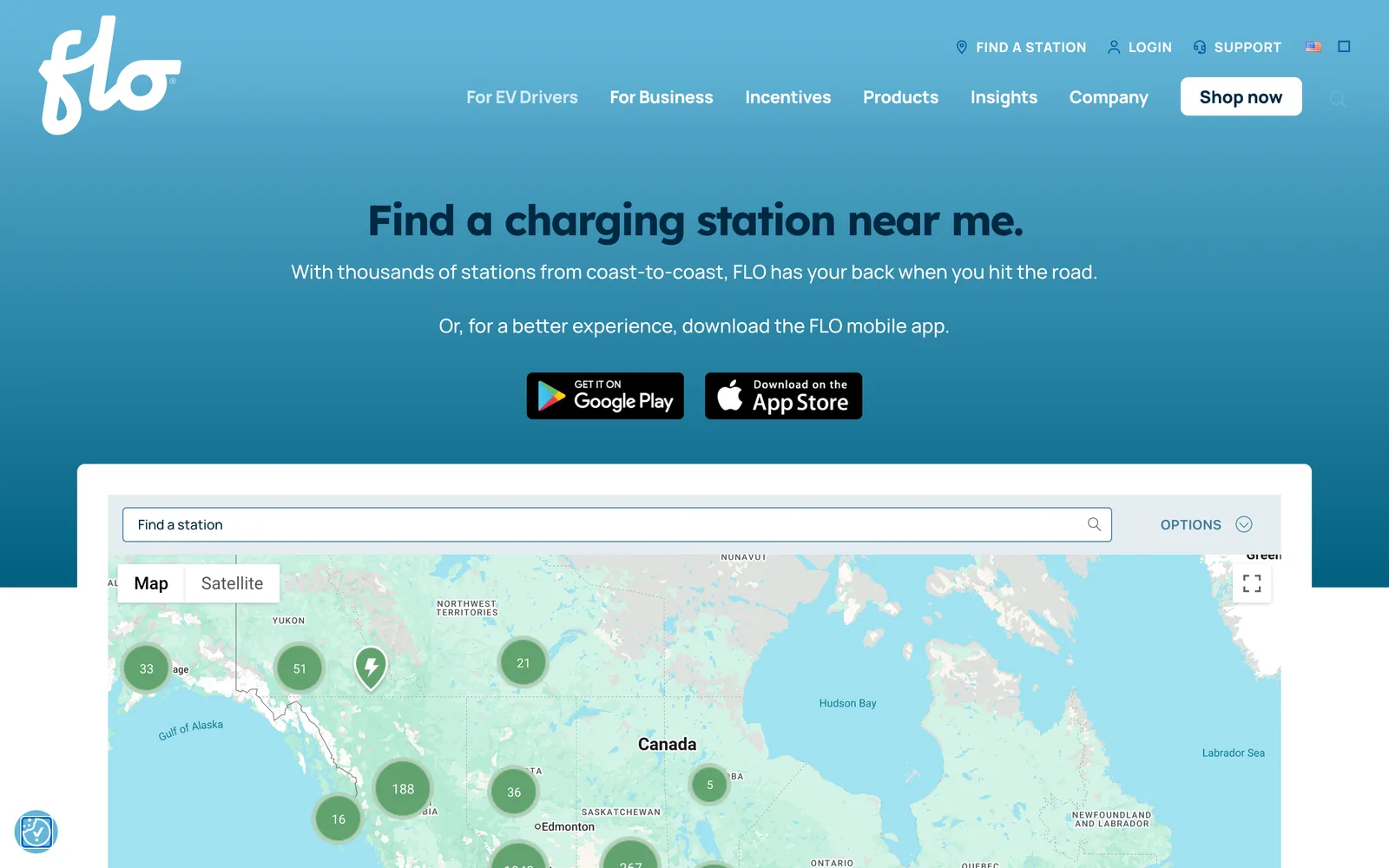
From there I designed a site structure that mapped to FLO's real audiences. Drivers, businesses (with sub-paths for property managers, dealerships, and fleet operators), and the FLO Network story all got their own surfaces. Each surface was designed for the buyer who would actually land on it, and each call to action was placed where that buyer was actually ready to engage. Wireframes were built end to end before any user interface design started so we could pressure-test the architecture against the discovery findings without getting distracted by visual decisions.
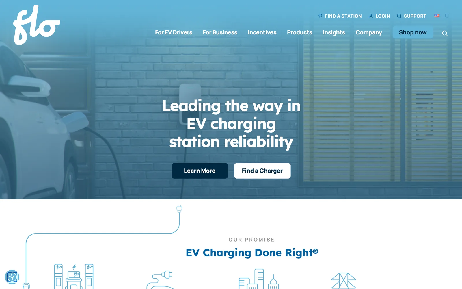
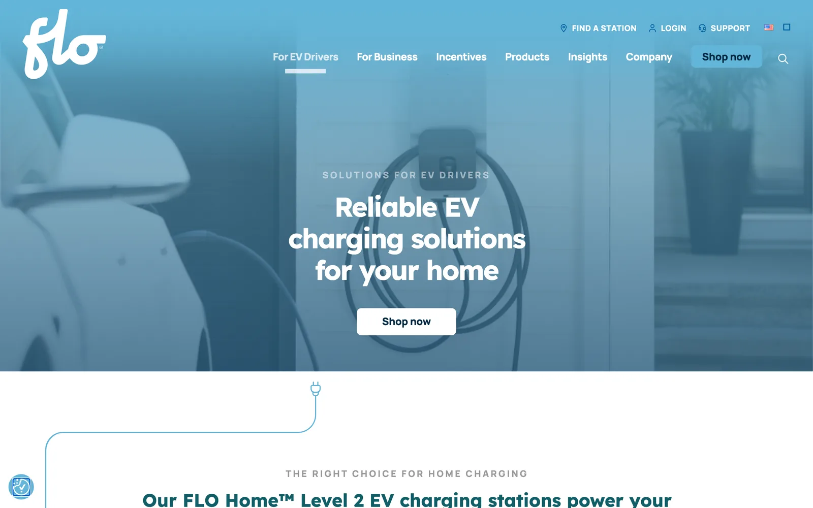
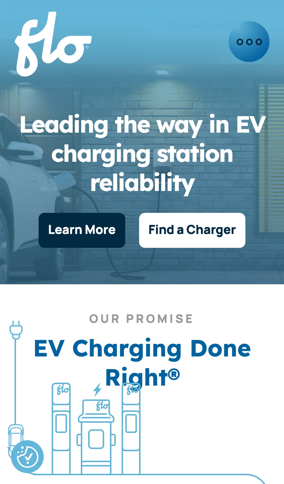
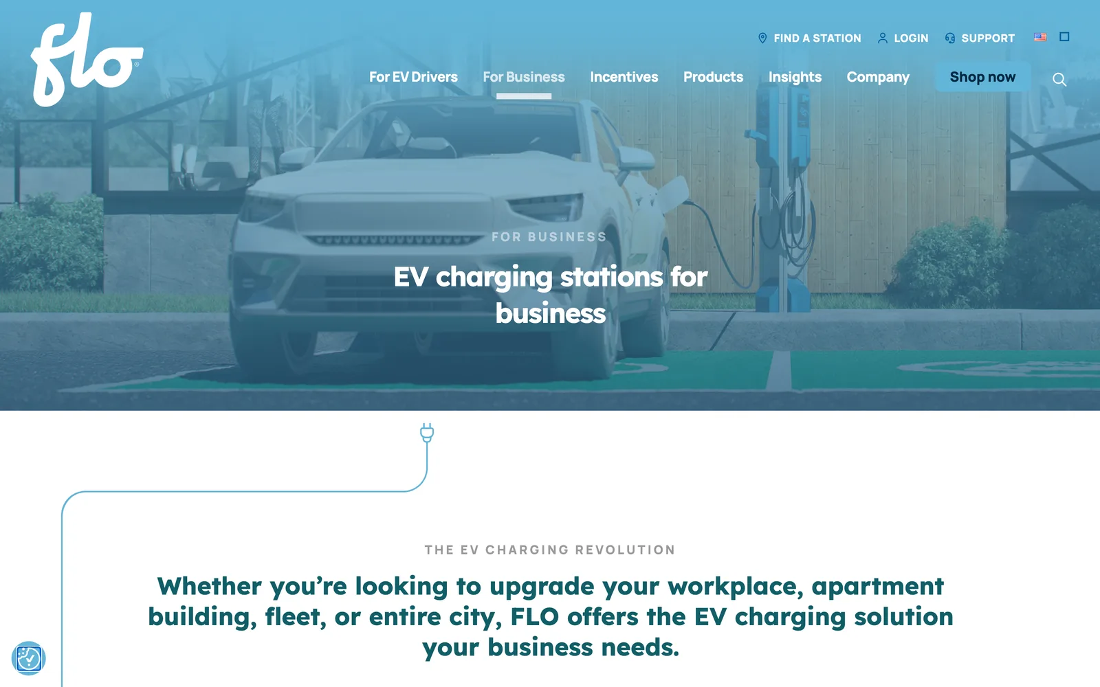
The user interface design was built around FLO's new identity. Organic shapes pulled from the hardware itself, a system that reads cinematic without losing the technical seriousness drivers and fleet operators expect, and animated cars that travel along the page as the user scrolls. Every template was designed mobile-first because most drivers land on the site from a phone in a parking lot, not a desk.
I built the platform on a custom WordPress multisite so the marketing team can manage three regional sites in two languages from a single administrative surface. Bespoke templates run every content type FLO ships, from driver content to commercial verticals, with accessibility built into the component library so new content rolls out compliant on day one rather than retrofitted later.