Skip to content
BurksUP Design

Case № 21

Real jerky.

Dick Duffs turned a family kitchen recipe into an organic beef jerky brand, with a rustic identity, a window-front package, and a custom WordPress ecommerce build that put the product directly in the customer's cart.

Client Dick Duffs
Industry Food & Beverage
Role Branding and Logo Design, Package Design
Live at dickduffs.com
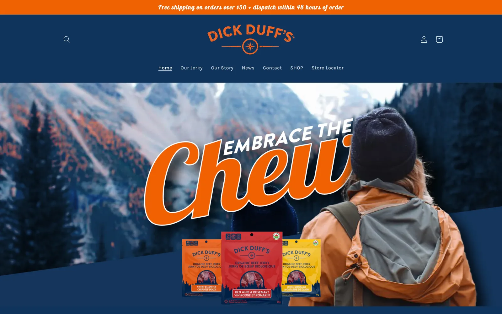
Dick Duffs hero
In short

Hot sauce brand website design and craft food ecommerce.

Hot sauce brand website design, craft jerky packaging, and small-batch food ecommerce all share a common problem. The story behind the recipe is what sells the product, but a generic site flattens that story into stock photos and templated cart pages. The Dick Duffs project was a chance to fix that for an organic beef jerky brand built around a real family recipe, real fishing and camping trips, and a customer base that was already buying the product before there was even a brand on the label.

I met Jeremy and Jonathan Anderson at a small Toronto cafe to walk through the idea. Their family friend Dick Duff had spent years in his kitchen making organic beef jerky, refining recipes, and feeding it to friends, family, and neighbours on camping trips. Demand had outgrown the kitchen, and the three of them had agreed to turn the hobby into a business.

I designed the brand, the logo, the package, and the custom WordPress ecommerce build that became the launch storefront. This case study walks through how each piece was made and why the rugged, outdoor character of the recipe was load-bearing across all of it.

Custom
WordPress and WooCommerce build responsive ecommerce
Window-front
Package design shows the product itself
Compass mark
Hand-crafted logo rustic and textured
Founder-shot
Photography library filtered into one set
01 / The Problem

What was broken.

Dick Duffs was launching as a startup with no digital presence, no brand identity, and no logo. Every customer they had at that point came from word of mouth around the founder's kitchen and a circle of friends and family. To enter the market they needed a complete brand from scratch, a package that could compete on shelf, and an ecommerce storefront that could take orders from day one. The plan was to sell primarily online at the start, so the website was not a marketing brochure, it was the actual storefront.

The category was already crowded. There were dozens of jerky brands in Canada and the United States competing on packaging, with many of them defaulting to a kraft paper aesthetic and a generic outdoor logo. The brand had to feel rooted in the real outdoor story of the founders without becoming a parody of it, and the package had to give a customer a reason to pick it up over a familiar incumbent. The risk of falling into a generic outdoor look was real, and avoiding it required a sharper visual point of view than the category default.

There was also no analytics history to design from. With an established business I would normally study traffic and shopping behaviour to inform site structure and product page design. Dick Duffs was a true blank slate, so the discovery work, the wireframes, and the conversion strategy had to lean on category research and the founders' direct knowledge of their customer rather than on past data. That is a position of trust, and it required earning the founders' confidence early in the project so the deeper creative decisions later in the process did not stall.

02 / The Approach

How it got fixed.

I started with a brand discovery exercise to get Jeremy, Jonathan, and Dick all sharing how they wanted the brand to feel. From there I gathered a wide cross-section of competing jerky packages from Canada and the United States, laid them out on a table, and walked through what was working in the category and what was not. That informed both the visual direction and the package design before any pixels moved.

The logo was the first design deliverable because every other piece (package, web, marketing) inherits from it. I produced three concepts that each spoke to a different angle of the recipe's story (nostalgia, the outdoors, simplicity) and we landed on a rustic compass mark with a textured, hand-crafted feel. That texture became a thread I wove through the rest of the brand, including the website.

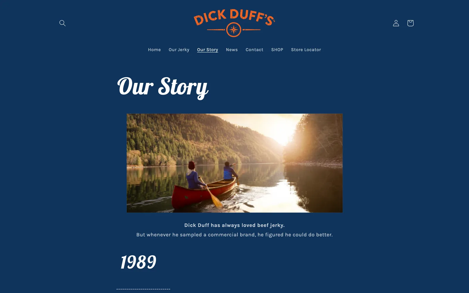
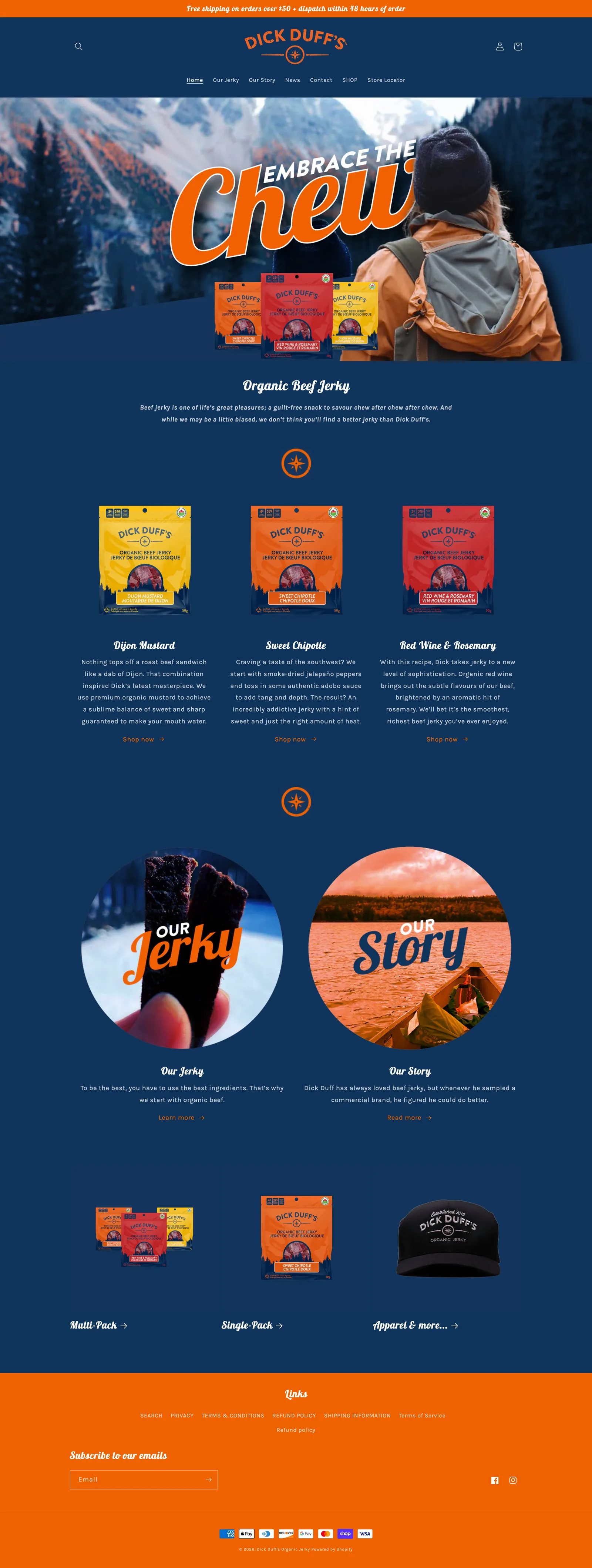
From there I built out the package design, including a transparent window that lets the raw, organic shape of the jerky sell itself, and the responsive ecommerce site on WordPress and WooCommerce. The website used outdoor photography shot by friends and family of the founders, run through a consistent set of photographic filters so the imagery read as one cohesive set rather than a collage of phone shots.

01

Brand discovery and category teardown

I ran the brand discovery questionnaire with Jeremy, Jonathan, and Dick, then laid out a physical collection of competitor jerky packages and walked through what worked and what did not. The output was a clear visual direction the trio bought into before I started designing.

02

Hand-crafted logo design

I produced three logo concepts, each tied to a different angle of the recipe's story. We landed on a rustic compass mark with a textured, hand-crafted feel that I could weave through the package, the website, and the marketing materials.

03

Window-front package design

I designed a package with a transparent window on the front so customers could see the raw, organic shape of the jerky. That decision came directly out of the competitor teardown, where almost no one was showing the product through the package.

04

Custom WordPress and WooCommerce ecommerce site

I designed the responsive site and partnered with the development team on a custom WordPress build with WooCommerce powering checkout. The product detail page and the checkout were treated as part of the brand, not a generic stack.

05

Outdoor photography direction and filter system

Many of the wilderness photographs on the site came from friends and family of the founders. I created a set of photographic filters and a consistent treatment so every shot, no matter who took it, sat together as a single cohesive visual library.

How it shipped

The work, step by step.

01

Discovery and strategy for a craft food startup

Dick Duffs joined the market with no analytics, no past site, and no list. I ran the brand discovery questionnaire with Jeremy, Jonathan, and Dick to surface how they wanted the brand to feel, then physically gathered competitor jerky packages from across Canada and the United States and laid them out as a category map. We talked through what was working visually and what was tired, and that conversation set both the package direction and the visual language of the brand.

02

Hand-crafted logo design for a rugged food brand

The logo is the cornerstone of any food brand and the one piece that almost never changes. I produced three concepts that each spoke to a different angle of the recipe's story, and we landed on a rustic compass mark with a hand-crafted, textured feel. The texture in the mark was deliberate, because it gave me a thread I could pull through the rest of the brand, the package, the photography treatment, and the website without it feeling pasted on.

03

Package design that shows the product

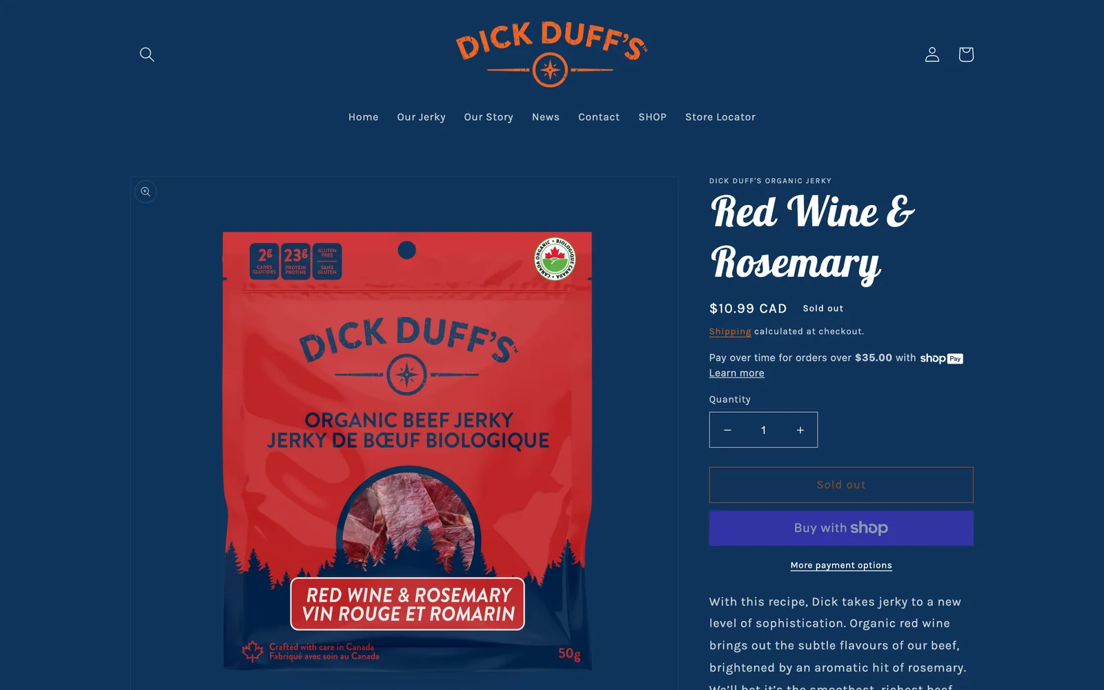
When I laid out the competitor packages during discovery, almost none of them showed the actual jerky. I designed a package with a transparent window on the front so the raw, organic shape of the jerky sells itself on the shelf. That single decision (showing the product) reinforced the rugged, hand-crafted brand position and gave Dick Duffs a clear visual differentiator without inventing a gimmick.

04

Ecommerce website design for an organic food brand

I designed the site as a full brand experience, not a templated cart. The product detail page treats the jerky like a hero, with a beautiful product shot and woodsy design elements that carry the rugged feel into the buying flow. The checkout was kept fast and reassuring, because nothing kills a small-brand purchase faster than a checkout that feels like a different website. The brand carries through every step from the homepage to the order confirmation.

05

Custom WordPress build with WooCommerce and search optimization

I worked with the development team on a custom WordPress site with WooCommerce powering ecommerce. WordPress was the right tool because the founders needed to publish blog posts, manage product inventory, and update content without coming back to a designer. We also invested in technical and on-page search optimization at launch, so a brand new business with no organic presence had a credible starting position from day one.

The Work, Specifically

What I actually shipped.

Not a services list. The real work streams, in the order I ran them.

  1. № 01

    Brand discovery and strategy

    I ran the discovery questionnaire with Jeremy, Jonathan, and Dick, and laid out a physical competitor teardown to find the white space in the category. That gave us a clear visual direction before any design work started.

  2. № 02

    Logo and identity

    I designed three logo concepts each tied to a different angle of the recipe's story, then iterated on the rustic compass mark we landed on. The textured, hand-crafted feel of the mark seeded the look of the rest of the brand.

  3. № 03

    Package design

    I designed a window-front package that shows the raw, organic shape of the jerky. The package gave Dick Duffs a real shelf differentiator and reinforced the rugged, hand-crafted brand position.

  4. № 04

    Custom WordPress and WooCommerce ecommerce site

    I designed the responsive site and partnered with the development team on a custom WordPress build with WooCommerce. The product detail page and the checkout were designed as part of the brand, not as a generic ecommerce stack.

  5. № 05

    Photography direction

    I directed a photography style and built a set of filters and treatments so the founder-shot wilderness photos and the studio product shots all read as a single visual library.

  6. № 06

    Search optimization and content training

    I made sure the site shipped with on-page metadata and technical search optimization in place at launch, and I trained the founders on the publishing workflow so they could ship new pages and products without coming back for help.

03 / The Work

What shipped.

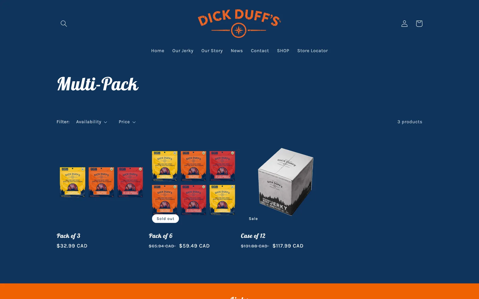
Dick Duffs in the browser, woods to wallet.

Dick Duffs in the browser, woods to wallet.

Dick Duffs, Window-front packaging that lets the product sell itself. (desktop)
Dick Duffs, Window-front packaging that lets the product sell itself. (mobile)

Window-front packaging that lets the product sell itself.

Dick Duffs — view 1
Dick Duffs — view 2
Dick Duffs — view 3

From the pack to the page to the order.

Nick takes time to identify a unique brand personality and needs instead of presenting general solutions. He responds quickly and keeps the project moving on schedule. Unlike other firms we've worked with, Nick actively collaborates and even challenges our ideas if it means creating a better end product. I would highly recommend Nick to any business in need of branding or website design services.
Jeremy Anderson Co-founder, Dick Duffs Inc.
04 / The Outcome

Where it landed.

Dick Duffs launched with a complete brand system: a rustic compass logo, window-front packaging that showed the product, a custom WordPress and WooCommerce ecommerce site, and an outdoor photography library run through a consistent filter system. The launch took a soft-launch approach, with a few quiet days on the production server to verify caching and performance before the public announcement. Once the technical checks were clean, the public launch went out and the storefront started taking orders directly.

Jeremy summed up the partnership in his testimonial: "Nick takes time to identify a unique brand personality and needs instead of presenting general solutions. Nick actively collaborates and even challenges our ideas if it means creating a better end product." That kind of working relationship was what allowed the rugged, hand-crafted character of the brand to land so cleanly across the package, the site, and the marketing. The brand never felt focus-grouped because the founders were inside the creative conversation, not waiting for slides at the end.

The site has continued to serve as the storefront for the brand and the home for the family-recipe story that started the business. The investment in technical and on-page search optimization at launch gave Dick Duffs a credible position in organic search even as a brand-new operation, and the founders were trained on the publishing workflow so they could keep adding new products and content without coming back to me for every change.

The Role
Branding and Logo Design Package Design User Experience Design Responsive Website Design Art Direction and Consulting Ecommerce Website Development Custom WordPress Development Search Optimization

Ready for your own case study?

Drop your URL. Nick will audit your site personally and build a live preview you can click through before you pay a dollar.

or write directly

Free, weekly

Site teardowns for home-service owners.

One real home-service site, broken down each week. What's leaking, what's working, the one fix that would matter most. Sent Mondays. Built for operators, not designers.

Built for home-service operators. Unsubscribe in one click.

See your free rebuild

No pressure. No upfront payment.