Skip to content
BurksUP Design

Case № 14

Real hunt.

HuntStand is North America's number one mobile app for hunting and land management. The brand and the marketing site needed to catch up to the depth of the app and the audience that depends on it.

Client HuntStand
Industry Software & Technology
Role Brand Refresh, User Experience Design
Live at www.huntstand.com
HuntStand hero
In short

Outdoor mapping app website design.

HuntStand came to me through Terrastride, the parent company that owns the app. The mobile app was already number one in its category in North America, with a deep set of mapping, scouting, and land management tools that hunters and landowners depend on in the field. The marketing site had not kept up.

The engagement covered three things at once. A digital brand refresh that pulled the look and feel up to where the app already lived. A complete custom WordPress website rebuild that gave the team direct control over content, advertising, and search. And a user experience audit on the mobile app itself, which I ran during hunting season so I could test the tools where they were actually used. The output of the audit was a phased improvement plan the Terrastride development team could ship alongside their own roadmap rather than as a separate rebuild.

This case study walks through how the brand was refreshed, how the site was rebuilt, and how the work tied together a marketing site, a media archive, and a mobile app under one coherent brand.

Three
Audiences casual, pro, info seeker
Custom
WordPress build modular blocks
Field Notes
Media archive on the main domain
App audit
Phased plan ran during season
01 / The Problem

What was broken.

The first challenge was that the brand was reading smaller than the app. HuntStand was the number one app in its category, with a passionate community of hunters and land managers who treated it as part of their season. The marketing site looked like a generic mobile app marketing site. Stakeholders inside Terrastride wanted a brand experience that finally matched the depth of what the app could do.

The second was the audience mix. HuntStand has casual users (people who download the app for one season and use it lightly), pro users (subscribers who depend on the advanced mapping, weather, and land management tools), and information seekers (people who land on the site looking for hunting and land management content rather than a download). Each of these audiences needs a different conversation, but the previous site collapsed all three into a single download story.

The third was the media archive. HuntStand had years of high-quality content for hunters and land managers (the team eventually rebranded the archive as Field Notes), and the previous setup had it living on an external source. That meant search authority was bleeding away from the main domain and the app and the content were not reinforcing each other. The rebuild had to bring all of that under one roof.

02 / The Approach

How it got fixed.

I started with discovery. Web analytics from the existing site, stakeholder interviews with the technical and marketing teams at Terrastride, and a deep look at how the user base was actually engaging with the app and the content. The goal was to understand the casual users, the pro users, and the information seekers as three different audiences and design the site so each found their own way in.

From there I refreshed the digital brand. New typographic system, a more confident color treatment that holds up against the high-stakes outdoor imagery the brand uses, and a custom icon library so the brand has visual signals it owns instead of borrowing them from generic outdoor brands. The system was designed so it could carry across the marketing site, the mobile app, paid advertising, and the sales material the team uses with partners.

I ran a user experience audit on the mobile app during hunting season so I could use the tools the way real users do. The output was a phased improvement plan the Terrastride development team could ship alongside their own roadmap, with core elements from the new website design pulled into the app so the brand reads coherent across both surfaces.

The site was rebuilt on custom WordPress with Advanced Custom Fields running the templates, integrated managed advertising surfaces so the site contributes revenue, and a search foundation built to absorb the years of content from the external media archive that became Field Notes.


01

Discovery and audience mapping

I dug into the analytics, ran stakeholder interviews with the Terrastride technical and marketing teams, and mapped the three real audiences (casual users, pro users, information seekers) so each could be designed for separately.

02

Digital brand refresh

I rebuilt the visual system around a more confident typographic pairing, a color treatment that holds up against high-stakes outdoor imagery, and a custom icon library that gives HuntStand visual signals it owns rather than borrowing from generic outdoor brands.

03

Custom WordPress publishing tool

I built HuntStand on a custom WordPress install with Advanced Custom Fields running the templates. Modular blocks the marketing team can run themselves, integrated managed advertising surfaces, and direct control over per-page search optimization.

04

Field Notes media archive consolidation

I pulled HuntStand's content archive (Field Notes) onto the main domain so search authority stays with HuntStand and the content reinforces the app. Years of high-value hunting and land management content now live where they support the rest of the brand instead of competing with it.

05

Mobile app user experience audit

I ran a user experience audit on the mobile app during hunting season so I could use the tools the way real users do. The output was a phased improvement plan the Terrastride development team could ship alongside their own roadmap, with core elements from the new website pulled into the app for visual continuity.

How it shipped

The work, step by step.

01

Brand refresh for an outdoor mapping app

Outdoor brands have a clichu00e9 problem. Most of them lean on the same camo-and-orange visual language, and the differences between brands disappear in the search results. I designed the HuntStand refresh to lean on the photography and the editorial voice the team had earned in the community, rather than on category clichu00e9s. The typographic system, the color treatment, and the custom icon library were all designed so the brand reads premium without losing the rugged credibility the audience expects.

02

User experience design for three audiences

The previous site collapsed casual users, pro users, and information seekers into one download story. I designed the new architecture so each audience finds their own conversation. Casual users get a clear product story and an easy path to the app stores. Pro users get a deeper product page with the mapping, weather, and land management tools that justify a subscription. Information seekers land on Field Notes, the media archive, and find years of high-value content that gives them a reason to come back and eventually convert into app users.

03

Custom WordPress development with managed advertising

I built HuntStand on a custom WordPress install with Advanced Custom Fields running the templates. The marketing team gets modular blocks they can run themselves. Managed advertising was integrated into the publishing tool so the team can place advertising surfaces without touching templates, and per-page search optimization controls are built into the publishing experience so every new page ships with the metadata, schema, and structure it needs to rank.

04

Field Notes media archive on the main domain

HuntStand's content archive had been living on an external domain, which meant the search authority was bleeding away from the main brand. I pulled the archive onto the main domain as Field Notes, which is now the editorial spine of the site. Years of high-value hunting and land management content live where they reinforce the app and the brand rather than competing with them, and the architecture was designed so the archive can keep growing without the search foundation falling behind.

05

Mobile app user experience audit and phased improvement plan

I ran the user experience audit on the mobile app during hunting season so I could use the tools where they were actually used. The output was a phased improvement plan the Terrastride development team could ship alongside their own product roadmap. Core elements from the new website design were pulled into the app so the brand reads coherent across both surfaces, and the improvements were sequenced so they could ship without forcing a full app rebuild.

06

Sales and partner material for an outdoor app brand

HuntStand sells through partnerships, sponsorships, and direct customer acquisition at the same time, and the marketing material had to support all three. I extended the refreshed brand into display advertising templates, content-rich email layouts, and sales presentation templates the team could adapt for individual pitches. The system is designed so a sales team member can build a custom presentation in minutes rather than starting from blank slides every time, and the brand reads coherent whether the customer encounters it through paid social, an email campaign, or a partner conversation.

The Work, Specifically

What I actually shipped.

Not a services list. The real work streams, in the order I ran them.

  1. № 01

    Discovery and audience mapping

    Analytics review, stakeholder interviews with the Terrastride technical and marketing teams, and a clear definition of the three real audiences (casual, pro, information seeker) so each could be designed for separately.

  2. № 02

    Digital brand refresh

    A more confident typographic system, a color treatment that holds up against the brand photography, and a custom icon library that gives HuntStand visual signals it owns. Designed to scale across the site, the app, paid advertising, and partner sales material.

  3. № 03

    User experience design

    Architecture that gives casual users, pro users, and information seekers each their own conversation. Wireframes pressure-tested against the discovery findings before any user interface design started.

  4. № 04

    Custom WordPress build

    A custom template system on Advanced Custom Fields with modular blocks the marketing team can run themselves. Managed advertising integrated into the publishing tool, per-page search controls built into the editor.

  5. № 05

    Field Notes media archive on the main domain

    Years of editorial content pulled onto the main domain as Field Notes. The architecture was designed so the archive can keep growing without the search foundation falling behind.

  6. № 06

    Mobile app user experience audit

    An audit run during hunting season with the tools used in the field, turned into a phased improvement plan the Terrastride development team could ship alongside their own roadmap. Core elements from the new site pulled into the app for visual continuity.

03 / The Work

What shipped.

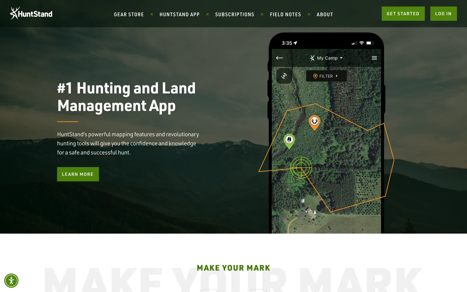
The HuntStand homepage, post-refresh.

The HuntStand homepage, post-refresh.

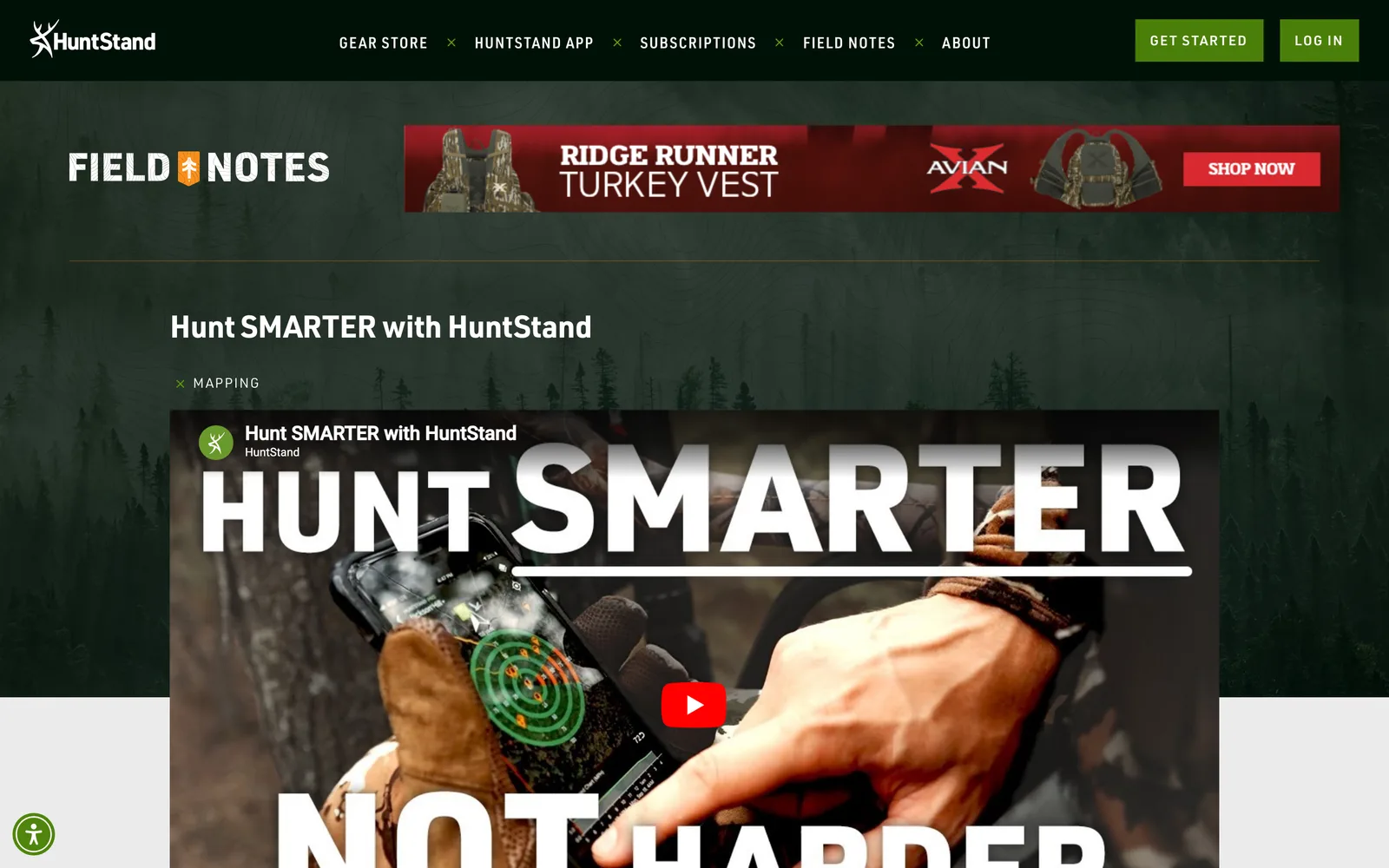
HuntStand, Field Notes editorial spine on the main domain. (desktop)
HuntStand, Field Notes editorial spine on the main domain. (mobile)

Field Notes editorial spine on the main domain.

HuntStand — view 1
HuntStand — view 2
HuntStand — view 3

Across the app, the marketing, the membership.

Nick refreshed our brand, redesigned our website from the ground up, and ran a user experience audit on our mobile application that turned into a phased improvement plan. The new site lifted the brand, gave our marketing team direct control through a custom publishing tool, and pulled our media archive (Field Notes) into a single place that supports our app instead of competing with it. The team has been a real partner from discovery through launch and beyond.
HuntStand Marketing Team Marketing Leadership, Terrastride / HuntStand
04 / The Outcome

Where it landed.

HuntStand launched the brand refresh, the new website, and the audit-driven app improvement plan together, and the work has held up at scale. The marketing team flagged that the site lifted the brand to where it belonged, gave them direct control through a custom publishing tool, and pulled the media archive into a single place that supports the app instead of competing with it.

The audience-first architecture means a casual user, a pro user, and an information seeker each land on a page that speaks their language. The Field Notes archive on the main domain has consolidated years of editorial authority into one place, and the publishing tool keeps producing without a developer in the loop. The phased app improvement plan let the Terrastride development team ship user experience updates alongside their own roadmap rather than as a separate rebuild.

The partnership extended past the website launch into the mobile application work, the broader marketing materials (display advertising, content-rich email, sales presentations), and the ongoing content strategy. HuntStand has the marketing infrastructure to compete at the scale the app already operates at.

The Role
Brand Refresh User Experience Design Site Structure & Strategy Responsive Website Design Custom WordPress Development Search Optimization

Ready for your own case study?

Drop your URL. Nick will audit your site personally and build a live preview you can click through before you pay a dollar.

or write directly

Free, weekly

Site teardowns for home-service owners.

One real home-service site, broken down each week. What's leaking, what's working, the one fix that would matter most. Sent Mondays. Built for operators, not designers.

Built for home-service operators. Unsubscribe in one click.

See your free rebuild

No pressure. No upfront payment.