I started with the naming. A working week of options with the leadership team, narrowing toward names that honored both sub-brand legacies without favoring one over the other. The team fell in love with Workbench Energy, and the work moved quickly from there.
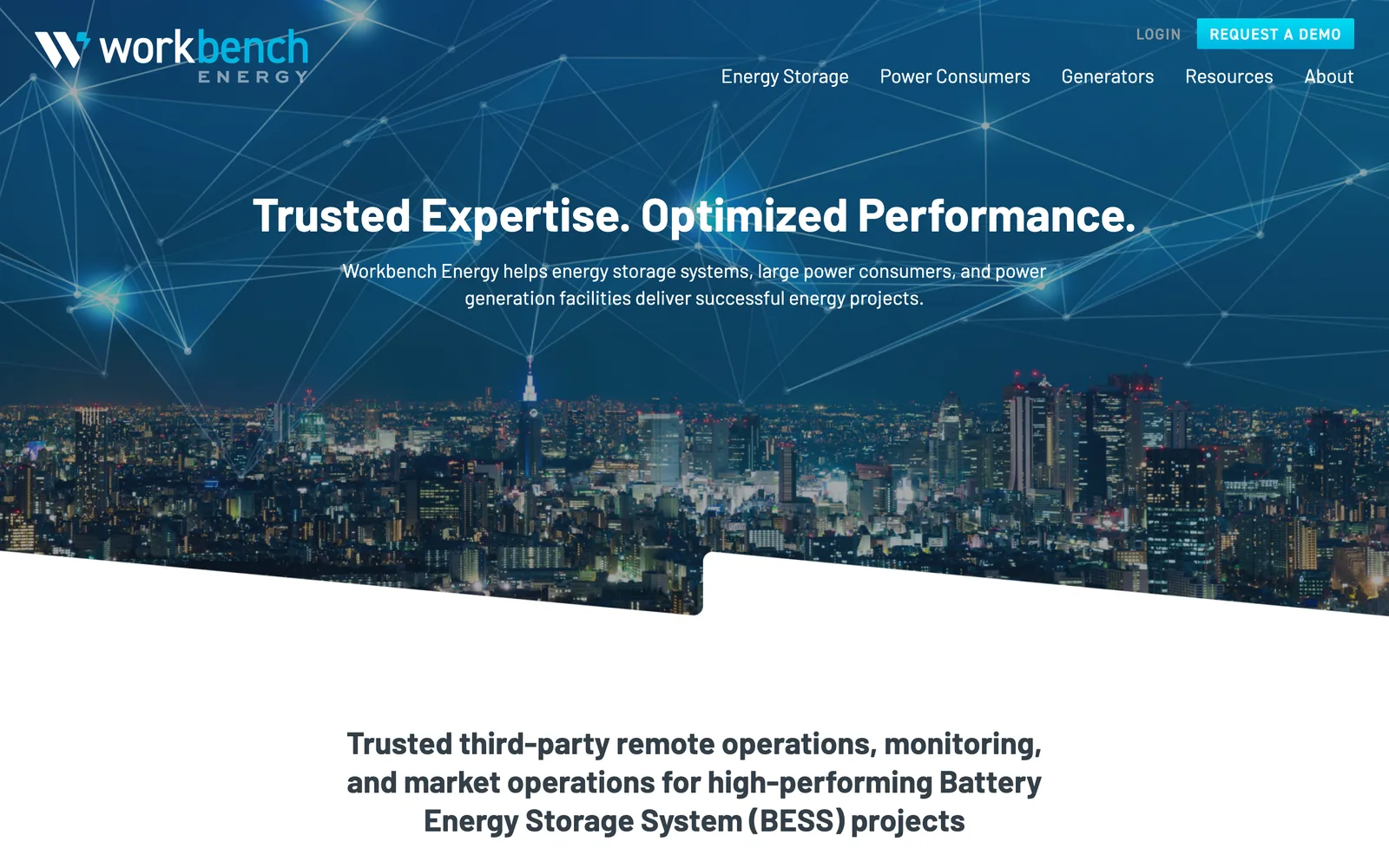
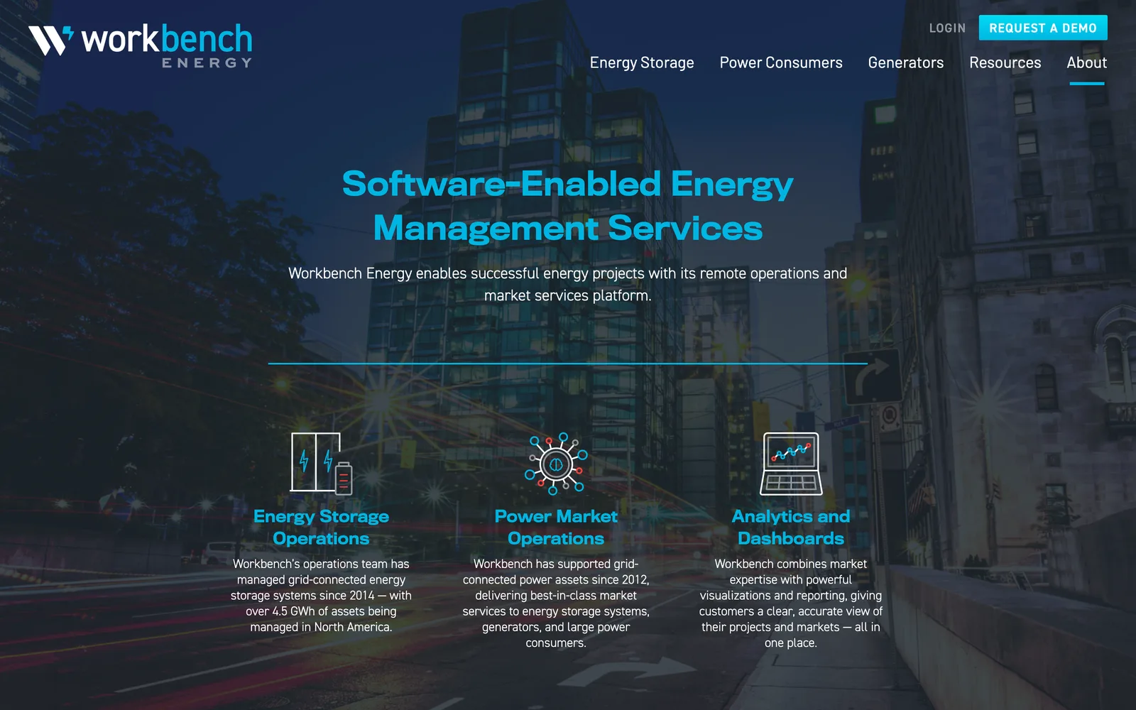
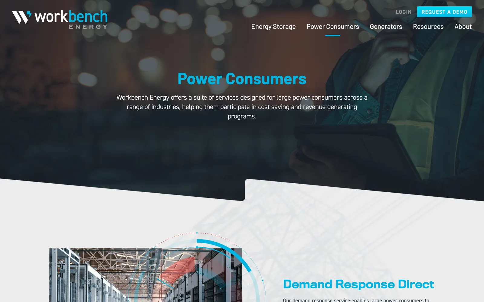
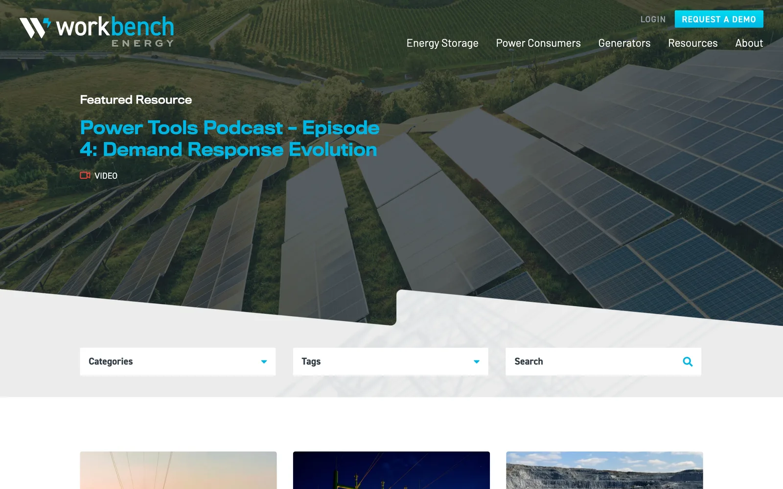
From there I designed the logo and brand system. The new parent logo set the tone, and I reapplied the design system and color palette to NRG Peaks and the original Workbench so all three entities lived under one umbrella. The system was designed to scale across business systems (cards, letterheads), reports and whitepaper templates, the digital pitch deck, and the website itself. The pitch deck got particular attention because the team needed to spin up presentations quickly without redrawing everything for each one.
The site was built on a custom WordPress install with fifteen bespoke page layouts, an online energy calculator integrated into the platform so prospects could engage with the tooling directly, and a publishing tool tuned for the marketing team's day-to-day. The site launched alongside the merger announcement, which meant deployment had to be tight. We staged the build, ran a soft launch in the wild for a couple of days, and rolled out to the public on launch day with the brand, the calculator, and the new positioning all landing at the same time.