Skip to content
BurksUP Design

Case № 09

Real experiences.

An award-winning experience-design firm that has shaped theme parks, attractions, and museums on six continents, rebuilt as a multilingual project portfolio that holds up to the work it represents.

Client FORREC
Industry Media & Lifestyle
Role User Experience Design, Site Structure & Navigation
Live at forrec.com
FORREC hero
In short

Experience design firm website.

FORREC is one of the most respected experience-design firms in the world. Their portfolio includes theme parks, attractions, retail experiences, museums, and large-scale destinations across six continents. When Samara Wolofsky and her team brought me in, FORREC had just completed a brand evolution and the existing website was no longer carrying the new identity. They needed a project portfolio that earned the work it represented, on a publishing platform their communications team could run, in three languages (English, French, and simplified Chinese) so the firm could reach North American, European, and Asian markets without parallel sites drifting out of sync.

I led user experience, site structure, the responsive interface, the custom WordPress publishing platform, the multilingual architecture, accessibility compliance, and the technical search optimization. The work shipped on time and on budget against a brief that had no room to slip, and the result is a sleek, clean, professional-looking website that speaks to the firm's motto of Inspiration at Work (Samara's words, not mine).

This case study walks through the strategy, the moves, and the choices that let the rebuild ship on time and become the foundation for FORREC's communications work.

0
Continents of work represented in the portfolio
0
Languages English, French, Chinese
On time
On budget shipped against a fixed schedule
Accessibility
Built in checked from the first wireframe
01 / The Problem

What was broken.

FORREC had outgrown a site that was built for the previous version of the firm. The brand evolution had locked a new identity, and the existing website could not carry it. Project pages were thin where the work deserved depth, the navigation had drifted as new service categories were added, and the site map did not match the way an experience-design firm actually wins business (which is portfolio-first, service-second). Visitors arriving from a referral or a search engine landed on a homepage that did not point them at the work, and the work was the reason they had come.

Samara and her team set three priorities for the rebuild. The user experience had to put the project portfolio at the centre, with every project page earning the work it represented through narrative depth, gallery treatment, and credit listings that named the team and the partners behind each destination. The publishing platform had to support three languages (English, French, and simplified Chinese) without forcing the communications team to maintain three independent sites that drift apart over time. And the rebuild had to ship on a schedule that did not flex, because Samara was carrying it through a calendar with hard external commitments tied to client announcements and industry events.

There was also an accessibility requirement. FORREC works on public-facing destinations that have to welcome visitors with a wide range of abilities, and the firm's own website needed to model the accessibility standards the firm preaches in its work. That meant focus states, contrast, alternative text, semantic structure, and keyboard navigation had to be designed in from the first wireframe rather than retrofitted at the end.

02 / The Approach

How it got fixed.

I started in the analytics. Before any wireframes were drawn, I pulled apart the historical visitor data on the legacy site and looked for the actual paths visitors took, the actual technology they used, and the actual content they got stuck on. The honest answer was that visitors came for the projects and bounced when the project pages did not earn the visit. That observation became the spine of the rebuild, and it is the reason every other decision rolled out from the project page first.

From there I worked outward into the new site map. I rebuilt navigation around three primary visitor jobs: see the work, learn what FORREC does, and get in touch. Service pages support the project portfolio rather than the other way around. The firm's about pages and team content sit behind the work because that is the order visitors actually move in, and forcing visitors through a service page before they reach a project would only repeat the bounce pattern the legacy site had built up.

I then designed the responsive interface, paying particular attention to image performance because the work is the website. Modern image formats, intentional cropping, lazy-loaded gallery assets, and a project template that holds up on a phone in low signal are all design decisions, not just technical ones. I built the multilingual architecture as a single publishing platform with three language layers rather than three independent sites, ran the templates against accessibility standards from the first wireframe, and shipped a search optimization layer that respects each language's own search intent. The Chinese-language version takes the differences in typography, line height, and reading patterns seriously rather than assuming the English layout will carry over.

01

Started the rebuild in the analytics

I pulled apart the legacy site's visitor data and surfaced the honest answer: visitors came for the projects and bounced when the project pages did not earn the visit. That observation set the priority for every downstream decision.

02

Rebuilt navigation around the project portfolio

See the work, learn what FORREC does, get in touch. Services support the projects, not the other way around. About and team content sit behind the work because that is the order visitors actually move in.

03

Designed for image performance

When the work is the website, the project pages have to be fast. I shipped modern image formats, intentional cropping, and a project template that loads heavy assets on demand so a portfolio piece does not punish a phone visitor.

04

Built the multilingual architecture as one platform

English, French, and simplified Chinese share a single publishing platform with language layers rather than three independent sites. The communications team updates a project once and the language structure handles the rest.

05

Held the rebuild to the brand and the schedule

Samara needed the rebuild on time and on budget against a calendar that had no room to slip. I designed the project around that constraint, kept the creative track and the development track moving in parallel, and shipped against the brand standards FORREC's branding partner had locked.

How it shipped

The work, step by step.

01

Experience design firm website built around the portfolio

The project page is the atom of the FORREC website. I designed it first (hero asset, project narrative, role and scope, gallery, related projects, contact prompt) and worked outward to the service pages, the about pages, and the homepage. Every other template inherits decisions from the project page because that is what visitors come to see.

02

User experience design for a creative agency website

Visitors to a creative-agency website are usually one of three people: a prospect evaluating fit, a peer studying the work, or a candidate considering the firm. The site map is designed to serve all three from the same content with different entry points. Prospects move from a project to a service to a contact form, peers move from a project to related projects, and candidates move from the work to the team. One portfolio, three paths.

03

Multilingual website design for North American, European, and Asian markets

FORREC works in English, French, and simplified Chinese. I designed the publishing platform as a single site with language layers rather than three independent sites that drift apart. The communications team updates a project record once, the language structure handles routing, and the typographic system is built to hold all three scripts without breaking the layout. Asian-market support draws on prior multilingual work I have done that takes the differences in Chinese typography and reading patterns seriously.

04

Custom WordPress development with accessibility compliance built in

I built the publishing platform on WordPress so the communications team can manage the portfolio without involving a developer. Every template was checked against accessibility standards from the first wireframe, including focus states, contrast, alternative text, semantic structure, and keyboard navigation. The firm's own website should model the accessibility the firm preaches, and this one does.

05

Search optimization for an experience-design firm in three languages

Each language has its own search intent. The English version of a project page targets English-language search. The French version targets French-language search. The Chinese version respects search behaviour in markets where Google is not the dominant engine. Every project, service, and about page ships with per-language metadata so search engines can cite the right page in the right language.

The Work, Specifically

What I actually shipped.

Not a services list. The real work streams, in the order I ran them.

  1. № 01

    Discovery and analytics review

    I pulled apart the legacy site's visitor data, surfaced the honest paths visitors took, and used the findings as the spine of the new site structure.

  2. № 02

    Site structure and user experience

    I rebuilt the site map around see the work, learn what FORREC does, and get in touch. The project page was designed first, then services, then about, then the homepage.

  3. № 03

    Responsive interface design

    I designed the desktop, tablet, and mobile interface for the homepage, project, service, and about templates. The system holds the brand evolution the firm's branding partner had locked.

  4. № 04

    Custom WordPress publishing platform

    One canonical project record, one canonical service record, one canonical team record. The public pages generate from those, in any of three languages, on a single publishing platform.

  5. № 05

    Multilingual architecture and accessibility compliance

    English, French, and simplified Chinese on a single publishing platform with language layers. Every template was checked against accessibility standards from the first wireframe, including focus states, contrast, alternative text, and keyboard navigation.

  6. № 06

    Search optimization and team training

    Per-language metadata, redirects from legacy URLs, and a hand-off training so the communications team can publish projects in any language without involving a developer.

03 / The Work

What shipped.

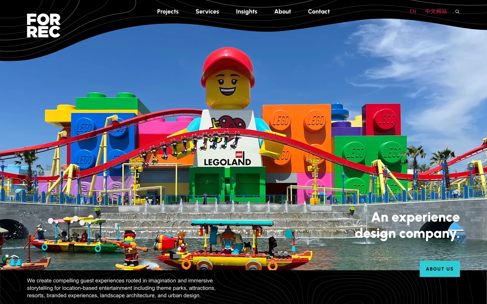
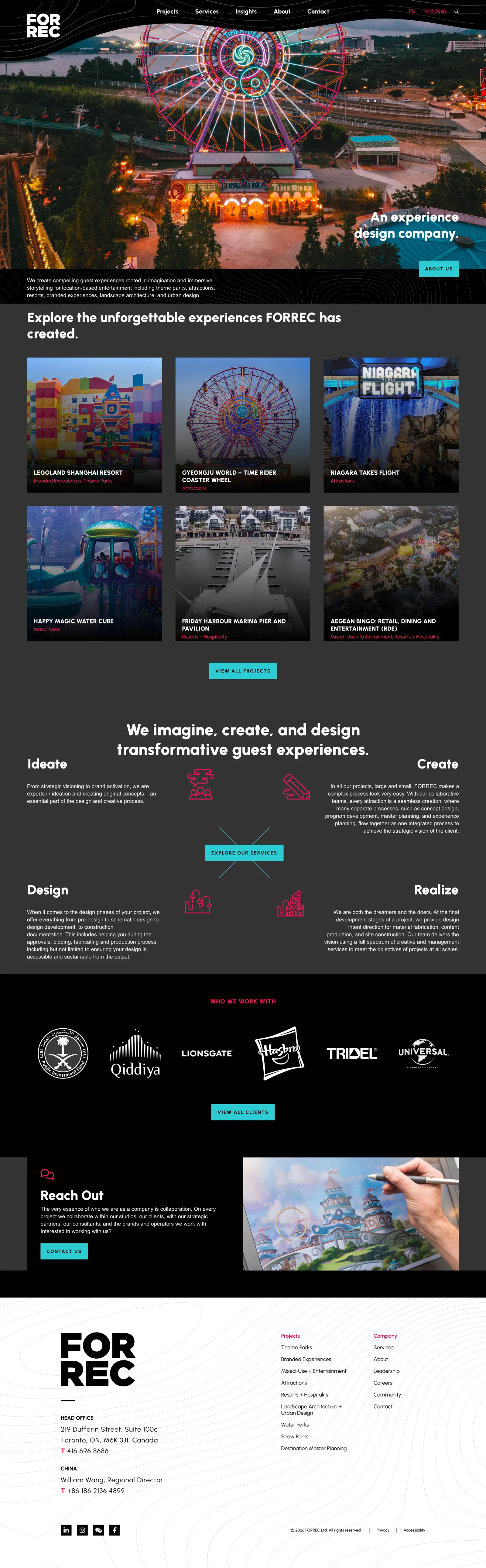
The FORREC homepage at full scroll.

The FORREC homepage at full scroll.

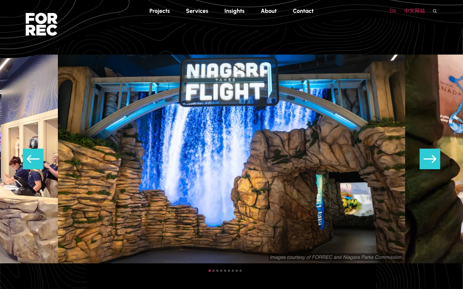
FORREC, Project portfolio template on mobile. (desktop)
FORREC, Project portfolio template on mobile. (mobile)

Project portfolio template on mobile.

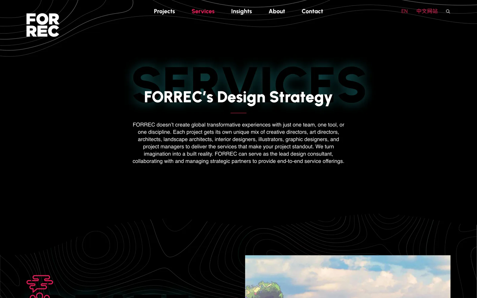
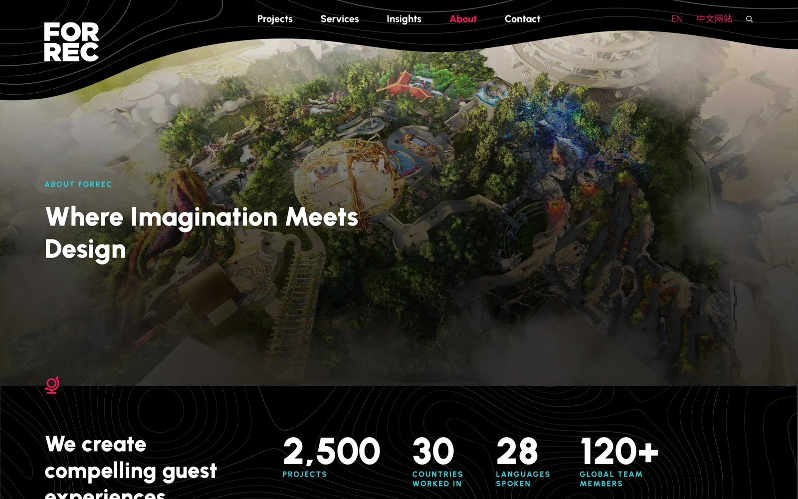
FORREC — view 1
FORREC — view 2
FORREC — view 3

From the work, the offerings, the people behind it.

It's exciting working with other professionals in the design industry as it's an opportunity to collaborate and get creative to the max. Nick did a great job capturing the new brand identity for our new website: it's sleek and clean, professional-looking, and really speaks to our motto of Inspiration at Work. Nick was incredibly responsive, kept the project on schedule and in-budget, and overall was a great partner to work with.
Samara Wolofsky Communications Manager, FORREC
04 / The Outcome

Where it landed.

The rebuild shipped on time and on budget. The new site holds the brand evolution that the firm's branding partner had locked, carries the project portfolio at the level the work deserves, and runs in three languages on a single publishing platform that the communications team has been managing on its own ever since launch. Project pages can be added in any of the three languages without designer support, and the language structure handles routing so search engines and visitors land on the right version automatically.

Samara Wolofsky, the Communications Manager who carried the project on the FORREC side, called the work sleek, clean, professional-looking, and a real expression of the firm's motto of Inspiration at Work. She also called out the responsiveness, the schedule discipline, and the budget discipline that carried the project from kick-off to launch. From my side, the outcome that mattered most is that the firm's own website now meets the standard the firm holds its client work to.

The deeper outcome is what the platform unlocks. New project case studies can be added in any of three languages without designer support. Service pages can grow with the firm as new disciplines are added to the practice. Accessibility is no longer an afterthought, which means visitors of any ability can experience the portfolio the way the firm intends. And the portfolio that is the front door of the business finally has a publishing platform that earns the visit.

The Role
User Experience Design Site Structure & Navigation Responsive Website Design Custom WordPress Development Multilingual Site Architecture Accessibility Compliance Search Optimization Art Direction & Consulting

Ready for your own case study?

Drop your URL. Nick will audit your site personally and build a live preview you can click through before you pay a dollar.

or write directly

Free, weekly

Site teardowns for home-service owners.

One real home-service site, broken down each week. What's leaking, what's working, the one fix that would matter most. Sent Mondays. Built for operators, not designers.

Built for home-service operators. Unsubscribe in one click.

See your free rebuild

No pressure. No upfront payment.