Skip to content
BurksUP Design

Case № 10

Real road.

Canada's national recreational vehicle association, rebuilt around the lifestyle visitors actually want and the dealer locator, trip planner, and matchmaker tools that turn inspiration into a Canadian road trip.

Client Go RVing Canada
Industry Media & Lifestyle
Role Digital Branding, User Experience Design
Live at gorving.ca
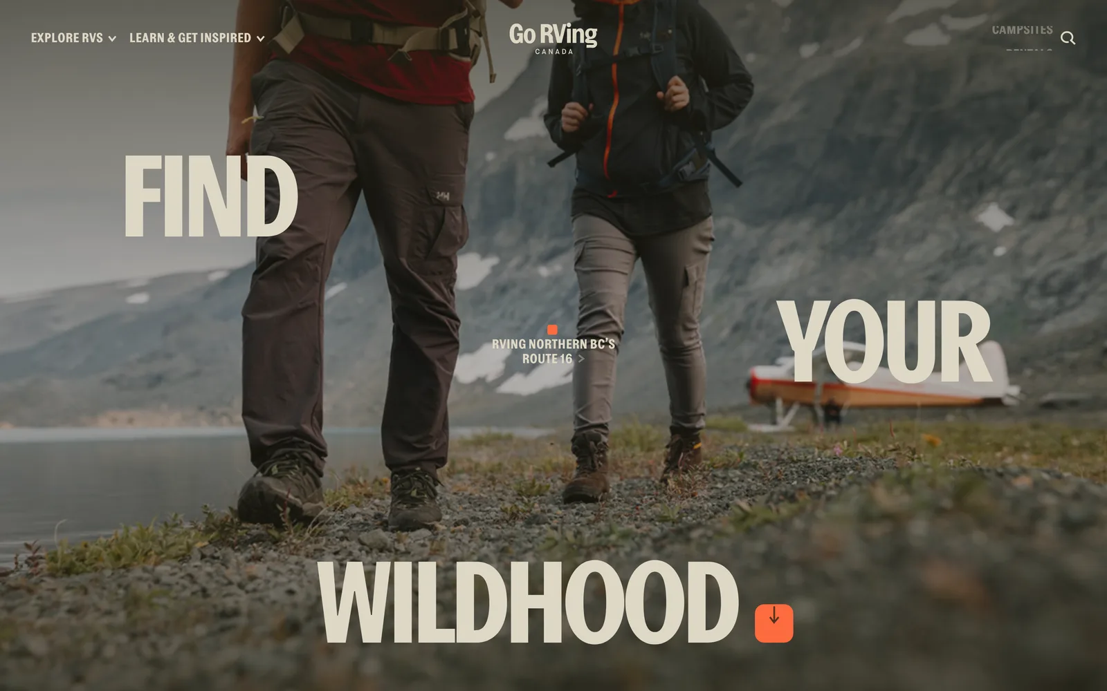
Go RVing Canada hero
In short

Travel association website design.

Go RVing Canada is the national association that represents the Canadian recreational vehicle industry. The audience is split between Canadians dreaming about their next coast-to-coast trip and Canadians ready to rent or buy a recreational vehicle from a member dealer. When Cyrus Irani, the Director of Digital Strategy, brought me in, the existing website was carrying the dealer-network side of the business well but leaving the lifestyle audience at the door. Visitors arriving from a search engine landed on a dealer list and bounced.

I led digital branding, user experience, site structure, the responsive interface, the custom WordPress publishing platform, the bilingual architecture (English and French on a multisite), the integrated trip mapping pulled from a headless content tool, and the technical search optimization. I also designed and shipped the interactive tools that became the centre of the rebuild: the recreational vehicle Matchmaker, the recreational vehicle Comparison Tool, the Affordability Calculator, the Trip Planner, and the dealer locator that connects all of them back to the member network.

This case study walks through how the project shipped on time and on budget, what the strategy was, and why the redesign moved the numbers Cyrus cares about.

+18-20%
Key indicators early post-launch lift
~50%
Component lift enhanced features post-launch
0
Languages English and French multisite
0
Interactive tools Matchmaker, Comparison, Calculator, Trip Planner
01 / The Problem

What was broken.

Go RVing Canada had a marketing problem the old site had quietly built into itself. The website was originally designed to send qualified leads to member dealers, and it did that job, but it did it at the cost of the lifestyle audience. Visitors arriving for inspiration (where to go, what to bring, what kind of vehicle fits a family of four) ran into a dealer list before they ran into the lifestyle. The dealers got the leads, but the marketing team could not grow the audience because the audience kept bouncing. The search-engine footprint reflected the same imbalance: the site was ranking on transactional terms but losing the lifestyle searches that should have been bringing new visitors in.

Cyrus and his team set three priorities for the rebuild. The user experience had to put the lifestyle at the centre, with curated stories, celebrity trips, and trip-planning resources leading visitors into the conversion funnel rather than ambushing them with a dealer page. Stakeholders still had to see their dealer-locator and lead-generation numbers go up because the member network is what funds the association, and the rebuild could not be allowed to weaken the dealer side of the business in pursuit of audience growth. And the rebuild had to ship in two languages (English and French) on a single publishing platform that the marketing team could run, because Go RVing Canada serves Canadians from coast to coast and the French-speaking audience is a core part of the brand.

There was also a context I want to name. The rebuild ran during a season when domestic travel was the only travel for a lot of Canadians. The lifestyle the brand sells (freedom, the road, the country) was suddenly more relevant than ever, and the website had to meet that moment without overpromising or feeling tone-deaf. The editorial direction needed to honour the moment without exploiting it, and the dealer locator had to be ready for visitors whose interest had genuinely moved from idle browsing to active planning.

02 / The Approach

How it got fixed.

I started where the project actually had to win: in the discovery phase. I pulled apart the legacy site's analytics, ran competitor analysis against the obvious peers, and crawled the existing site to understand its search-engine footprint. The honest answer was that the site was ranking for terms related to dealers and rentals but losing visitors at the door because the experience did not match the search intent. Visitors searching for a road trip wanted a road trip, not a dealer list.

From there I rebuilt the site map around three primary visitor jobs. Find inspiration for a trip, learn what kind of recreational vehicle fits the family, and locate the nearest dealer when ready. Stakeholder pages and dealer content sit behind those three because that is the order visitors actually move in. The change does not weaken the dealer side of the business. It strengthens it by feeding qualified, primed visitors into the locator instead of ambushing strangers with it.

I then designed the responsive interface mobile-first, built the bilingual architecture as a single WordPress publishing platform with English and French as language layers, and shipped the interactive tools that turn the lifestyle promise into a planned trip. The Matchmaker, the Comparison Tool, the Affordability Calculator, and the Trip Planner all connect back to the dealer locator so the marketing funnel and the dealer funnel finally point in the same direction.

01

Started in the analytics and the search footprint

I pulled apart visitor data, competitor data, and the legacy search-engine footprint and surfaced the honest answer: visitors searching for a road trip wanted a road trip, not a dealer list. That observation set the priority for every downstream decision.

02

Rebuilt navigation around the lifestyle, not the dealer list

Find inspiration for a trip, learn what kind of recreational vehicle fits the family, and locate the nearest dealer when ready. The dealer locator still gets the qualified leads. It just gets them from primed visitors instead of cold ones.

03

Shipped a recreational vehicle Matchmaker and Comparison Tool

The Matchmaker is a conversational quiz that turns family lifestyle questions into a recommended vehicle category, and the Comparison Tool lets visitors put two recreational vehicles side by side. Both feed primed visitors into the dealer locator at the right moment.

04

Shipped a Trip Planner integrated with a headless content tool

The Trip Planner is a custom interactive built on the WordPress publishing platform with route data and curated trip guides pulled from a headless content tool. Visitors browse curated coast-to-coast trips, customize them, and end at a dealer or campground locator.

05

Built the bilingual platform as a single publishing tool

English and French run on one WordPress multisite. The marketing team manages two languages without maintaining two separate sites, and the language structure handles routing without forcing duplicate content fights with search engines.

How it shipped

The work, step by step.

01

Travel association website design built around the lifestyle

Most travel-association websites are dealer directories with content marketing applied on top. The Go RVing Canada rebuild flips that. The lifestyle is the centre, the curated trips and stories are the proof, and the dealer locator is the conversion point. Visitors who land on a curated trip end at a dealer. Visitors who land on a Matchmaker quiz end at a dealer. Visitors who land on the Affordability Calculator end at a dealer. The funnel finally serves both the marketing team and the member network at the same time.

02

User experience design for a national travel brand

Visitors to a travel association are usually one of three people: someone dreaming about a trip, someone ready to rent, and someone ready to buy. The site map serves all three from the same content with different entry points. Dreamers move through stories and curated trips, renters move through the Matchmaker into the dealer locator, and buyers move through the Comparison Tool and the Affordability Calculator into the dealer locator. One platform, three paths.

03

Custom WordPress development with a headless trip-planning integration

I built the publishing platform on WordPress because the marketing team needed to manage stories, curated trips, and dealer records without involving a developer. The Trip Planner pulls route data and curated trip guides from a headless content tool through a clean integration so the interactive map stays fast even as the trip library grows. The marketing team can publish a new trip in either language and the Trip Planner picks it up automatically.

04

Interactive tools that turn inspiration into a recreational vehicle trip

The recreational vehicle Matchmaker is a conversational quiz that maps family lifestyle questions to a vehicle category. The Comparison Tool puts two vehicles side by side. The Affordability Calculator answers the budget question without sending visitors away to a third-party calculator. The Trip Planner turns curated trips into customizable itineraries. All four feed primed visitors into the dealer locator at the right moment.

05

Search optimization and bilingual architecture for English and French Canada

English and French run on a single WordPress multisite, with each language as its own search-optimized property. Every story, trip, vehicle category, and dealer record ships with per-language metadata, descriptive URLs, and structured data. The result is a publishing platform that ranks in both languages for the lifestyle terms the brand actually wants to own, with the technical foundation to keep the search-engine footprint that the legacy site had built up.

The Work, Specifically

What I actually shipped.

Not a services list. The real work streams, in the order I ran them.

  1. № 01

    Discovery and search-footprint analysis

    I pulled apart the legacy site's analytics, ran competitor analysis, and crawled the existing site to understand its search-engine footprint. The findings became the spine of the new site structure.

  2. № 02

    Site structure and user experience

    I rebuilt navigation around find inspiration, learn what fits, and locate the nearest dealer. Stakeholder pages and dealer content sit behind those three because that is the order visitors actually move in.

  3. № 03

    Digital brand and responsive interface

    Mobile-first interface design that puts the lifestyle at the centre, paired with a refreshed visual system that supports television spots, paid media, and the daily editorial cadence the marketing team runs.

  4. № 04

    Custom WordPress publishing platform with bilingual architecture

    English and French on a single WordPress multisite. The marketing team manages two languages without maintaining two separate sites, and the language structure handles routing for search engines.

  5. № 05

    Interactive tools and headless trip-planning integration

    The recreational vehicle Matchmaker, the Comparison Tool, the Affordability Calculator, and the Trip Planner. The Trip Planner pulls route data and curated trip guides from a headless content tool and feeds primed visitors into the dealer locator.

  6. № 06

    Search optimization and team training

    Per-language metadata, redirects from legacy URLs, and a hand-off training so the marketing team can publish stories, curated trips, and dealer records in either language without involving a developer.

03 / The Work

What shipped.

The Go RVing Canada homepage at full scroll.

The Go RVing Canada homepage at full scroll.

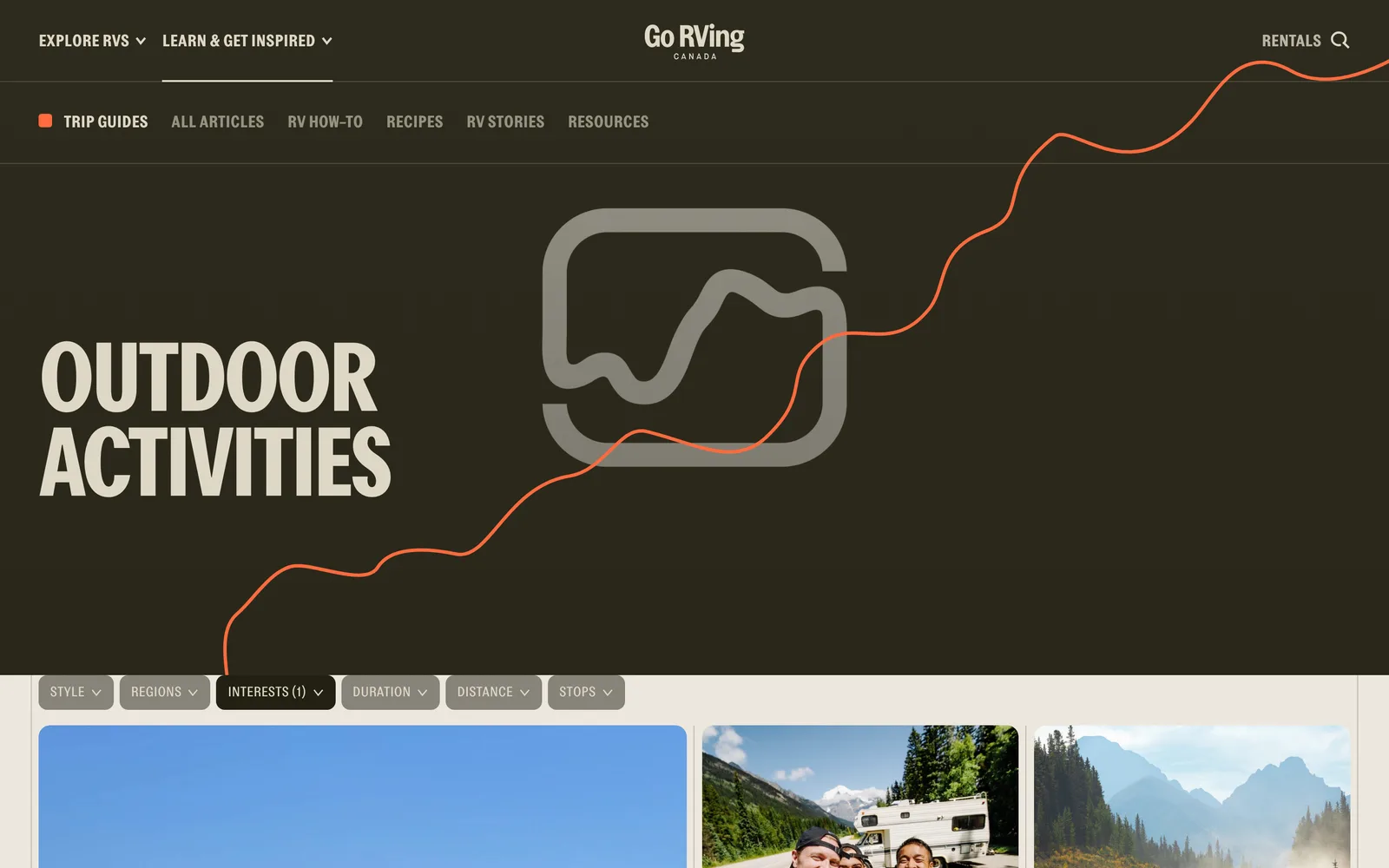
Go RVing Canada, Trip Planner and dealer locator on mobile. (desktop)
Go RVing Canada, Trip Planner and dealer locator on mobile. (mobile)

Trip Planner and dealer locator on mobile.

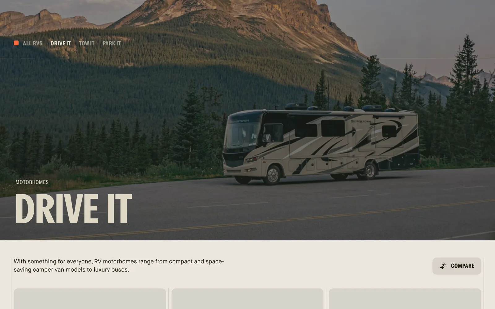
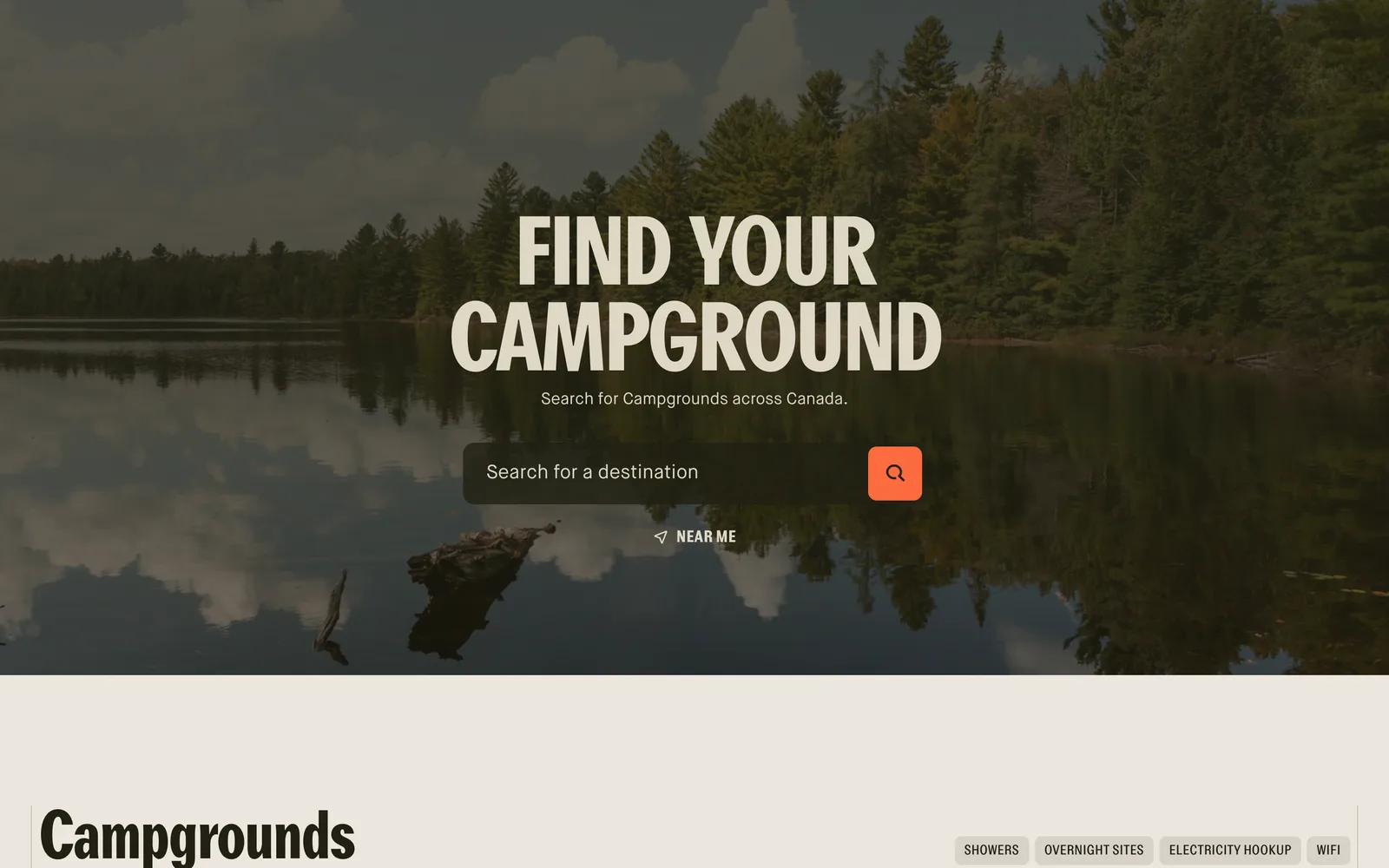
Go RVing Canada — view 1
Go RVing Canada — view 2
Go RVing Canada — view 3

Across the dream, the trip, the gear.

The thoroughness with which Nick approached the strategy behind the project stood out. I wanted to be challenged by a design team on certain decisions, and they did that. Finishing on time and on budget, the initial impact of the work has our KPIs are up 18%-20% already. Certain components of the site that Nick enhanced for us are up closer to 50%. We're thrilled about these gains, and we look forward to continuing our relationship.
Cyrus Irani Director of Digital Strategy, Go RVing Canada
04 / The Outcome

Where it landed.

The site shipped on time and on budget, and the early numbers Cyrus called out were the ones that mattered most. Overall key performance indicators were up eighteen to twenty percent already at the time of his testimonial, and certain components I enhanced were up closer to fifty percent. From my side, the outcome that mattered most is what those numbers represent. The marketing funnel and the dealer funnel are pointing in the same direction. Lifestyle visitors are converting into dealer locator hits. The dealer side of the business is stronger because the marketing side finally is too.

Cyrus described the engagement as a partnership he wanted to continue, and the appetite to be challenged on strategy that he set at the start of the project is what carried the work through. He wanted a design partner who would push back on certain decisions rather than rubber-stamp them, and the rigour we applied to the discovery phase, the site map, and the interactive tools is what produced the early lift on the components he flagged.

The deeper outcome is that Go RVing Canada now has a publishing platform that supports television spots, paid media, and the daily editorial cadence the marketing team runs, in two languages, with interactive tools that connect the lifestyle to the member network. New stories, curated trips, and dealer records can be added without designer support. The Trip Planner stays current as the headless content tool grows. The Matchmaker, the Comparison Tool, and the Affordability Calculator continue to feed primed visitors into the dealer locator. And the brand has the digital foundation to support whatever the next chapter of Canadian recreational vehicle travel looks like.


The Role
Digital Branding User Experience Design Site Structure & Navigation Responsive Website Design Custom WordPress Development Interactive Tools Development Multilingual Site Architecture Search Optimization Art Direction & Consulting

Ready for your own case study?

Drop your URL. Nick will audit your site personally and build a live preview you can click through before you pay a dollar.

or write directly

Free, weekly

Site teardowns for home-service owners.

One real home-service site, broken down each week. What's leaking, what's working, the one fix that would matter most. Sent Mondays. Built for operators, not designers.

Built for home-service operators. Unsubscribe in one click.

See your free rebuild

No pressure. No upfront payment.