Skip to content
BurksUP Design

Case № 22

Real agency pitch.

Goose Digital is a Toronto-based marketing automation and business marketing agency. They watched me work with their shared client Carbon60, then hired me to redesign their own site on a tight post-holiday timeline. The new site has been the cornerstone of their marketing ever since.

Client Goose Digital
Industry Professional Services
Role Website Architecture and Strategy, User Experience Design
Live at goosedigital.com
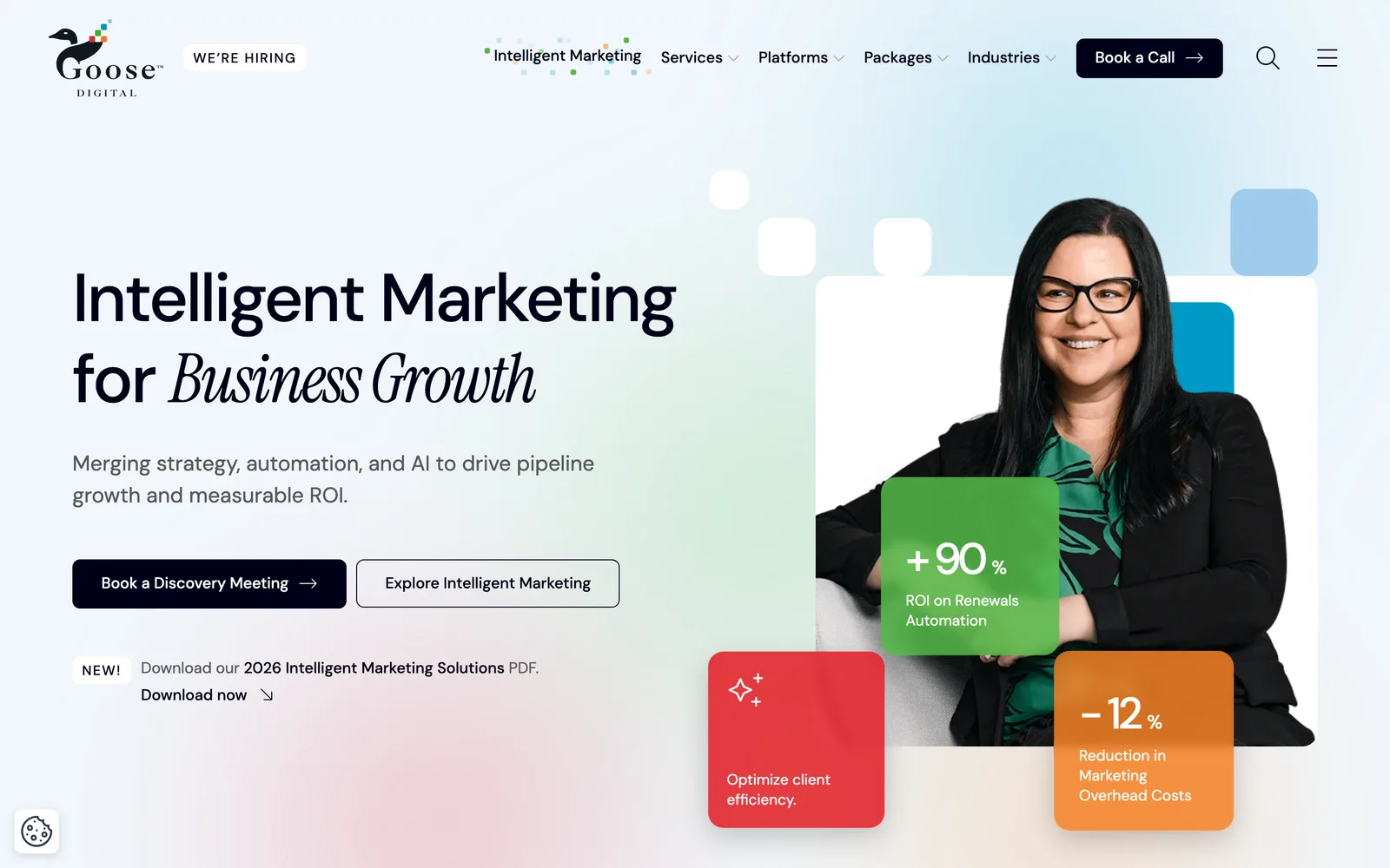
Goose Digital hero
In short

Marketing agency website design.

Goose Digital is a Toronto marketing automation agency that works primarily with business clients in the professional services and technology sectors. We met on a shared client engagement (a corporate rebrand and website for Carbon60) where I led the web design and Goose led the marketing automation strategy. The collaboration went well enough that when Goose decided to overhaul their own site, they brought me in directly.

The brief from Vice President of Strategy Kevin Butler was specific: a fully responsive site, a custom WordPress theme that gives the marketing team genuine flexibility, a brand evolution that reads as more professional and confident, and a delivery timeline 25 percent faster than a typical project of this size because Goose had a post-holiday marketing push lined up that depended on the new site as the foundation.

Kevin's exact recommendation after launch: "Nick took our ideas and brought them to life using his creativity and expertise on a very short timeline. Since launch, our new website has exceeded expectations and served as a cornerstone for our marketing."

Decade-plus
Working relationship since shared client work
25%
Faster delivery post-holiday push timeline
Custom
WordPress theme no third-party plugin sprawl
Custom
Iconography and illustration for marketing automation services
01 / The Problem

What was broken.

Goose Digital had three problems heading into the rebuild. The existing site was dated and struggled in modern mobile environments, which is a particularly bad look for an agency that sells digital marketing for a living. The brand had not kept up with the maturity of the agency itself, and the visual posture undersold the team's actual professional credibility. And the service offering was no longer clearly articulated, which is the most expensive failure mode for an agency website because it directly costs new business pitches.

The brand color palette was a real design constraint. The Goose system features primary red, blue, green, and orange. Used at full strength, those four colors fight each other and bounce the eye violently around the interface. The previous site leaned on them too hard, and the analytics showed it. Drop-off rates spiked on the pages where the palette competed with the content. The new design had to keep the brand recognizable while solving that competition.

The timeline pressure was the third constraint. Goose had committed to a post-holiday marketing push. The new website was the foundation of that push, and slipping the launch was not an option. The entire engagement had to ship roughly 25 percent faster than a typical project of similar scope.

02 / The Approach

How it got fixed.

I had the advantage of already knowing how Goose works. The Carbon60 engagement had given me direct exposure to their strategy team, their sales process, and their marketing automation thinking. That history compressed the discovery phase. I went straight from a focused kickoff into the analytics review and identified the navigation drop-offs and content gaps that the rebuild needed to solve. The compressed discovery also let us move directly into competitive research and content audit work that would normally start a week or two later in a typical engagement.

The strategy work produced a sitemap and a wireframe set built in an interactive prototyping tool. The navigation got rebuilt around the agency's primary content jobs (services, industries served, insights, and about) with the structure tuned to reduce the drop-offs the previous site analytics had flagged. Wireframing in a prototyping tool let Kevin and the strategy team review structure in real browser context before any visual design started, which is the move that made the compressed timeline possible. Each unique page template got reviewed and approved at the wireframe stage so the creative phase could move forward without re-opening structural questions.

The creative phase solved the color problem head-on. I broke up the four primary brand colors, restricted their use to specific roles, and leaned on a foundation of strong black and high-quality content-focused photography to carry the design. The result reads as more professional and confident without losing brand recognition. I also commissioned custom iconography and illustration for the marketing automation services, because stock icons cannot tell that story with the same clarity a custom set can. The image-heavy design got engineered for mobile delivery from the first comp so the visual richness survives on slower connections without compromising the desktop experience.


01

Compressed discovery from prior shared work

Because I had already worked with Goose on the Carbon60 engagement, I knew their voice, their strategy team, and their sales process going in. Discovery focused on the new site's specific issues rather than starting from zero, which made the 25-percent-faster timeline realistic.

02

Analytics-driven information architecture

I pulled the existing site's analytics and identified the pages and navigation paths with the highest drop-off rates. The new sitemap was designed specifically to fix those leaks while keeping the structure scannable.

03

Brand evolution toward confidence and clarity

The previous design leaned too hard on Goose's four primary colors and the eye bounced. I broke up the palette, restricted color to specific roles, and grounded the design on strong black and content-focused photography. The brand still reads as Goose. It just reads as a more confident version.

04

Custom WordPress theme with hard-coded features

I built a custom WordPress theme rather than stitching together third-party plugins. Hard-coded features run faster, are cheaper to maintain, and let the marketing team modify page layouts and add functionality without my involvement.

05

Custom icons and illustrations for marketing automation

Marketing automation is hard to depict. I commissioned a custom icon set and illustration system specifically for Goose's service pages so the abstract concepts have meaningful visual anchors instead of stock symbols.

How it shipped

The work, step by step.

01

Marketing agency website design that doubles as a credibility play

An agency website is not just marketing collateral. It is a live demonstration of what the agency can do. For Goose, the rebuild had to read as more professional and confident than the previous site because every prospective client who lands on it is asking, in effect, can these people make my own marketing this good. The brand evolution and the design system were calibrated specifically to answer that question in the affirmative.

02

Analytics-driven information architecture for a business marketing agency

I pulled the existing Goose analytics and looked specifically for navigation paths with high drop-offs and pages where users were not finding what they needed. The new sitemap is built to plug those leaks. Services and industries served got first-class navigation. Insights and case studies got cleaner index pages. The about section got rebuilt to surface the team and the agency's strategic depth earlier.

03

Disciplined color usage on a four-color brand

Goose's brand uses primary red, blue, green, and orange. Four primary colors at full strength is a known design problem. The eye bounces, the page becomes loud, and the user cannot tell what to read first. I broke the colors apart, gave each one a defined role (red for emphasis on key calls-to-action, the others for category and accent), and grounded the design on strong black with high-quality content-focused photography. The brand stays recognizable, the page calms down.

04

Custom WordPress theme with hard-coded functionality

I built a custom WordPress theme rather than relying on third-party plugins for core functionality. Hard-coded features run faster, are cheaper to maintain over the long term, and behave more predictably during the editorial workflow. The result is a publishing tool the marketing team can modify on the fly (page layouts, content blocks, calls-to-action) without involving a developer for each change.

05

Mobile-first responsive interface for an image-heavy agency site

Goose's design is image-heavy by intent, which is hard to do well on mobile. Bandwidth, image weight, and layout density all become problems. I designed the responsive interface mobile-first, optimized image delivery so the visual richness survives at slower connections, and tuned the breakpoints around the actual mobile behavior of business audiences (not the textbook ones).

The Work, Specifically

What I actually shipped.

Not a services list. The real work streams, in the order I ran them.

  1. № 01

    Discovery and analytics review

    Compressed discovery anchored in prior shared client work, plus a deep analytics review of the existing Goose site to identify navigation drop-offs and content gaps the rebuild had to solve.

  2. № 02

    Sitemap and information architecture

    A new navigation built around the agency's primary content jobs (services, industries served, insights, about), with structural fixes targeted directly at the drop-off rates from the previous site.

  3. № 03

    Wireframes and user experience design

    Interactive wireframes presented in a prototyping tool so the strategy team could review structure in real browser context before visual design started. That review pace was the move that made the compressed timeline possible.

  4. № 04

    Brand evolution and creative interface design

    A more professional and confident visual language anchored on strong black, content-focused photography, and a disciplined use of Goose's four primary brand colors. Custom iconography and illustration designed specifically for the marketing automation services.

  5. № 05

    Custom WordPress theme development

    A custom theme with hard-coded core functionality (no third-party plugin sprawl), built so the marketing team can modify page layouts, content blocks, and calls-to-action without developer involvement.

  6. № 06

    Search optimization and quality assurance

    Performance-tuned page templates, complete page metadata across the site, script compression, and a full pre-launch quality assurance pass across browsers and mobile devices to make sure the launch hit the post-holiday window cleanly.

03 / The Work

What shipped.

The Goose Digital homepage, in the browser.

The Goose Digital homepage, in the browser.

Goose Digital, Disciplined color and content-focused photography. (desktop)
Goose Digital, Disciplined color and content-focused photography. (mobile)

Disciplined color and content-focused photography.

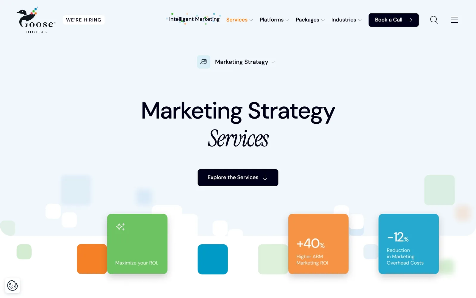
Goose Digital — view 1
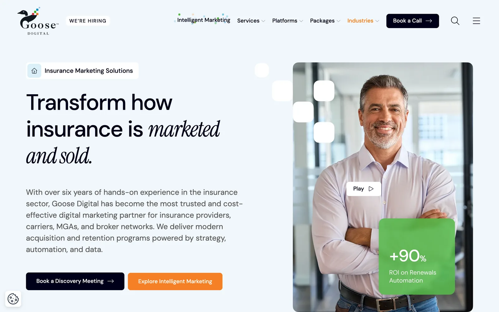
Goose Digital — view 2
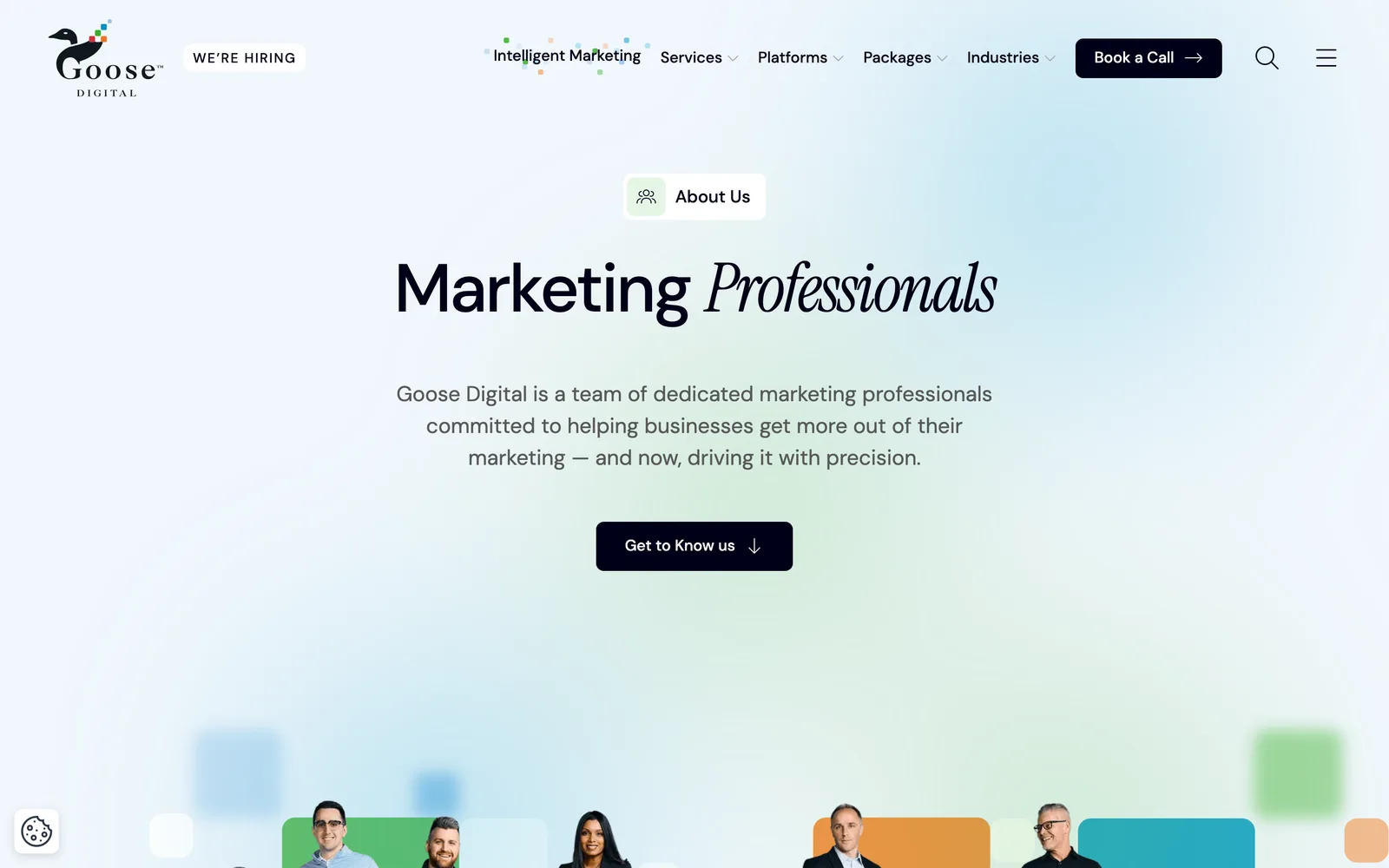
Goose Digital — view 3

Across services, work, and the agency story.

Having witnessed Nick's web design process with a shared client, there was no question as to who would create our new website. Nick took our ideas and brought them to life using his creativity and expertise on a very short timeline. Since launch, our new website has exceeded expectations and served as a cornerstone for our marketing. I would recommend Nick in a heartbeat.
Kevin Butler Vice President, Strategy, Goose Digital
04 / The Outcome

Where it landed.

The new Goose Digital site shipped on the compressed timeline and went live ahead of the post-holiday marketing push it was built to support. Since launch, it has been the cornerstone of the agency's own marketing. The custom WordPress theme has handled years of content updates, new service pages, and new case studies without requiring structural changes, which is the test of whether a custom build was worth the upfront investment.

Vice President of Strategy Kevin Butler put it directly: "Nick took our ideas and brought them to life using his creativity and expertise on a very short timeline. Since launch, our new website has exceeded expectations and served as a cornerstone for our marketing. I would recommend Nick in a heartbeat." That is exactly the outcome you want from an agency client, because they understand what good marketing infrastructure looks like and they are still recommending the work. An agency that recommends another agency is an unusual signal in the industry, and it is the signal that matters.

The partnership did not end at launch. Goose and I now collaborate on a regular basis pairing their marketing automation services with my web design and development work for shared clients in professional services and technology, including in the business marketing space. Multiple shared client engagements have shipped since the Goose rebuild, with the original collaboration on Carbon60 setting the template for how the two practices work together on the more complex projects.

The Role
Website Architecture and Strategy User Experience Design Responsive Website Design Custom WordPress Theme Development Custom Iconography and Illustration Search Optimization Conversion Rate Optimization Marketing Automation Integration

Ready for your own case study?

Drop your URL. Nick will audit your site personally and build a live preview you can click through before you pay a dollar.

or write directly

Free, weekly

Site teardowns for home-service owners.

One real home-service site, broken down each week. What's leaking, what's working, the one fix that would matter most. Sent Mondays. Built for operators, not designers.

Built for home-service operators. Unsubscribe in one click.

See your free rebuild

No pressure. No upfront payment.