Skip to content
BurksUP Design

Case № 26

Real pharma.

Kohl & Frisch is the leader in healthcare distribution across Canada and the most established pharmaceutical wholesaler in the country. I led their first full website rebuild in nearly two decades, with a bilingual interface, accessibility compliance, and a publishing tool every department of the business can run.

Client Kohl & Frisch Ltd.
Industry Professional Services
Role User Experience Design, Information Architecture
Live at kohlandfrisch.com
Kohl & Frisch Ltd. hero
In short

Pharma distribution website design.

Kohl & Frisch is one of Canada's largest pharmaceutical wholesalers and a leader in healthcare distribution coast to coast. The company has now passed 100 years in business. I led the first full rebuild of their website in nearly 20 years, working with Marketing Manager Eric Frisch and stakeholders across information technology, human resources, and corporate communications.

The brief was demanding. A complete site architecture overhaul, a fully responsive interface (the previous site had no mobile presence at all), a bilingual French and English experience, accessibility compliance for an audience that skews older and is distributed across the country, and a custom publishing tool flexible enough that each arm of the business can manage their own content without involving a central web team.

Eric summed up why they chose me to do the work: "Nick was the only one to personify the combination of clean design and originality our company needed. It's exceedingly rare to find a site that is simple and intuitive but also has a distinct look and feel." That balance was the engineering problem of the project.

0
Years in business national category leader
Bilingual
French and English full content parity
Accessibility-first
Design system older national audience
Multi-department
Publishing tool content models per business arm
01 / The Problem

What was broken.

Kohl & Frisch had a website that had not changed structurally in nearly 20 years. The architecture was built for a single-language desktop browser of a different era. There was no mobile experience. The accessibility was not where a national distributor needs it to be in a regulated industry. And the publishing tool was a chokepoint, because every arm of the business (information technology, human resources, customer service, communications) had content to manage and could not without going through a central team.

The audience added more constraints. A coast-to-coast pharmacy customer base that skews older and depends on the site for serious operational information. The interface had to be readable, calm, and accessible by default, not as an afterthought. It had to work bilingually with full content parity in French and English. And it had to deliver a coherent brand presence that matched the seniority of a 100-year-old leader in the category.

Finally, a national wholesale distributor's brand cannot afford to look generic. Eric's exact requirement was that the site be both simple and intuitive and have a distinct look and feel. That combination is hard to achieve. Most simple sites end up generic, most distinct sites end up busy. The design system had to thread that needle from the homepage to the manufacturer service pages.

02 / The Approach

How it got fixed.

I started at corporate headquarters just north of Toronto with a kickoff session covering pain points from the website management team and reports from their pharmacy customer base. From that conversation I built a discovery document covering the audience, the goals, the brand vision, and the design direction for the rebuild, then dropped into the analytics history to understand how the existing customers were finding the site and where they were getting stuck. The kickoff also covered internal stakeholders from information technology, human resources, customer service, and corporate communications so every department's content needs went into the brief from day one.

The strategy phase produced a new sitemap and a wireframe set built in an interactive prototyping tool. Eric and his stakeholders could click through the structure in a real browser context before any visual design started, which is the moment most enterprise web projects either gain momentum or stall. We came out of wireframing with a navigation that surfaces manufacturer services, pharmacy customer support, careers, and corporate information in two clicks, with bilingual parity built into the structure rather than bolted on. The wireframes also surfaced where the previous publishing tool's content models were forcing departments to compromise on how they presented their work, and the new architecture solved those compromises directly.

From there I designed the responsive interface with the older audience and the accessibility requirements as the design constraints up front rather than as a post-launch checklist. The user interface is intentionally calm, with a strong typographic hierarchy, generous spacing, and a color palette that meets contrast requirements without looking institutional. The custom WordPress build came alongside the design, with content models for each business arm so information technology, human resources, and customer support each get a clean publishing space. The bilingual structure was engineered as a first-class behavior of the publishing tool so the marketing team can keep French and English in lockstep without separate workflows, and the search optimization framework was wired into the templates and metadata system so every new page inherits the strategy automatically.

01

Discovery at corporate headquarters

I ran the kickoff session in person at Kohl & Frisch HQ with the website management team. Pain points from internal users and from the pharmacy customer base went directly into the redesign plan, alongside a deep analytics review of the existing site.

02

Sitemap and wireframes in an interactive prototype

I rebuilt the navigation around the four primary jobs: manufacturer services, pharmacy customer support, careers, and corporate information. Stakeholders reviewed the structure in a real browser context before any visual design started, which kept the creative phase efficient.

03

Bilingual responsive interface design

The new interface is the company's first to genuinely work on mobile and the first to deliver full content parity in French and English. The design system handles both languages without compromising layout or typographic hierarchy.

04

Accessibility-first design system

Accessibility for an older audience went in as a design constraint at the start. Strong typographic hierarchy, generous spacing, contrast-compliant palette, and keyboard-friendly interaction patterns across every page template.

05

Custom WordPress with per-department content models

I built the publishing tool on WordPress with content models tailored to each arm of the business. Information technology, human resources, customer support, and communications each get a clean publishing space without stepping on each other.

How it shipped

The work, step by step.

01

Pharma distribution website design for a national wholesaler

Kohl & Frisch sits between pharmaceutical manufacturers and pharmacies across the country. The website serves both audiences, plus job seekers, plus corporate communications. The architecture had to make each audience feel like the site was built for them while remaining one cohesive corporate presence. I designed the navigation around the four primary content jobs and built parallel reading paths for each audience type.

02

Bilingual website design with full French and English parity

A national Canadian distributor needs full content parity between French and English, not a translated subset. I built the publishing tool to handle bilingual content as a first-class structure (with paired pages, language-aware metadata, and language-aware navigation) so the marketing team can keep both versions in lockstep without separate workflows.

03

Accessibility compliance for an older national audience

Accessibility went in as a design constraint at the beginning, not as a remediation pass at the end. Strong typographic hierarchy, generous spacing, a contrast-compliant palette, keyboard-navigable components, alt text discipline, and form labelling were all baked into the design system from the first wireframe. The result is a site that is accessible by construction, not by patch.

04

Custom WordPress publishing tool for a multi-department business

The previous site had a single bottlenecked publishing tool. The rebuild gives each arm of the business their own content models. Manufacturer services, pharmacy customer support, careers, corporate communications, and information technology each get a tailored publishing surface. The marketing manager can run the brand-level content; each department runs their own content underneath without stepping on the others.

05

Search optimization for a 100-year-old industry leader

Kohl & Frisch has a century of brand equity behind their name. The rebuild had to convert that equity into search visibility. I structured the page metadata system around the firm's highest-value queries (manufacturer services, pharmacy distribution, careers in healthcare distribution), tuned the WordPress install for performance, and built the publishing tool so content the team adds later inherits the same search-friendly structure.

The Work, Specifically

What I actually shipped.

Not a services list. The real work streams, in the order I ran them.

  1. № 01

    Discovery and project kickoff

    On-site session at Kohl & Frisch HQ covering internal pain points, pharmacy customer feedback, and the analytics history of the previous site. Output was a one-page brief that fed every downstream decision.

  2. № 02

    Sitemap and information architecture

    A new navigation built around four primary content jobs, with bilingual parity baked into the structure and parallel reading paths for manufacturer and pharmacy customer audiences.

  3. № 03

    Wireframes and user experience

    Interactive wireframes presented in a prototyping tool so stakeholders could review structure in context before visual design started, with accessibility constraints designed in from the first frame.

  4. № 04

    Bilingual responsive interface design

    A modern responsive interface that handles French and English with full layout parity, designed mobile-first and accessibility-first so the site behaves cleanly on every device for the firm's national audience.

  5. № 05

    Custom WordPress publishing tool

    Custom WordPress build with content models per business arm so manufacturer services, customer support, careers, and corporate communications each get a clean publishing space without stepping on the others.

  6. № 06

    Search optimization and post-launch training

    Performance-tuned templates, page metadata anchored on the firm's highest-value queries, and a recorded training session covering the publishing tool and the search framework so the team can run the site themselves.

03 / The Work

What shipped.

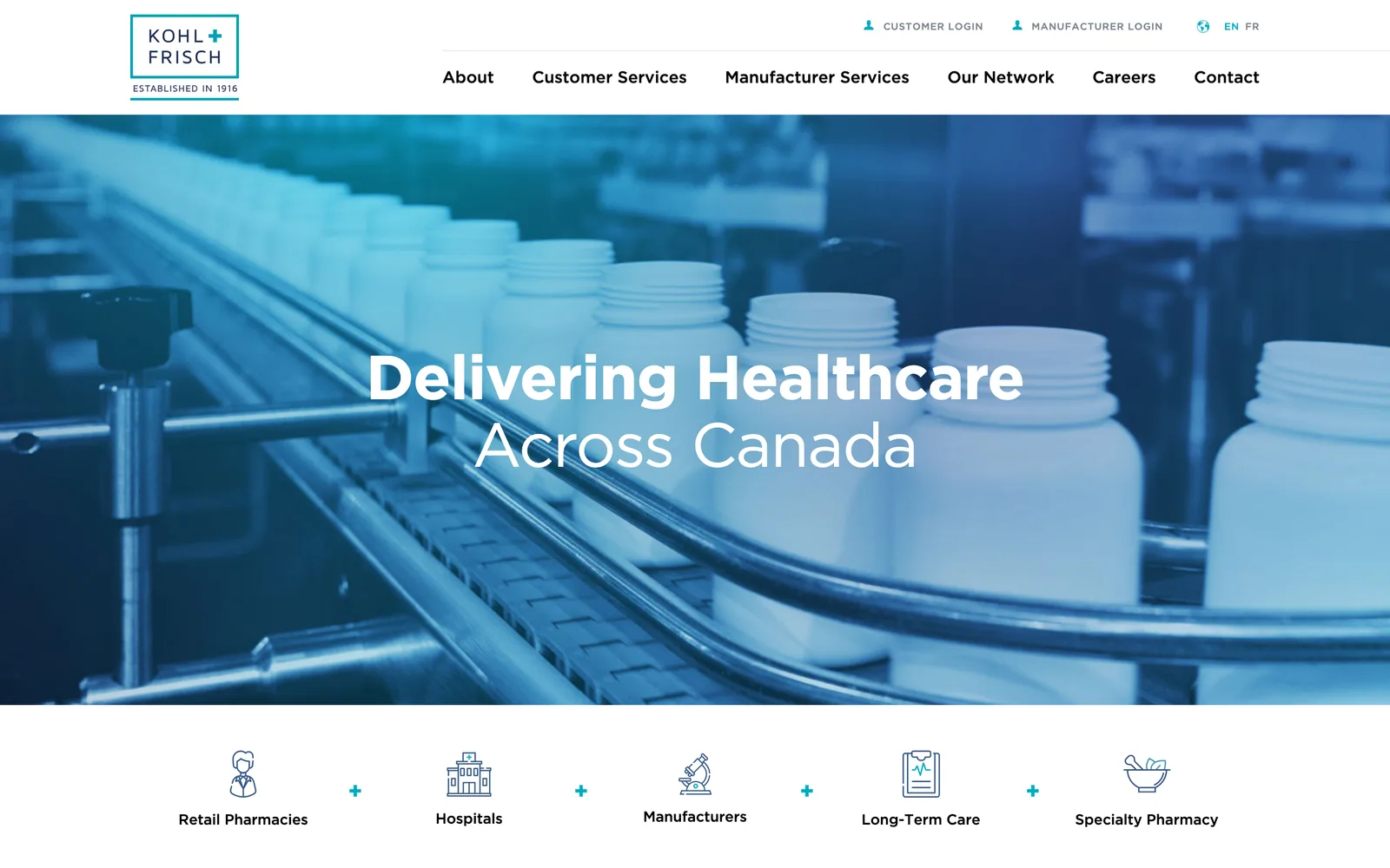
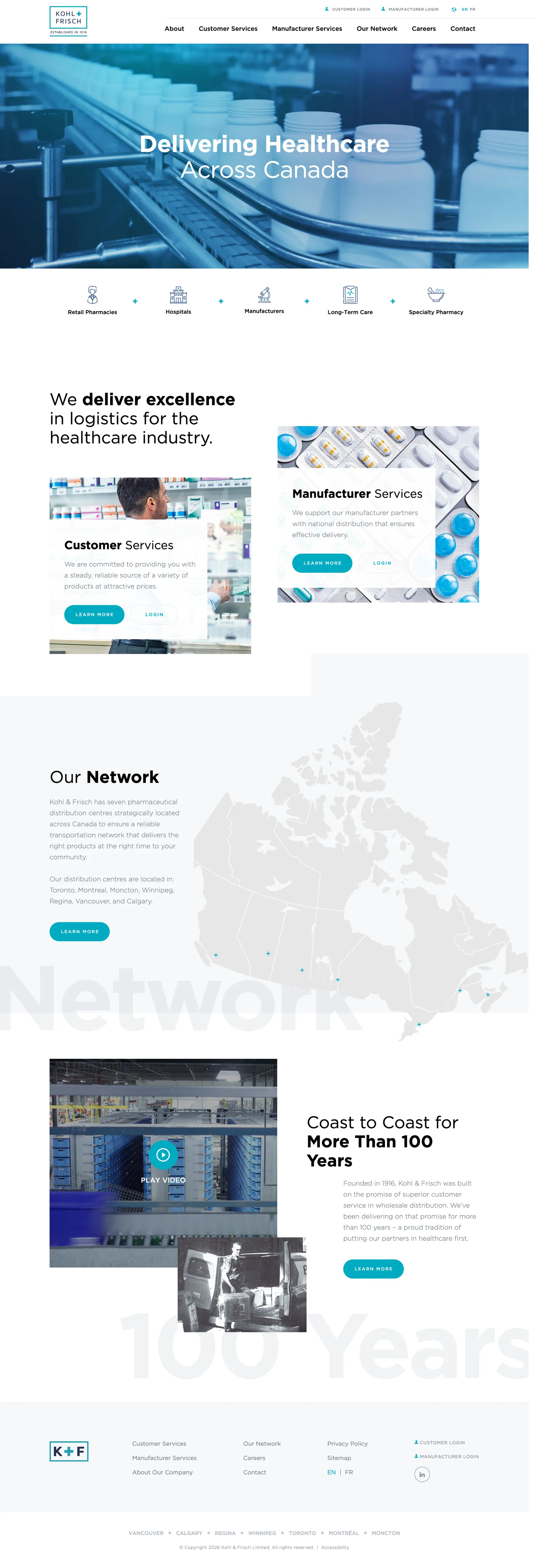
The Kohl & Frisch homepage, in the browser.

The Kohl & Frisch homepage, in the browser.

Kohl & Frisch Ltd., Bilingual responsive interface, French and English. (desktop)
Kohl & Frisch Ltd., Bilingual responsive interface, French and English. (mobile)

Bilingual responsive interface, French and English.

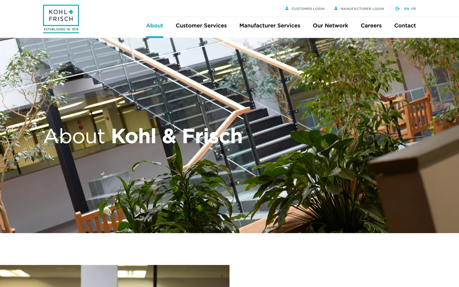
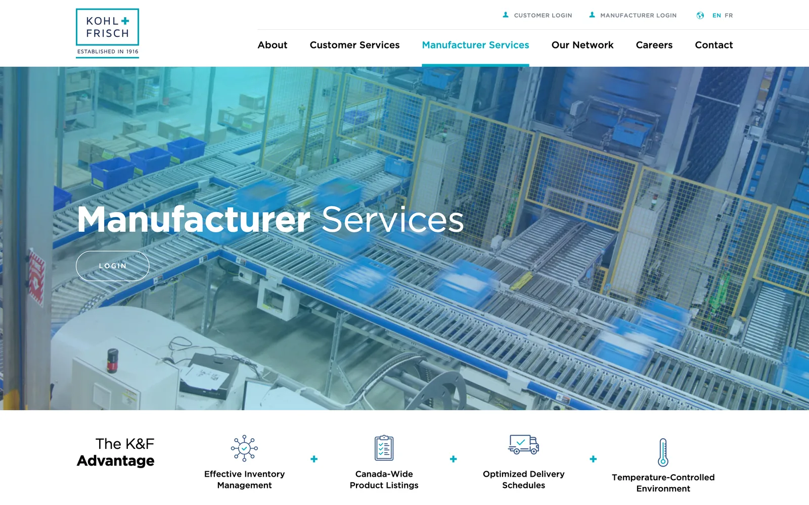
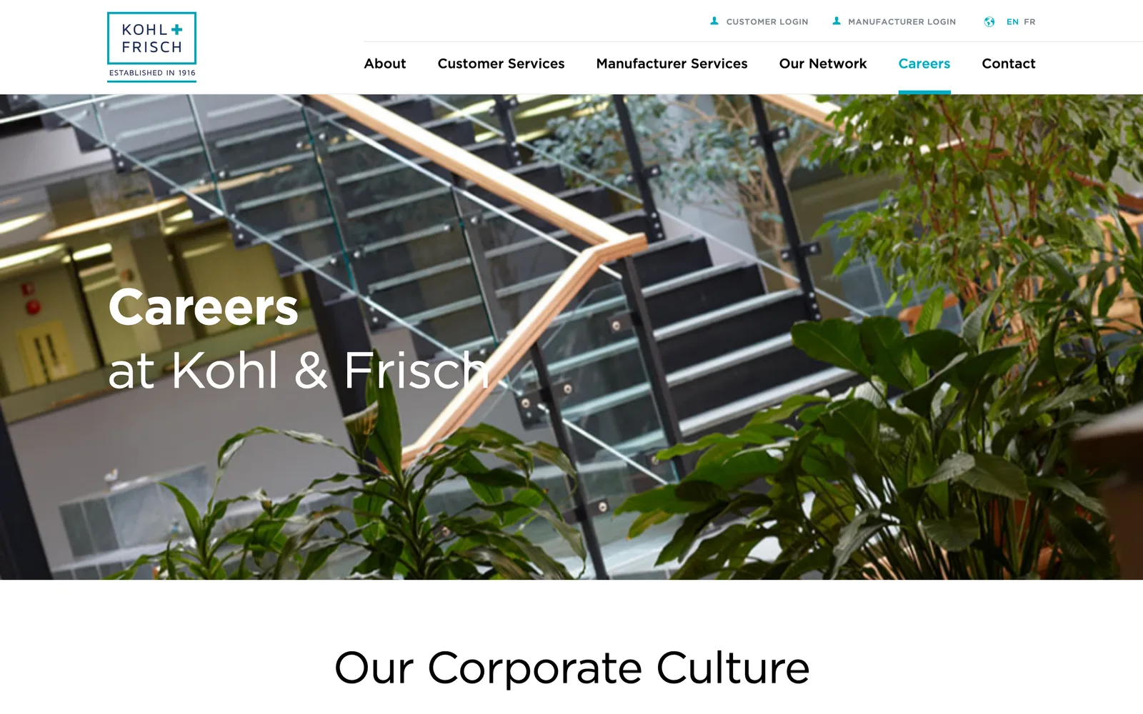
Kohl & Frisch Ltd. — view 1
Kohl & Frisch Ltd. — view 2
Kohl & Frisch Ltd. — view 3

Across the catalogue, the markets, the company.

We researched many web design companies in Toronto before realizing Nick was the only one to personify the combination of clean design and originality our company needed. It's exceedingly rare to find a site that is simple and intuitive but also has a distinct look and feel. That's why we chose Nick, who certainly delivered on that promise. In addition to building us a beautiful website, Nick was lightning-fast to respond to our requests. He worked with us on a lot of different design ideas and concepts and provided great direction to us about how to modernize the look of our site while staying true to our desire for simplicity. It was truly great working with him. We would highly recommend Nick to anyone looking for a clean, contemporary website.
Eric Frisch Marketing Manager, Kohl & Frisch Ltd.
04 / The Outcome

Where it landed.

The new site launched and Kohl & Frisch now has a digital presence that matches the seniority of a 100-year-old industry leader. The architecture handles both manufacturer and pharmacy customer audiences cleanly, the publishing tool gives each arm of the business autonomy, and the bilingual responsive interface delivers full content parity in French and English on every device. The accessibility compliance baked into the design system means the site serves a national audience that genuinely depends on it for operational information, including audiences who would have struggled with the previous design.

Marketing Manager Eric Frisch has been direct about the working relationship: "It's exceedingly rare to find a site that is simple and intuitive but also has a distinct look and feel. Nick certainly delivered on that promise. The team was lightning-fast to respond to our requests and provided great direction to us about how to modernize the look of our site while staying true to our desire for simplicity." That captures the design constraint of the project and the result. The combination of clean and original is hard to ship, and shipping it for a national pharmaceutical wholesaler with the operational seriousness Kohl & Frisch carries was the engineering problem of the engagement.

The accessibility-first approach has aged well. The site continues to meet a national distributor's expectations for an audience that depends on it for operational information, and the bilingual structure has stayed in lockstep across years of content updates without requiring a separate workflow. The publishing tool's per-department content models keep the marketing team unblocked even as the business continues to grow into its second century.

The Role
User Experience Design Information Architecture Responsive Website Design Bilingual Website Design Accessibility Compliance Custom WordPress Development Search Optimization Art Direction and Consulting

Ready for your own case study?

Drop your URL. Nick will audit your site personally and build a live preview you can click through before you pay a dollar.

or write directly

Free, weekly

Site teardowns for home-service owners.

One real home-service site, broken down each week. What's leaking, what's working, the one fix that would matter most. Sent Mondays. Built for operators, not designers.

Built for home-service operators. Unsubscribe in one click.

See your free rebuild

No pressure. No upfront payment.